Oriol.Design
Home
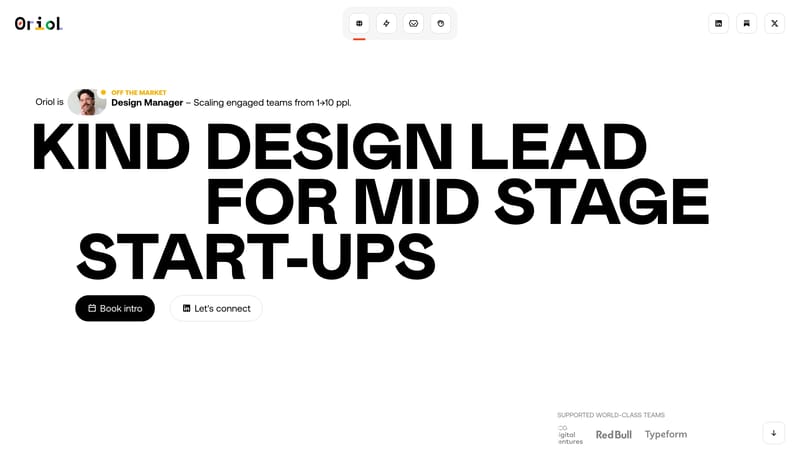
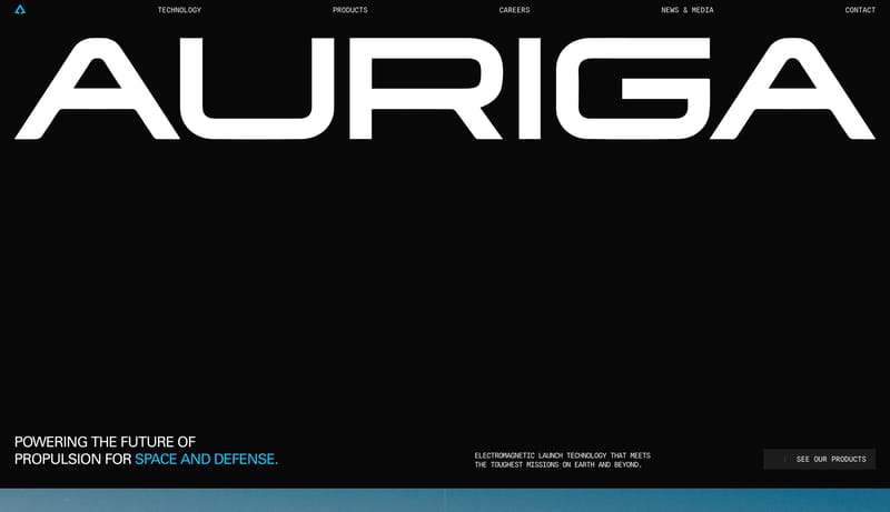
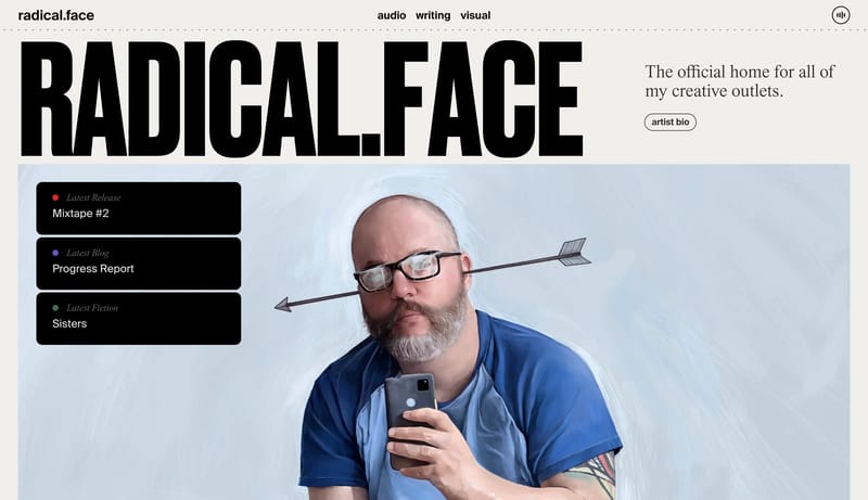
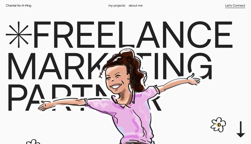
Build a system that feels kind, editorial, and sharply opinionated. A stark editorial portfolio system built from black hero pills, white outlined capsules, giant grotesk type, and orange-red proof cards.
Open exampleStyle
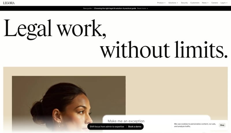
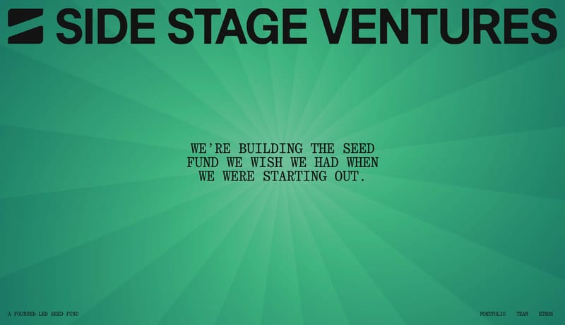
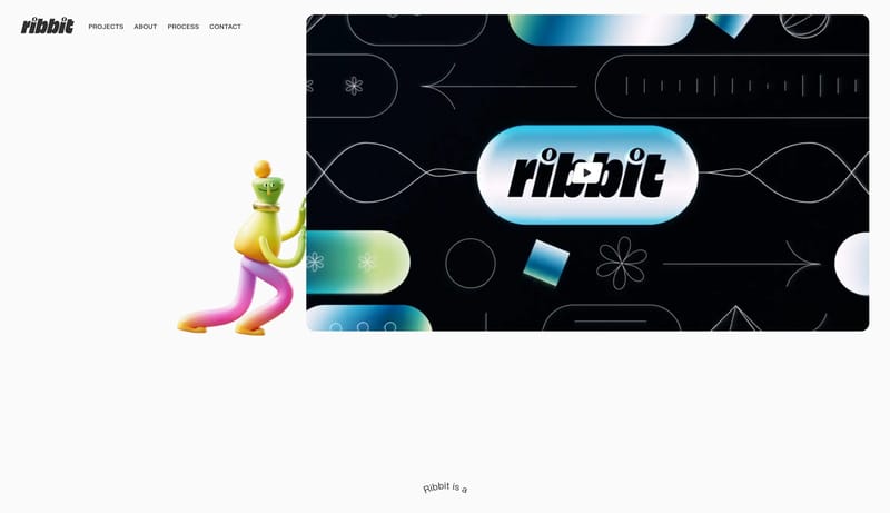
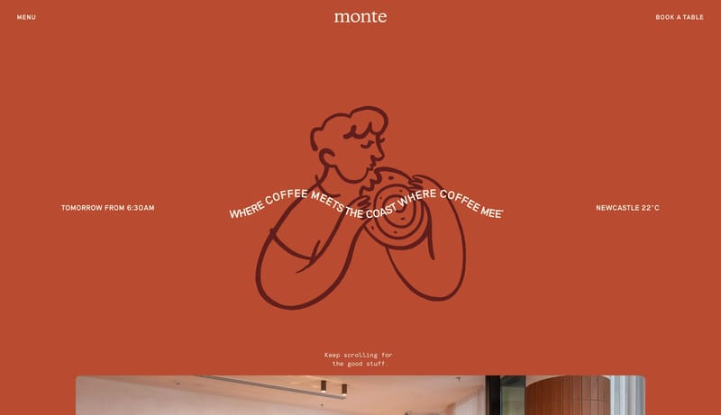
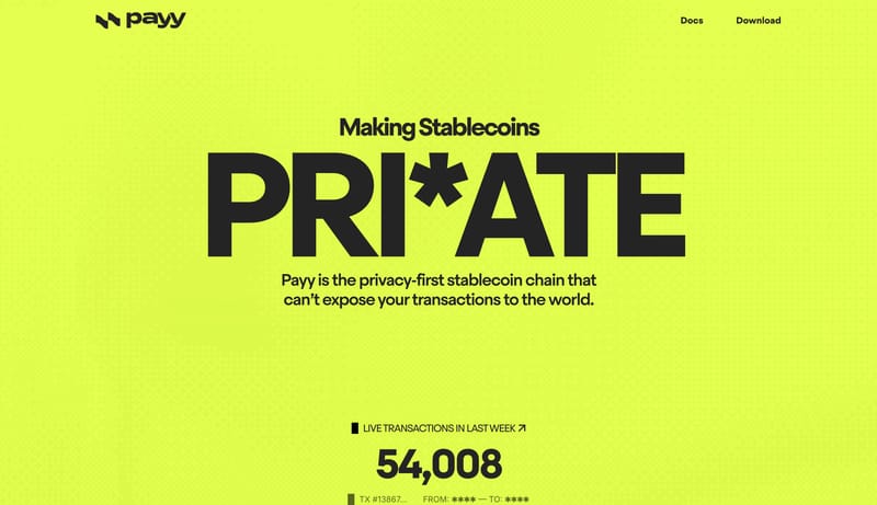
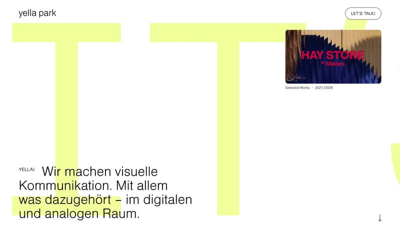
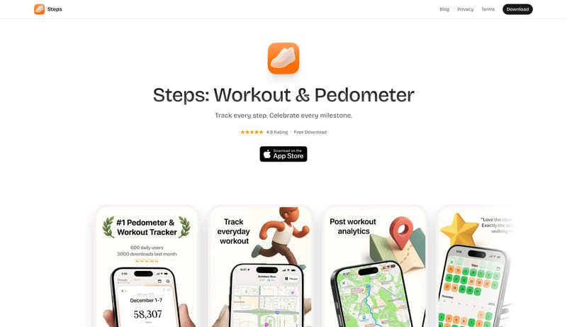
Browse 182 curated Large Type website examples to review visual direction, typography, color systems, motion, and overall brand expression.
What To Look For
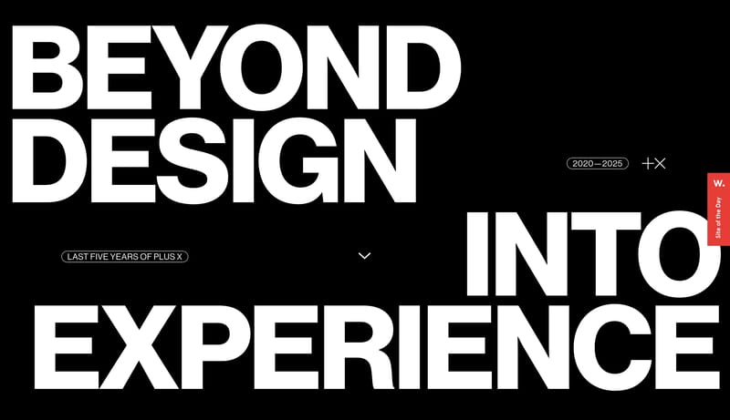
Study how Large Type style decisions affect first impression, readability, visual tension, motion, and the overall feel of the product.
What To Compare
Pay attention to color contrast, type pairings, spacing density, illustration treatment, motion restraint, and how the Large Type style stays consistent across the page.
Design Analysis
Build a system that feels kind, editorial, and sharply opinionated. A stark editorial portfolio system built from black hero pills, white outlined capsules, giant grotesk type, and orange-red proof cards. Soft Agent Workspace is a light-first system that makes...
Oriol.Design
Home
Build a system that feels kind, editorial, and sharply opinionated. A stark editorial portfolio system built from black hero pills, white outlined capsules, giant grotesk type, and orange-red proof cards.
Open exampleLobeHub
Home
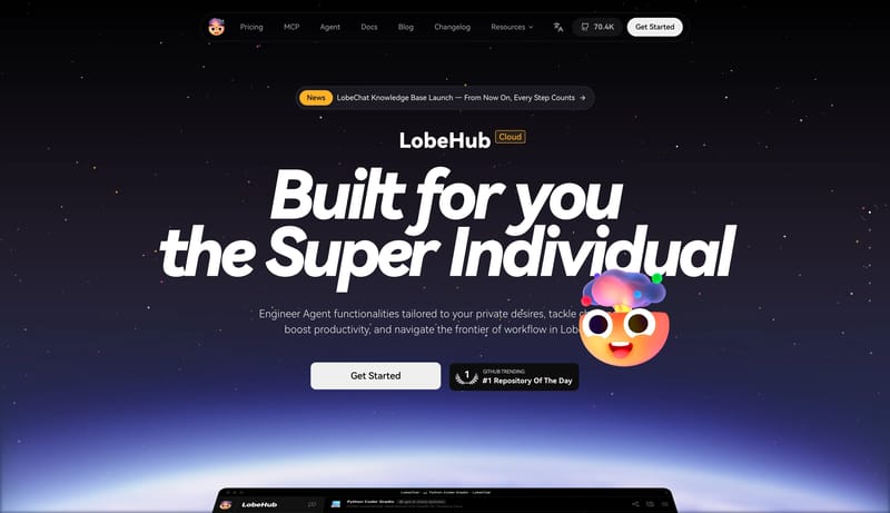
Soft Agent Workspace is a light-first system that makes advanced software feel collaborative and approachable. The first impression should be one giant italic statement over a near-white canvas, followed by a polished wh...
Mixpanel
Home
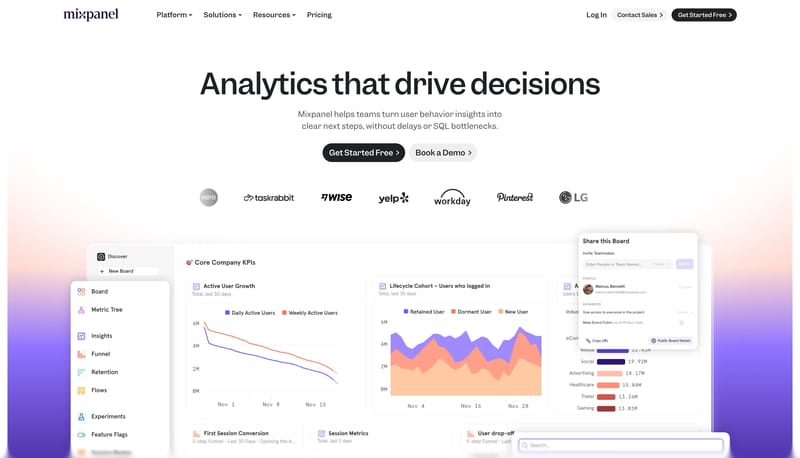
Build the system as white space, giant dark statements, and one orderly row of signal tiles. Use lilac and violet to energize proof without changing the page shell into an accent wash. Let monochrome pills keep the inter...
Use these internal hubs to keep branching from Large Type into broader design research, structured design analysis, or adjacent website inspiration taxonomies.
Hub
Return to the broader styles hub if you want to branch into adjacent topics beyond Large Type.
Related Hub
Browse pages grouped by repeated design signals when you want inspiration organized by visual patterns instead of taxonomy alone.
Related Hub
Study structured design analysis, reusable tokens, and AI-readable system guidance tied back to real production websites.
Workflow Collection
Portfolio references and related tools for studios, personal brands, creative developers, and case-study-led sites.
Workflow Collection
Collections for vibe-coded sites, AI website builders, and fast-moving prompt-to-product workflows.
Workflow Collection
A broader collection of AI product references, AI website examples, design-system examples, and workflow tools.
Explore More
Switch to the categories hub to compare Large Type inspiration against a different browsing dimension.
Explore More
Switch to the sections hub to compare Large Type inspiration against a different browsing dimension.
Refto for Mac
Save pages, images and videos from the browser into one library, and find them again by what they show. Free for 15 days.
It helps you compare visual tone, typography, color systems, spacing density, illustration treatment, and motion choices used in Large Type website design.
Use them to calibrate creative direction, collect mood references, and decide which visual traits feel distinctive enough to adapt for your own product.