Design Analysis
What stands out in Interactive websites
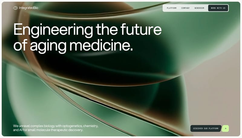
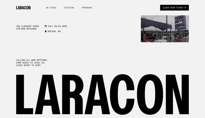
Build every page from exposed structural rules, giant black statements, and wide white breathing room. Let the page feel instructional and precise, never ornamental. Use black pills and restrained UI capsules as the only... Community Card Carnival is a social...
Build every page from exposed structural rules, giant black statements, and wide white breathing room. Let the page feel instructional and precise, never ornamental. Use black pills and restrained UI capsules as the only...
- Build every page from exposed structural rules, giant black statements, and wide white breathing room.
- Let the page feel instructional and precise, never ornamental.
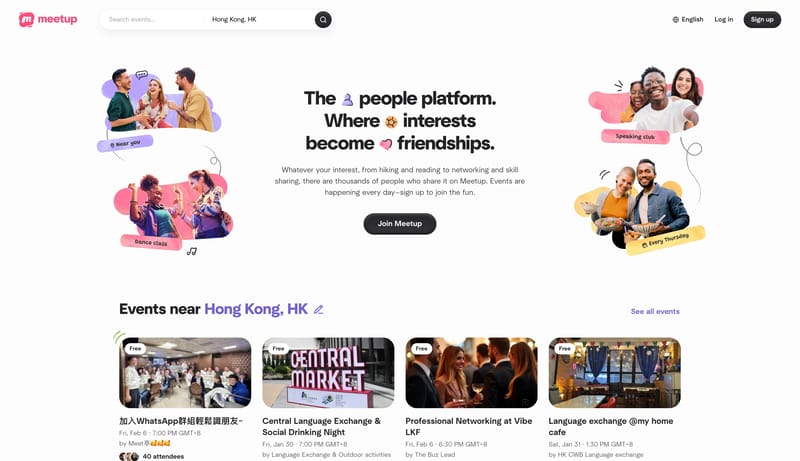
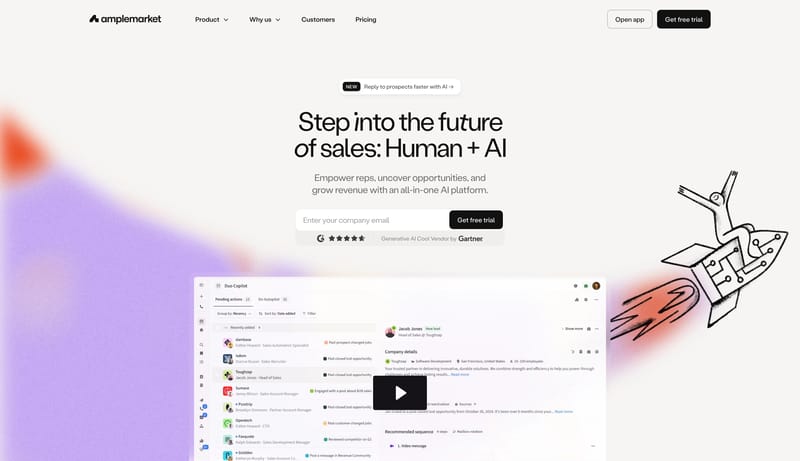
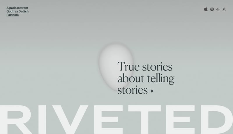
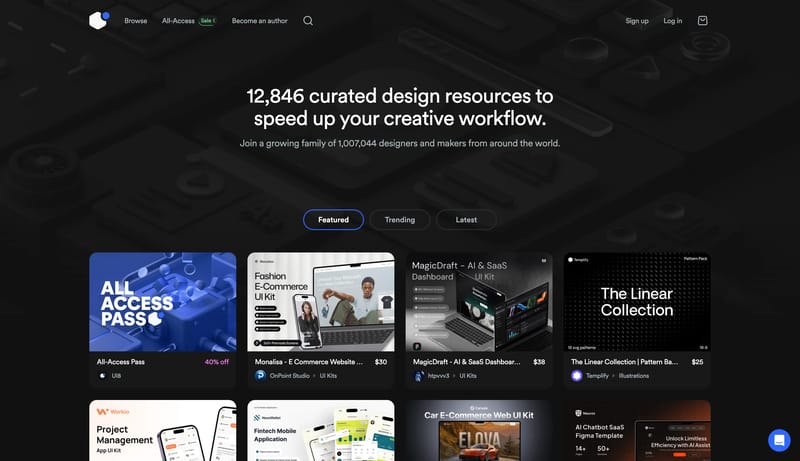
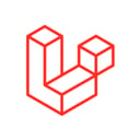
Open exampleCommunity Card Carnival is a social discovery system that prioritizes momentum and friendliness. Search, categories, and event rails should feel effortless, broad, and welcoming, with bright white breathing room keeping...
- Primary ( FF5A5F): the warm social signal.
- Secondary ( 2F3136): main text and dark CTA color.
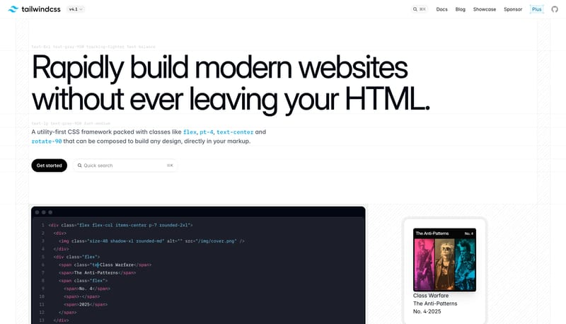
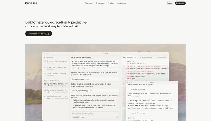
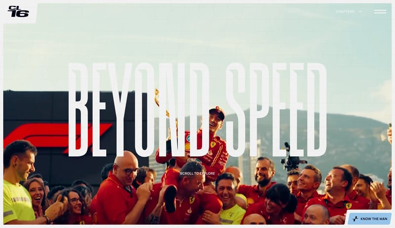
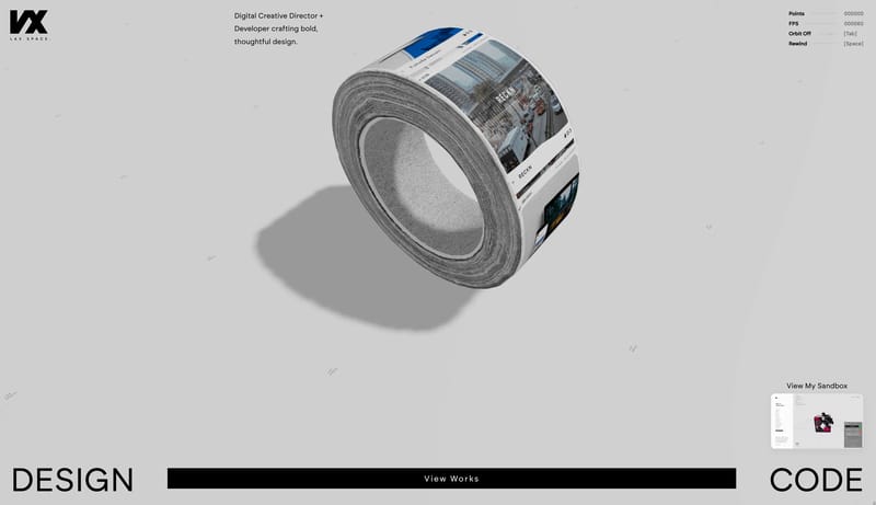
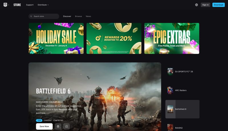
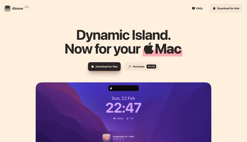
Open exampleBuild the page as warm paper, quiet chrome, and one believable software window at a time. Let the system feel productive and premium rather than speculative or flashy. Use black pills as the clearest action voice. Use la...
- Build the page as warm paper, quiet chrome, and one believable software window at a time.
- Let the system feel productive and premium rather than speculative or flashy.
Open example