Browse all Styles

Style

Interactive Website Inspiration

Browse 172 curated Interactive website examples to review visual direction, typography, color systems, motion, and overall brand expression.

172 curated examples24 per pagePage 1 of 8

What To Look For

Study how Interactive style decisions affect first impression, readability, visual tension, motion, and the overall feel of the product.

What To Compare

Pay attention to color contrast, type pairings, spacing density, illustration treatment, motion restraint, and how the Interactive style stays consistent across the page.

Design Analysis

What stands out in Interactive websites

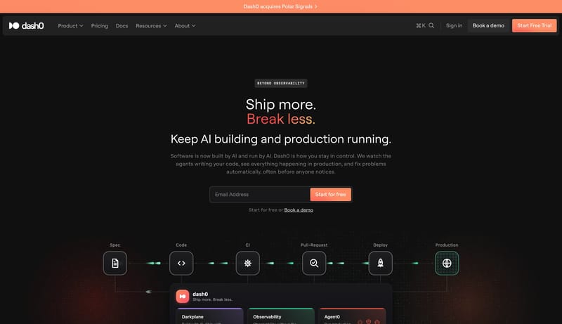
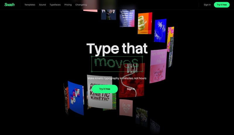
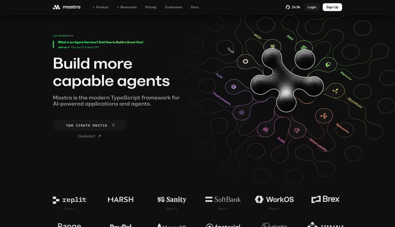
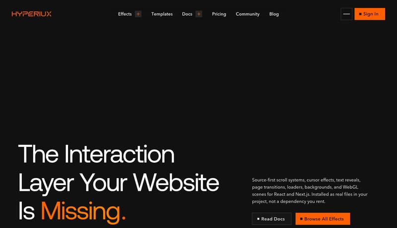
A near-black developer canvas with oversized white display type, an orange action colour and live interactive demos. Tone: technical, high-energy and precise. Density 3/5, visual variance 4/5, motion 4/5. Built for a dev... A white canvas with a violet accent,...

Recurring Signals

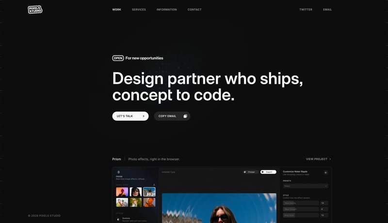
  • A near-black developer canvas with oversized white display type, an orange action colour and live interactive demos.
  • Tone: technical, high-energy and precise. Density 3/5, visual variance 4/5, motion 4/5.
  • Built for a developer tooling / frontend effects audience; keep the page readable before adding visual flourish.
  • Use 111111 as the page background and FFFFFF for primary text.
  • Reserve FF5F00 for the main call to action and key emphasis.
  • Use FFFFFF and 939393 as supporting tones for secondary actions, labels and status accents.

Related Keywords

OverviewColorsTypographyLayoutImage DirectionEntry & Arrival MotionKeep proof and action modules simple and grounded

Hyperiux Vault

Home

2026-11-21

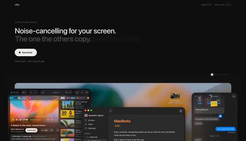
A near-black developer canvas with oversized white display type, an orange action colour and live interactive demos. Tone: technical, high-energy and precise. Density 3/5, visual variance 4/5, motion 4/5. Built for a dev...

  • A near-black developer canvas with oversized white display type, an orange action colour and live interactive demos.
  • Tone: technical, high-energy and precise. Density 3/5, visual variance 4/5, motion 4/5.
Open example

ExpoKit

Home

2026-11-20

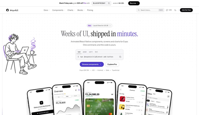
A white canvas with a violet accent, an editorial serif headline and a live component wall that rewards interaction. Tone: expressive, playful and technical. Density 3/5, visual variance 4/5, motion 4/5. Built for a mobi...

  • A white canvas with a violet accent, an editorial serif headline and a live component wall that rewards interaction.
  • Tone: expressive, playful and technical. Density 3/5, visual variance 4/5, motion 4/5.
Open example

IconMCP

Home

2026-11-20

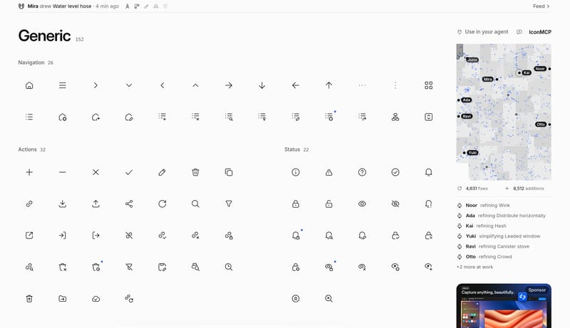
A white, monochrome catalogue with a dense icon grid, neutral zinc tones and a single pill-shaped search bar. Tone: minimal, quiet and utilitarian. Density 4/5, visual variance 2/5, motion 2/5. Built for a developer tool...

  • A white, monochrome catalogue with a dense icon grid, neutral zinc tones and a single pill-shaped search bar.
  • Tone: minimal, quiet and utilitarian. Density 4/5, visual variance 2/5, motion 2/5.
Open example

Continue Exploring

Use these internal hubs to keep branching from Interactive into broader design research, structured design analysis, or adjacent website inspiration taxonomies.

Interactive Inspiration FAQ

What can this Interactive style collection help with?
It helps you compare visual tone, typography, color systems, spacing density, illustration treatment, and motion choices used in Interactive website design.

How should I use Interactive style references?

Use them to calibrate creative direction, collect mood references, and decide which visual traits feel distinctive enough to adapt for your own product.