Browse all Styles

Style

Interactive Website Inspiration

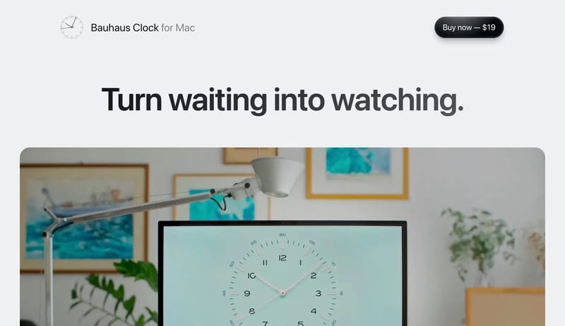
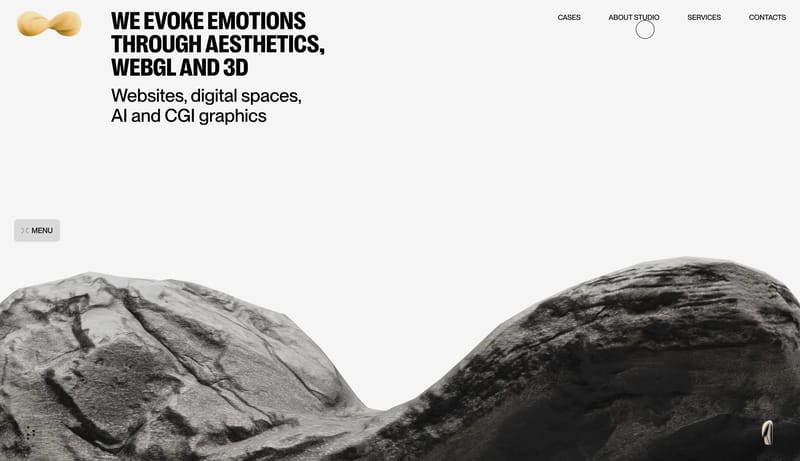
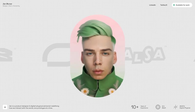
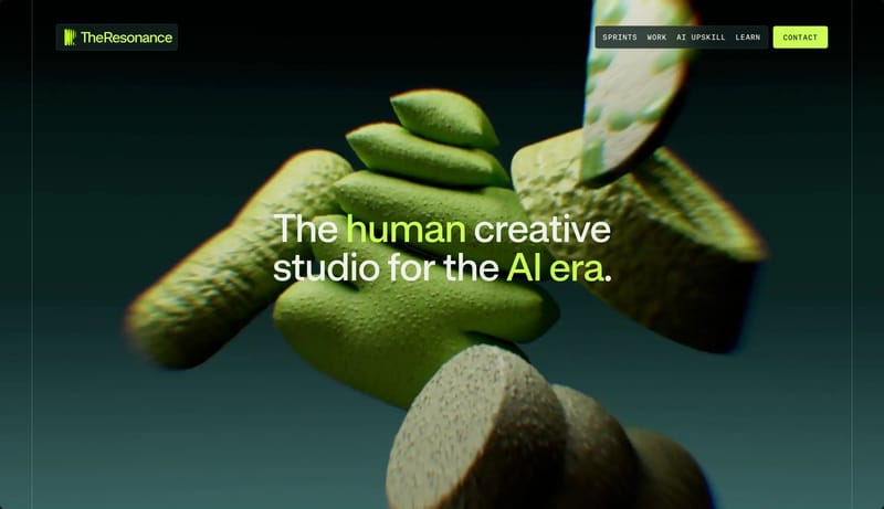
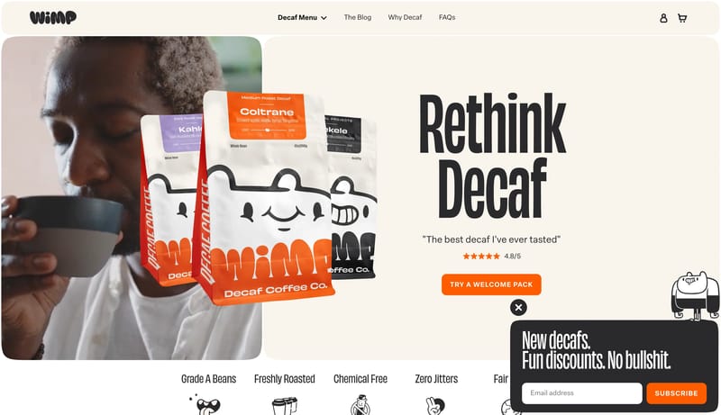
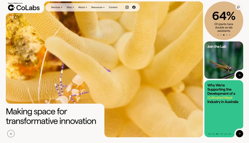
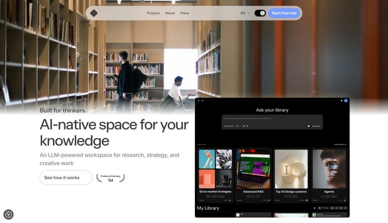
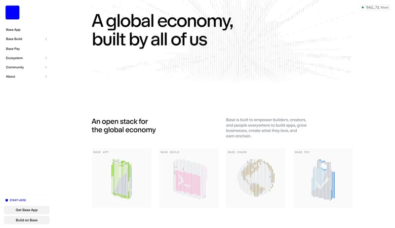
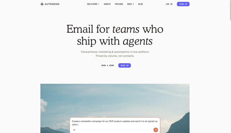
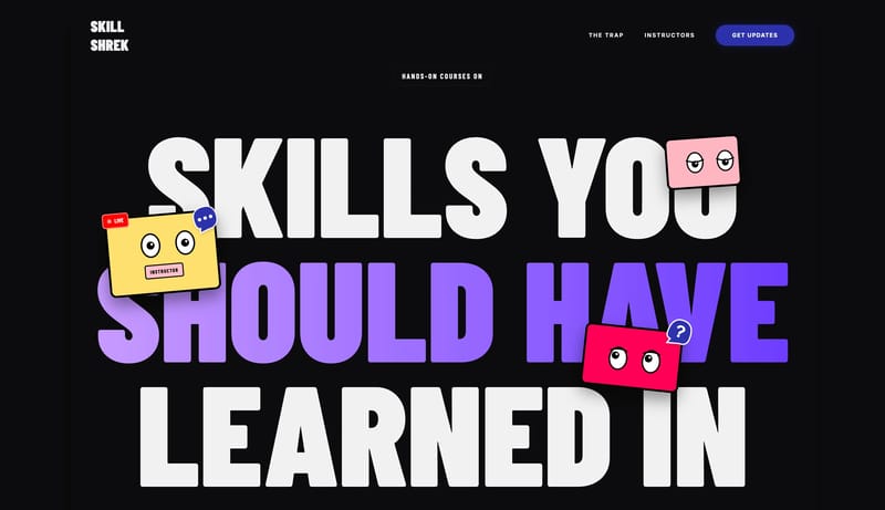
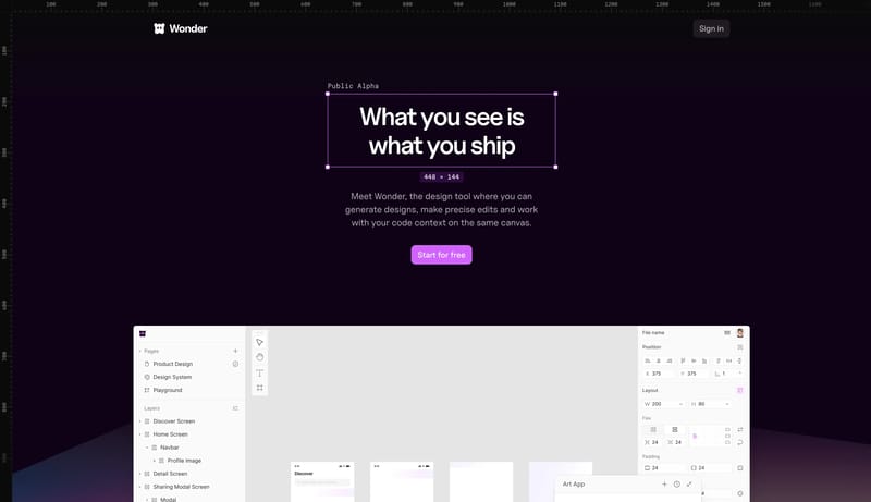
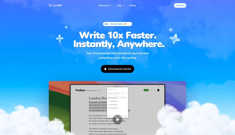
Browse 136 curated Interactive website examples to review visual direction, typography, color systems, motion, and overall brand expression.

136 curated examples24 per pagePage 2 of 6

What To Look For

Study how Interactive style decisions affect first impression, readability, visual tension, motion, and the overall feel of the product.

What To Compare

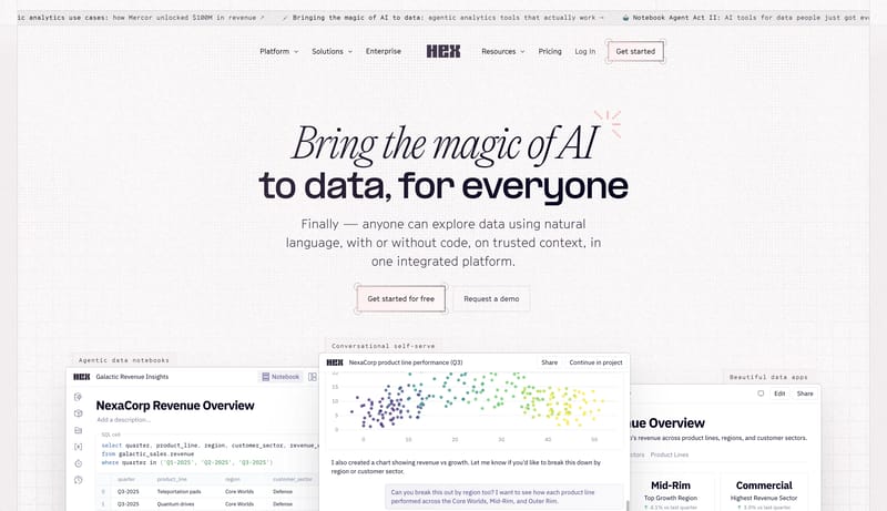
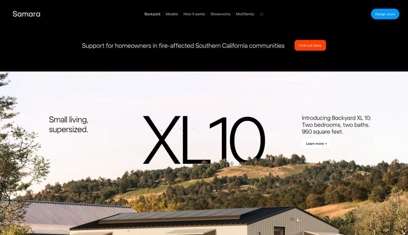
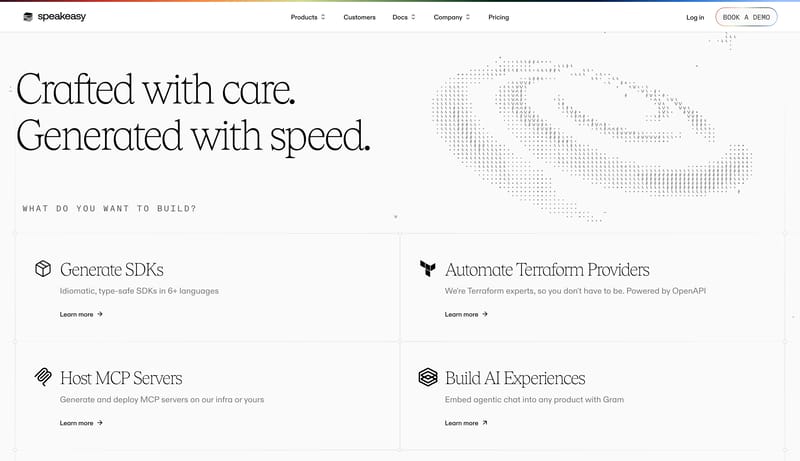
Pay attention to color contrast, type pairings, spacing density, illustration treatment, motion restraint, and how the Interactive style stays consistent across the page.

Design Analysis

What stands out in Interactive websites

--- version: alpha name: "Notebook Collage Noir" description: "A charcoal editorial portfolio language built from cream graph-paper surfaces, coral marker accents, and scrapbook-framed project artifacts." colors: primary... --- version: alpha name: Cream Tacti...

Recurring Signals

  • Build the experience as a dark stage with one dominant warm paper object carrying the main story.
  • Let the interface feel handmade, but not sloppy: every doodle, sticker, and offset layer should still support clear reading order.
  • Treat the page like a curated notebook spread rather than a polished product dashboard.
  • Use a recurring scrapbook image language: graph paper, clipped screenshots, pinned inserts, cutout portraits, and hand-drawn perimeter objects.
  • Keep one major content surface in focus and let supporting graphics orbit the edge rather than compete for attention.
  • Favor cream paper, charcoal voids, coral marker lines, and sparse yellow highlights over broad multicolor illustration.

Related Keywords

OverviewImage DirectionColorsTypographyLayout

Jackie Zhang

Home

2025-12-29

--- version: alpha name: "Notebook Collage Noir" description: "A charcoal editorial portfolio language built from cream graph-paper surfaces, coral marker accents, and scrapbook-framed project artifacts." colors: primary...

  • Build the experience as a dark stage with one dominant warm paper object carrying the main story.
  • Let the interface feel handmade, but not sloppy: every doodle, sticker, and offset layer should still support clear reading order.
Open example

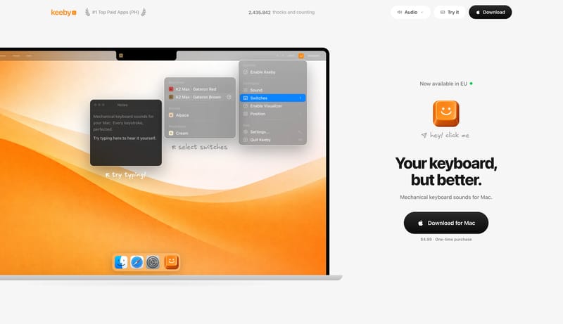
Klack

Home

2026-02-22

--- version: alpha name: Cream Tactile Utility description: A warm Mac utility design language with cream canvas, huge bold system type, dark rounded download buttons, purple highlight marks, tactile app mockups, and lar...

Open example
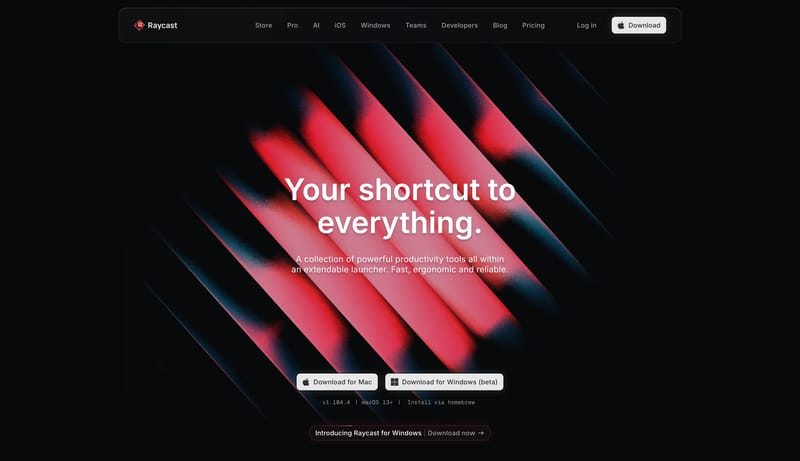
Raycast

Home

2026-02-05

--- version: "alpha" name: "Command Glow Black" description: "A precision dark productivity system built from obsidian shells, metallic controls, and restrained red spectral glow." colors: primary: " E54857" secondary: "...

Open example

Interactive Inspiration FAQ

What can this Interactive style collection help with?
It helps you compare visual tone, typography, color systems, spacing density, illustration treatment, and motion choices used in Interactive website design.

How should I use Interactive style references?

Use them to calibrate creative direction, collect mood references, and decide which visual traits feel distinctive enough to adapt for your own product.