Browse all Styles

Style

Clean Website Inspiration

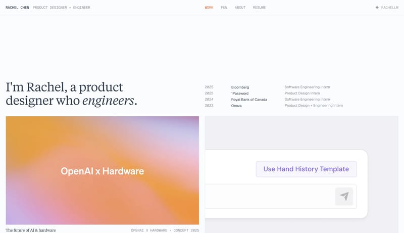
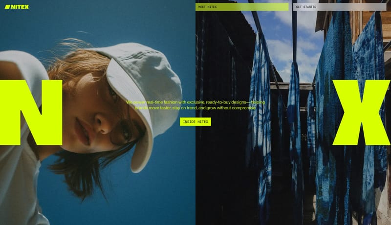
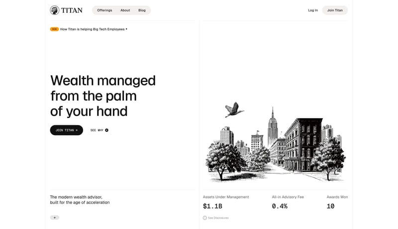
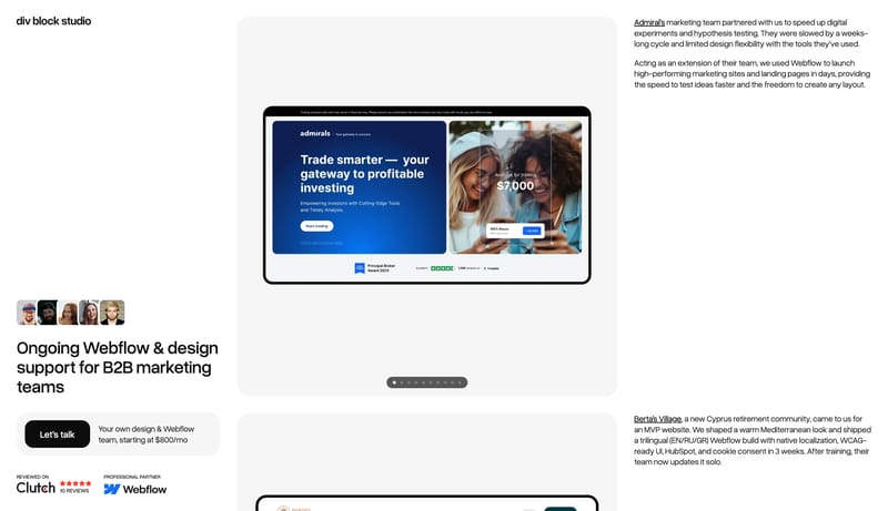
Browse 300 curated Clean website examples to review visual direction, typography, color systems, motion, and overall brand expression.

300 curated examples24 per pagePage 6 of 13

What To Look For

Study how Clean style decisions affect first impression, readability, visual tension, motion, and the overall feel of the product.

What To Compare

Pay attention to color contrast, type pairings, spacing density, illustration treatment, motion restraint, and how the Clean style stays consistent across the page.

Design Analysis

What stands out in Clean websites

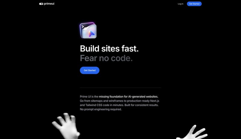
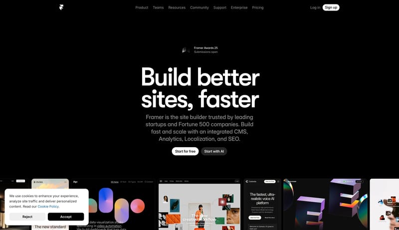
Midnight Builder Marquee is a black-first launch system that sells speed and polish through reduction. The shell should feel almost empty at first glance: one oversized white headline, one short block of cool-gray suppor... This design language turns data infr...

Recurring Signals

  • Primary ( FFFFFF): Display text and the highest-intent CTA fill.
  • Secondary ( 1B1B1B): Quiet dark support action fill and panel tone.
  • Tertiary ( 8E8E93): Support copy, muted navigation, and low-priority labels.
  • Display: Very large, bold, tightly tracked, and tightly leaded.
  • Body: Neutral and readable, with restrained width under the hero.
  • Labels: Slightly heavier than body copy so small navigation items do not disappear on black.

Related Keywords

OverviewImage DirectionColorsTypographyLayoutUse one modern sans family with controlled weight

Framer

Home

2026-01-23

Midnight Builder Marquee is a black-first launch system that sells speed and polish through reduction. The shell should feel almost empty at first glance: one oversized white headline, one short block of cool-gray suppor...

  • Primary ( FFFFFF): Display text and the highest-intent CTA fill.
  • Secondary ( 1B1B1B): Quiet dark support action fill and panel tone.
Open example

Datashake

Home

2026-02-20

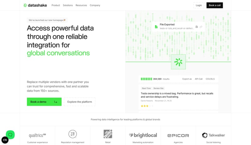
This design language turns data infrastructure into a crisp commercial interface. It uses white space, large editorial sans headlines, dashed utility borders, structured data cards, black commitment CTAs, and green live-...

Open example

Quick14

Home

2026-02-07

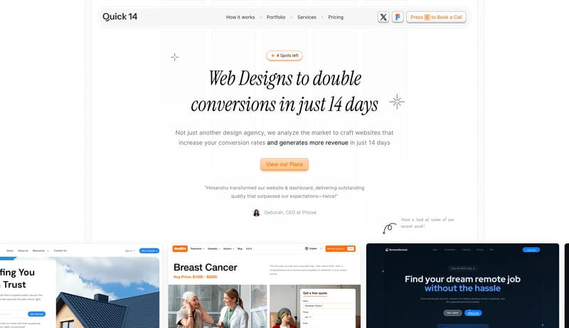
Editorial Conversion Grid is a conversion studio system that trades generic startup polish for sharp typography, clean white space, and visible annotation energy. It should feel fast, opinionated, and highly legible.

Open example

Continue Exploring

Use these internal hubs to keep branching from Clean into broader design research, structured design analysis, or adjacent website inspiration taxonomies.

Clean Inspiration FAQ

What can this Clean style collection help with?

It helps you compare visual tone, typography, color systems, spacing density, illustration treatment, and motion choices used in Clean website design.

How should I use Clean style references?

Use them to calibrate creative direction, collect mood references, and decide which visual traits feel distinctive enough to adapt for your own product.