Browse all Styles

Style

Clean Website Inspiration

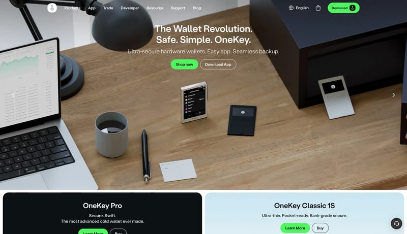
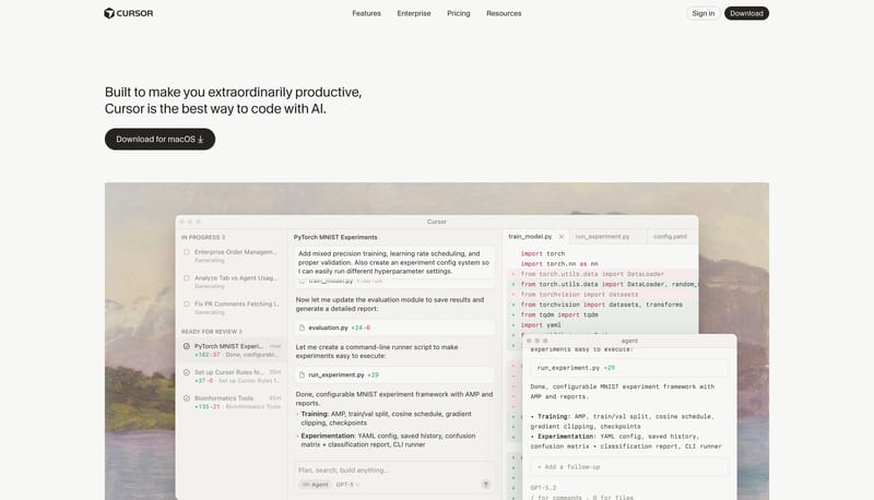
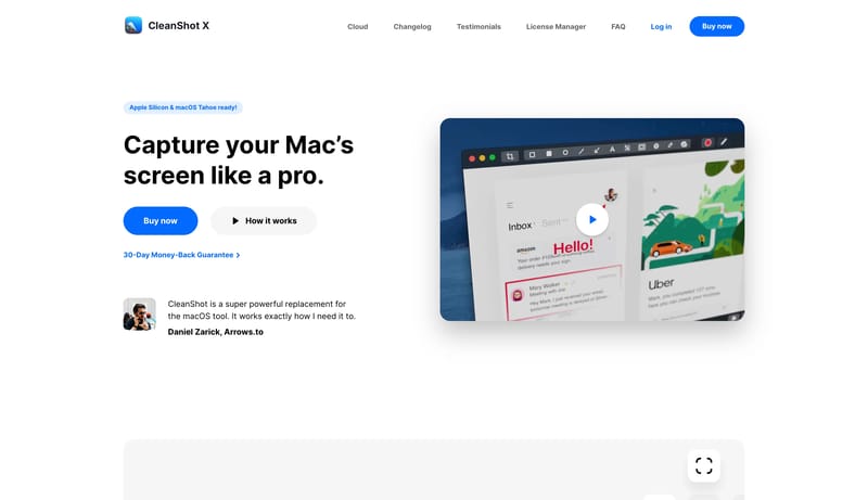
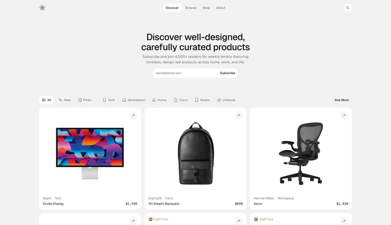
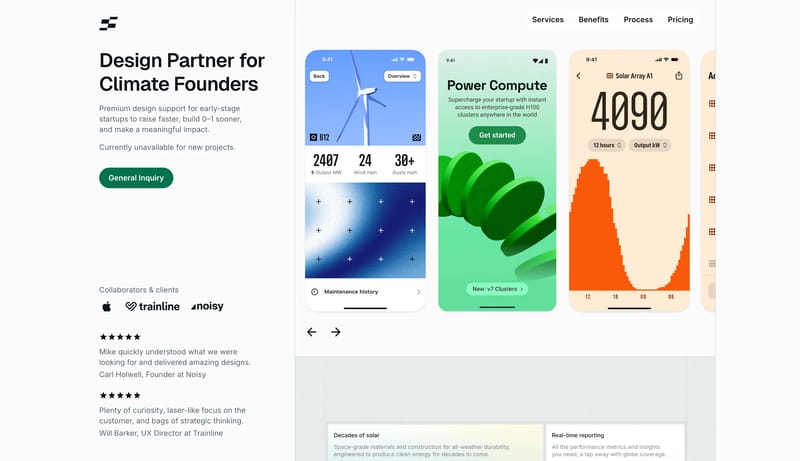
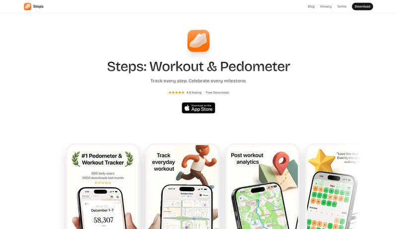
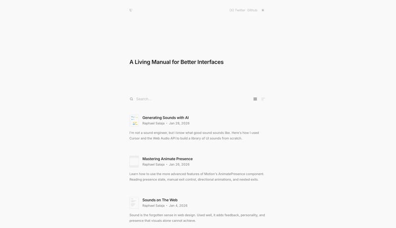
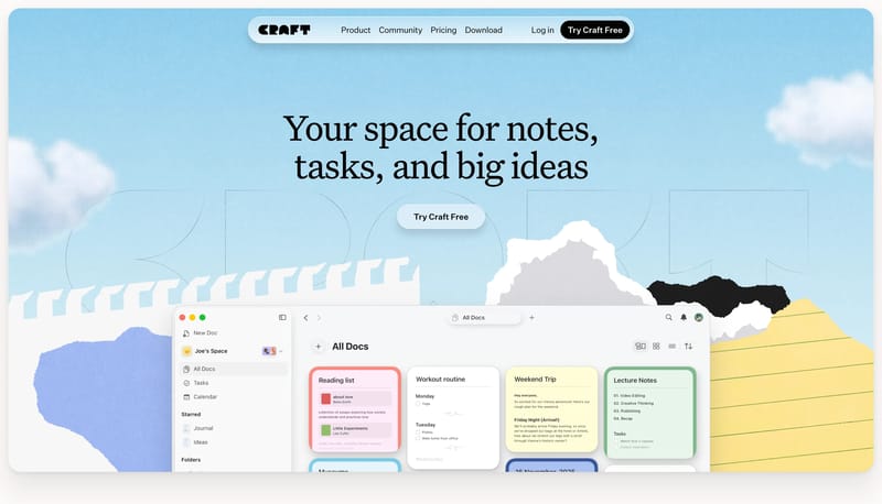
Browse 300 curated Clean website examples to review visual direction, typography, color systems, motion, and overall brand expression.

300 curated examples24 per pagePage 7 of 13

What To Look For

Study how Clean style decisions affect first impression, readability, visual tension, motion, and the overall feel of the product.

What To Compare

Pay attention to color contrast, type pairings, spacing density, illustration treatment, motion restraint, and how the Clean style stays consistent across the page.

Design Analysis

What stands out in Clean websites

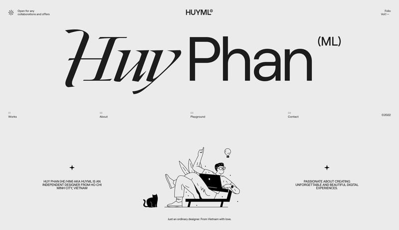
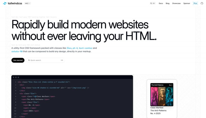
Build every page from exposed structural rules, giant black statements, and wide white breathing room. Let the page feel instructional and precise, never ornamental. Use black pills and restrained UI capsules as the only... Community Card Carnival is a social...

Recurring Signals

  • Build every page from exposed structural rules, giant black statements, and wide white breathing room.
  • Let the page feel instructional and precise, never ornamental.
  • Use black pills and restrained UI capsules as the only high-contrast interruptions in the rule field.
  • Use code crops, interface snippets, and sparse site previews rather than illustration-heavy hero art.
  • Keep each proof artifact isolated inside large white space and framed by visible lines.
  • Use near-white and graphite rules as the default page atmosphere.

Related Keywords

OverviewImage DirectionColorsTypographyPrimary ( FF5A5F): the warm social signalTertiary ( B79CFF): soft lavender support accentDisplay: compact, strong, and highly legibleBody: short and practical, supporting dense metadataSecondary ( FFFFFF): bright card and control surfaceTertiary ( 5C8BFF): one cool gradient anchorDisplay: bold and contemporary, with tight spacingBody: practical and product-led

Tailwind CSS

Home

2026-01-09

Build every page from exposed structural rules, giant black statements, and wide white breathing room. Let the page feel instructional and precise, never ornamental. Use black pills and restrained UI capsules as the only...

  • Build every page from exposed structural rules, giant black statements, and wide white breathing room.
  • Let the page feel instructional and precise, never ornamental.
Open example

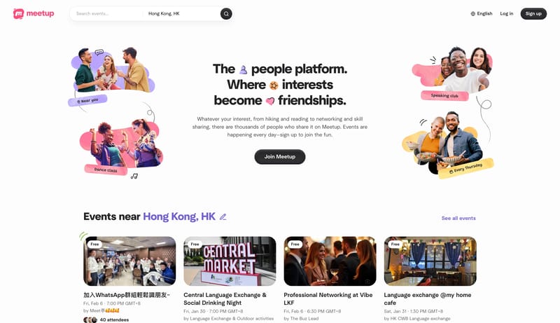
Meetup

Home

2026-01-30

Community Card Carnival is a social discovery system that prioritizes momentum and friendliness. Search, categories, and event rails should feel effortless, broad, and welcoming, with bright white breathing room keeping...

  • Primary ( FF5A5F): the warm social signal.
  • Secondary ( 2F3136): main text and dark CTA color.
Open example

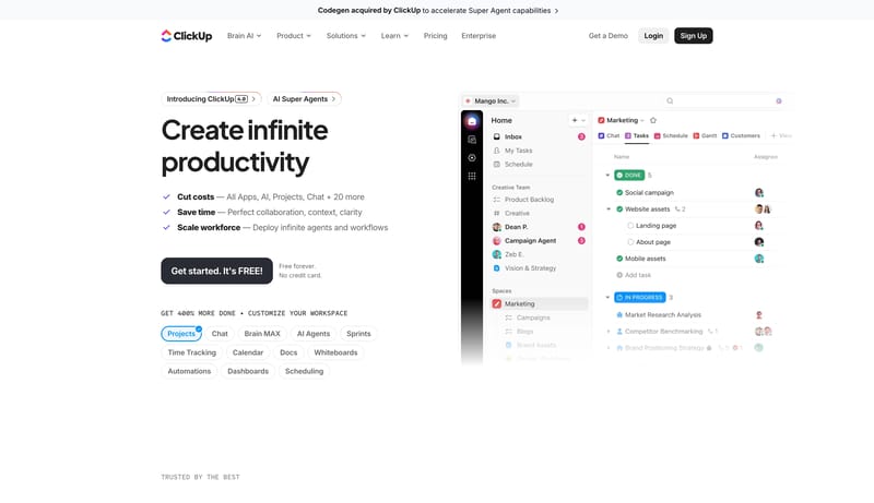
ClickUp

Home

2026-01-30

Gradient Productivity Stage is a software-marketing system that feels broad, polished, and credible. White proof sections carry the main narrative, while occasional dark product theaters and concentrated gradient objects...

  • Primary ( 292D34): main text and dark action color.
  • Secondary ( FFFFFF): bright card and control surface.
Open example

Continue Exploring

Use these internal hubs to keep branching from Clean into broader design research, structured design analysis, or adjacent website inspiration taxonomies.

Clean Inspiration FAQ

What can this Clean style collection help with?
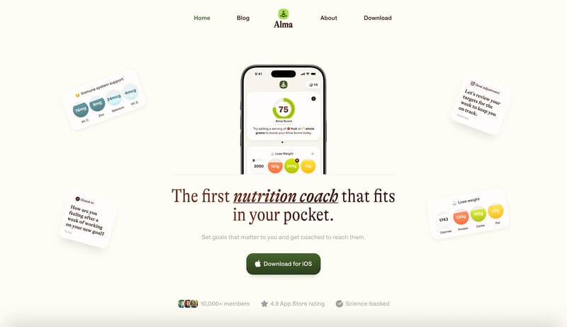
It helps you compare visual tone, typography, color systems, spacing density, illustration treatment, and motion choices used in Clean website design.

How should I use Clean style references?

Use them to calibrate creative direction, collect mood references, and decide which visual traits feel distinctive enough to adapt for your own product.