Design Analysis
What stands out in Clean websites
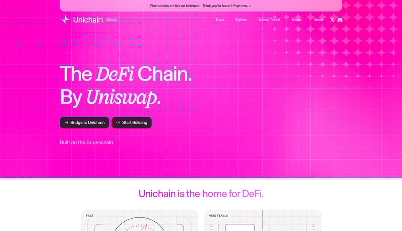
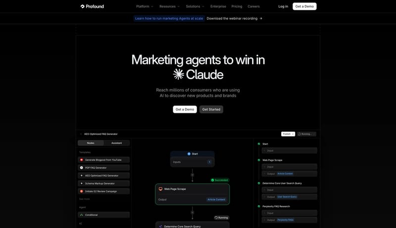
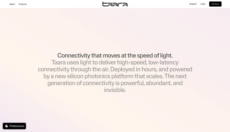
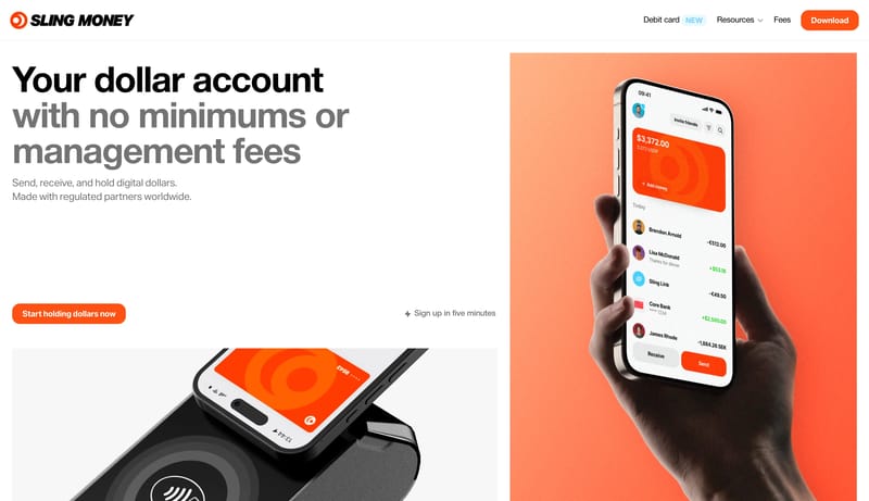
This design language is for onchain finance products that need to feel direct, technical, and high-energy. It uses a saturated magenta stage, visible grid structure, oversized white or magenta headlines, dark plum pill a... Build for a studio site that is inte...
This design language is for onchain finance products that need to feel direct, technical, and high-energy. It uses a saturated magenta stage, visible grid structure, oversized white or magenta headlines, dark plum pill a...
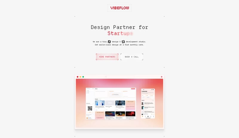
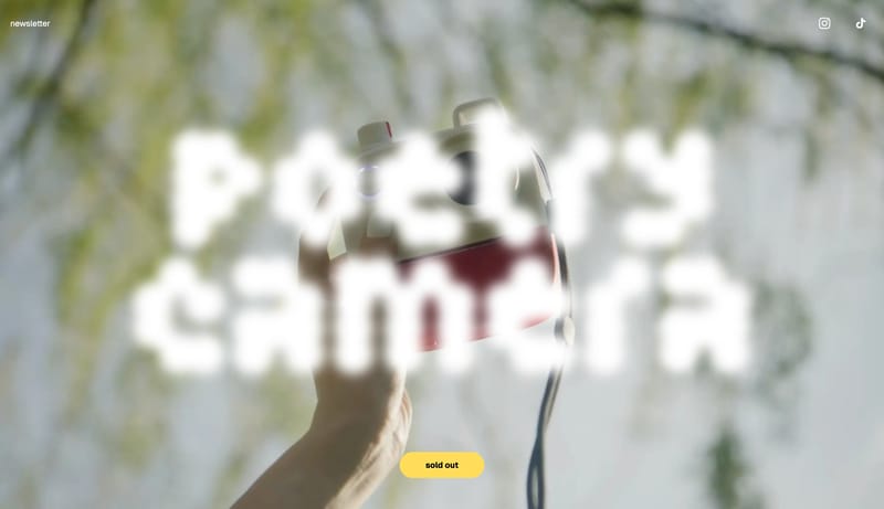
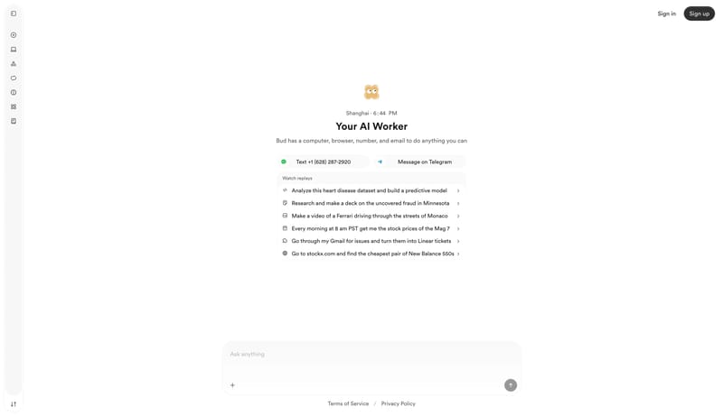
Open exampleBuild for a studio site that is intentionally sparse, textual, and a little raw. Let mono typography and white space do most of the aesthetic work. Keep the page feeling deliberate, not unfinished. The low-fi quality sho...
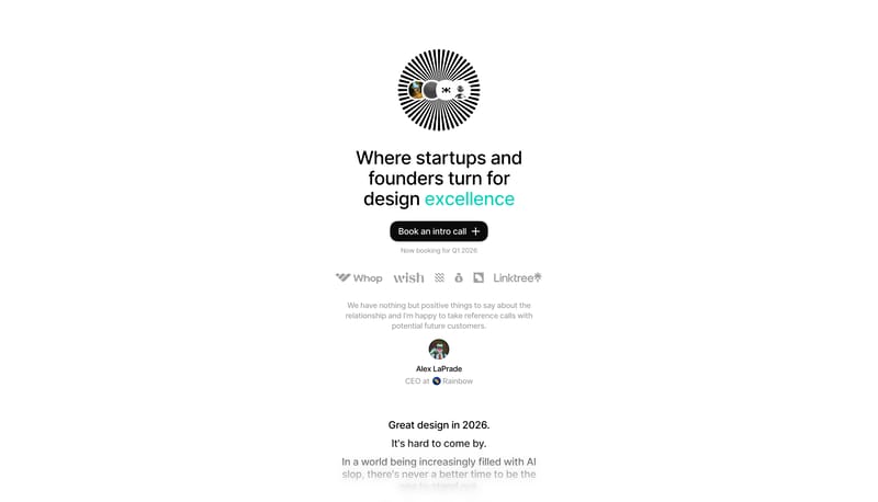
- Build for a studio site that is intentionally sparse, textual, and a little raw.
- Let mono typography and white space do most of the aesthetic work.
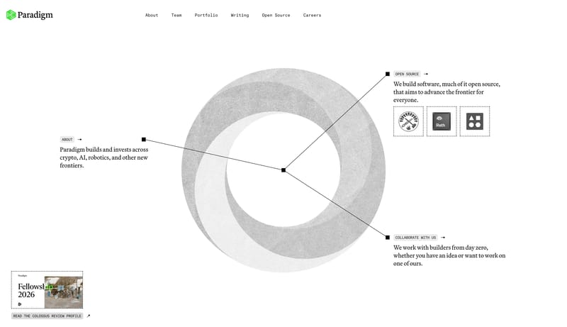
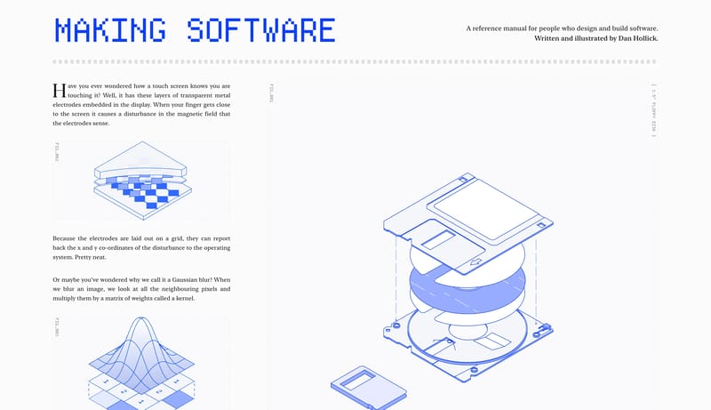
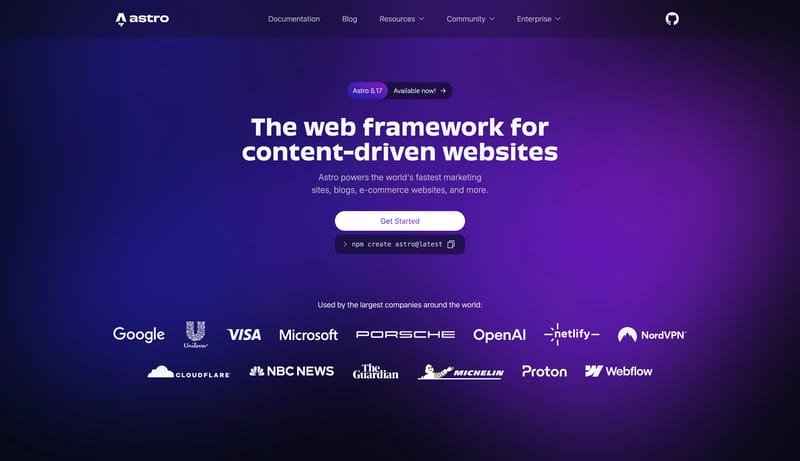
Open exampleThis system should feel like a digital reference manual rather than a marketing site. The page needs the calm authority of print: bright paper background, black serif reading, strong column structure, and obvious section...
Open example