Design Analysis
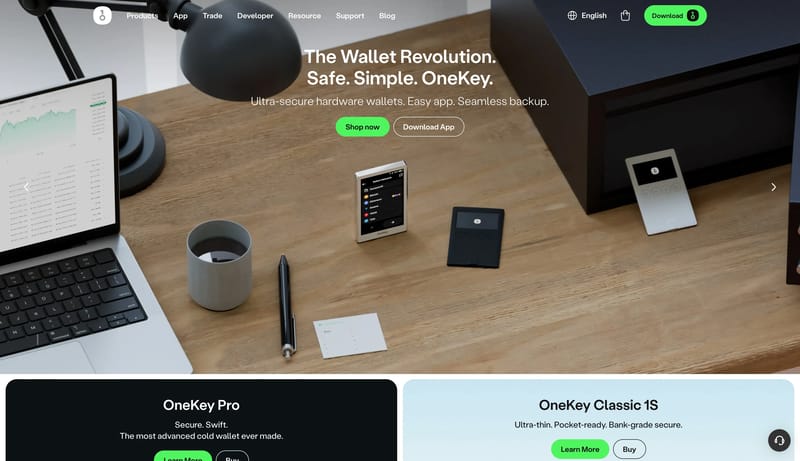
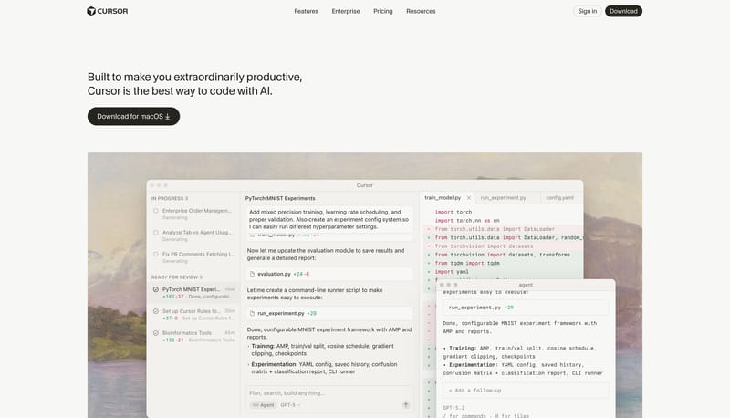
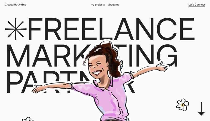
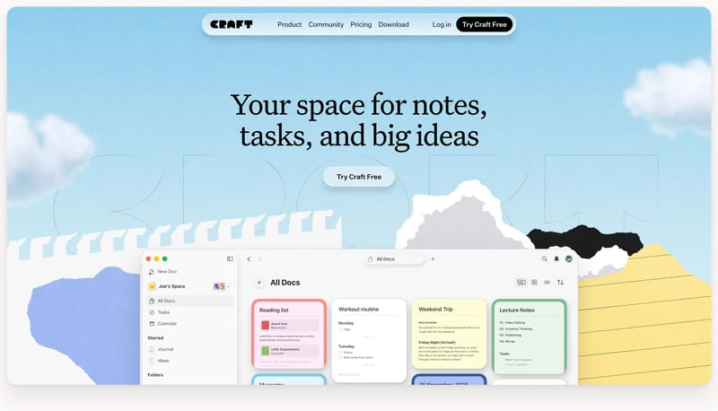
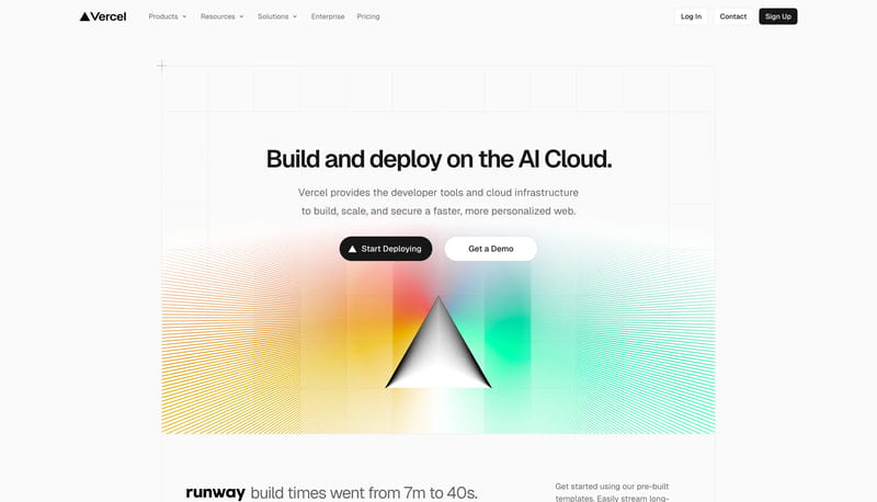
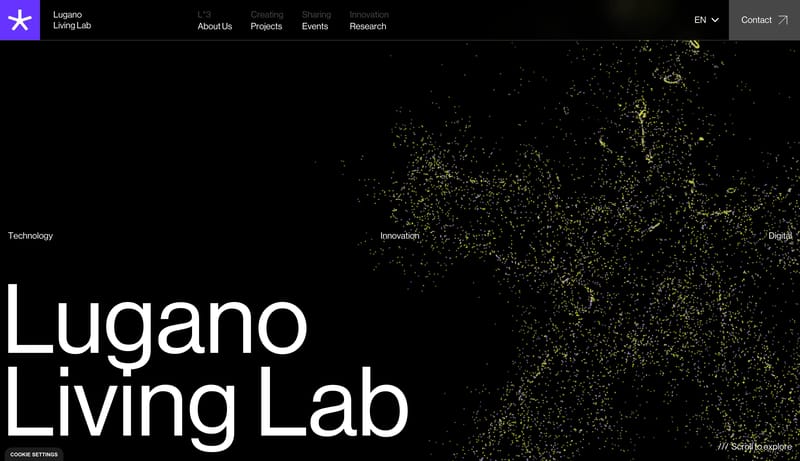
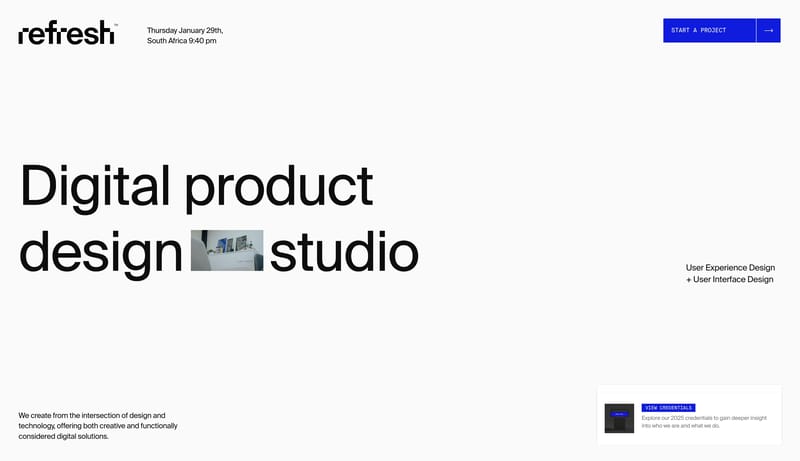
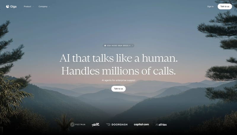
What stands out in Big Background Image websites
--- version: alpha name: Creative Monolith Stage description: Black creative-software system with massive serif display type, acid-green CTAs, vivid artwork collage, and load-bearing pinned showcase progression. colors:... --- version: alpha name: Soft Agent W...

Recurring Signals
- Primary is an acid green reserved for the main action.
- Secondary is a warm stone support surface for secondary action.
- Tertiary is a showcase accent that can appear in creative proof blocks.
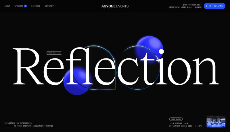
- Use a dramatic high-contrast serif for the largest statements.
- Use a simple UI sans for everything operational.
- Keep the display type huge enough to compete with the artwork.
Related Keywords
OverviewImage DirectionColorsTypographyUse a simple UI sans for everything operationalDisplay: Oversized, italic, tightly tracked, and highly confidentBody: Calm, friendly, and evenly spacedLet monochrome pills keep the interaction posture groundedKeep proof tidy and clearly categorizedUse white and dark graphite as the baseLayout
--- version: alpha name: Creative Monolith Stage description: Black creative-software system with massive serif display type, acid-green CTAs, vivid artwork collage, and load-bearing pinned showcase progression. colors:...
- Primary is an acid green reserved for the main action.
- Secondary is a warm stone support surface for secondary action.
Open example--- version: alpha name: Soft Agent Workspace description: Off-white workspace marketing system with giant italic grotesk display, soft aurora tinting, rounded white product windows, and black first-action buttons. color...
- Primary ( 222222): High-intent button fill and dark utility emphasis.
- Secondary ( FFFFFF): Card, button, and workspace window surface.
Open example--- version: "alpha" name: "Lilac Signal Ledger" description: "A bright analytics marketing system with giant dark headlines, lilac signal tiles, fine violet outlines, monochrome pills, and a soft lavender glow." colors:...
- Build the system as white space, giant dark statements, and one orderly row of signal tiles.
- Use lilac and violet to energize proof without changing the page shell into an accent wash.
Open example