Notion
Home
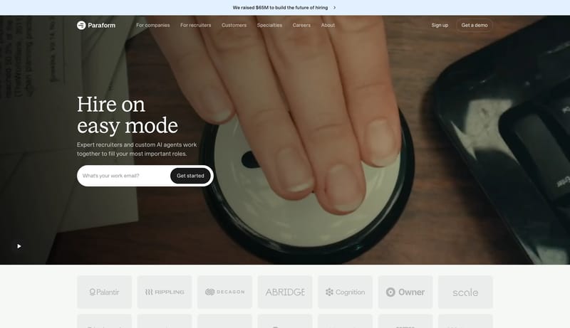
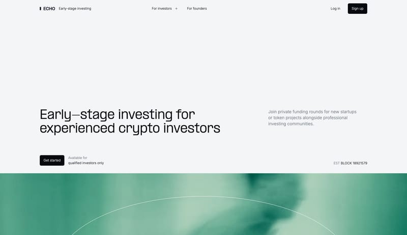
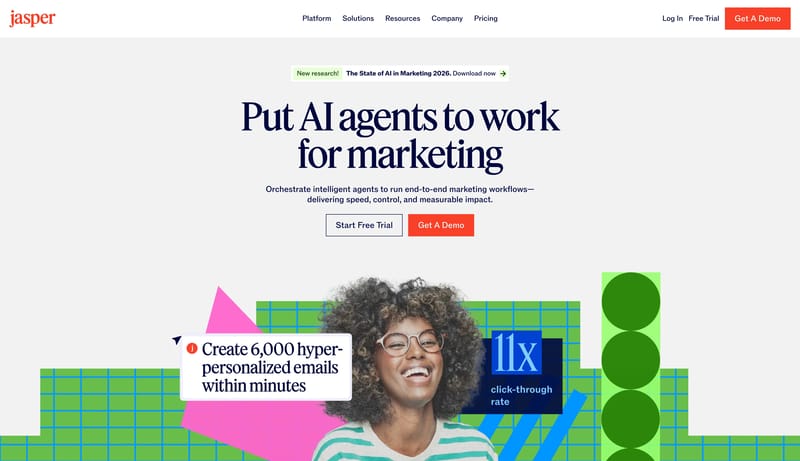
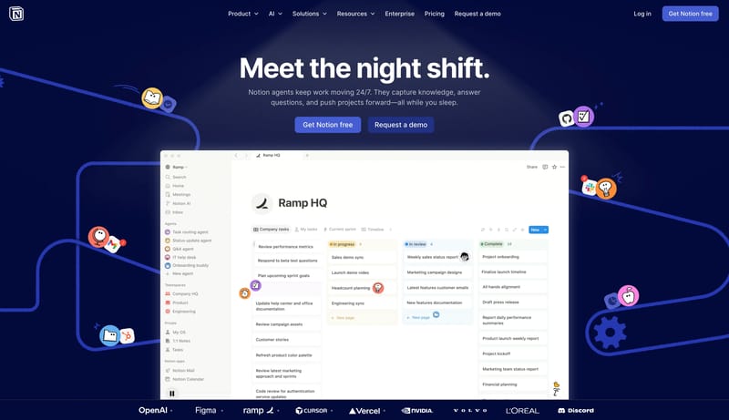
Build a system that feels clear, modular, and confidently helpful. A productivity marketing system that pairs a deep midnight hero with bright product canvases, periwinkle actions, and white modular cards.
Open exampleSection
Browse 146 curated Big Background Image website examples to compare repeated section patterns, layout systems, messaging structure, and interaction details.
What To Compare
Review how teams design Big Background Image sections through layout choices, copy hierarchy, media usage, interaction patterns, and CTA placement.
What To Compare
Pay attention to heading rhythm, supporting copy, cards, imagery, interaction cues, and what each Big Background Image section asks the user to do next.
Design Analysis
Build a system that feels clear, modular, and confidently helpful. A productivity marketing system that pairs a deep midnight hero with bright product canvases, periwinkle actions, and white modular cards. Use a native iOS marketing language: white space, syst...
Notion
Home
Build a system that feels clear, modular, and confidently helpful. A productivity marketing system that pairs a deep midnight hero with bright product canvases, periwinkle actions, and white modular cards.
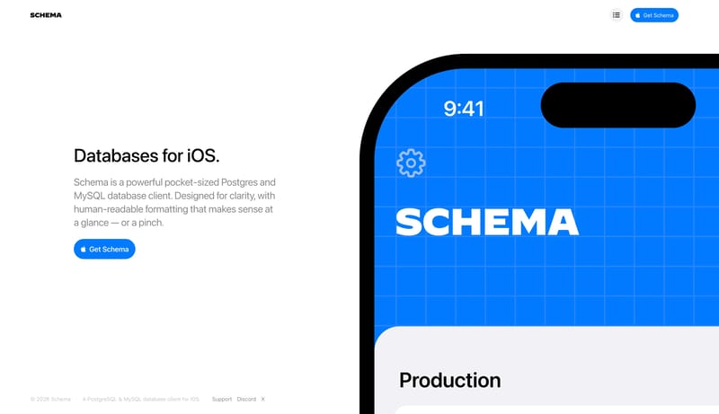
Open exampleSchema
Home
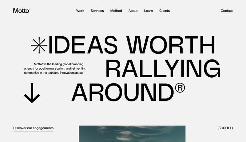
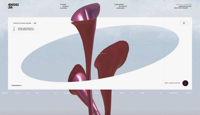
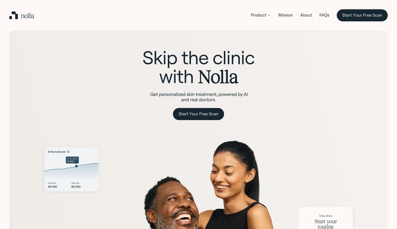
Use a native iOS marketing language: white space, system type, a blue product object, cropped phone mockups, and simple support diagrams.
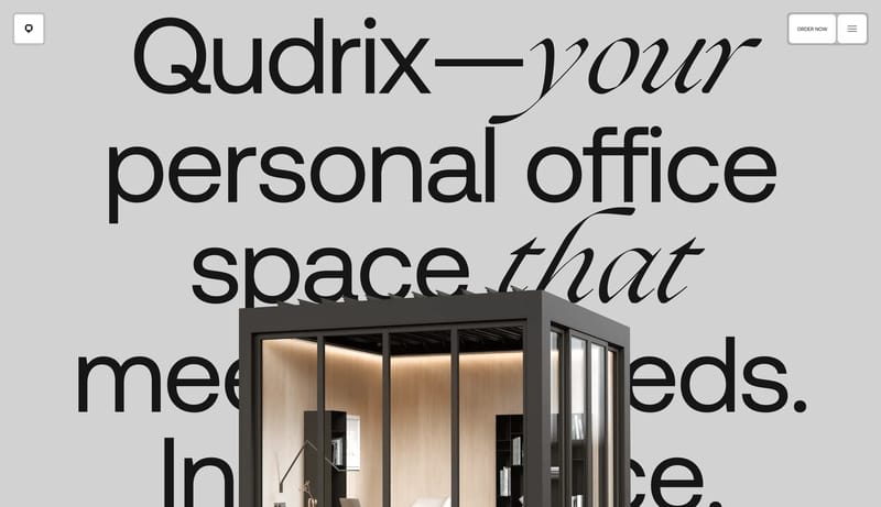
Open exampleQudrix
Home
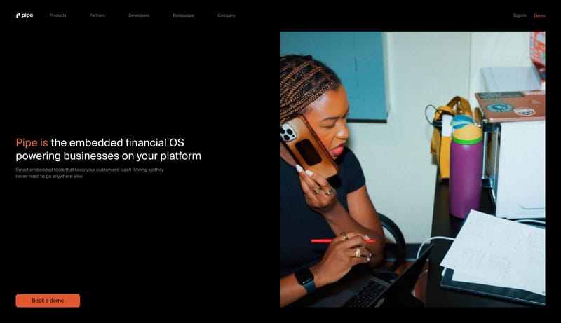
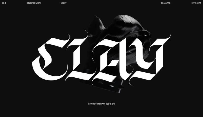
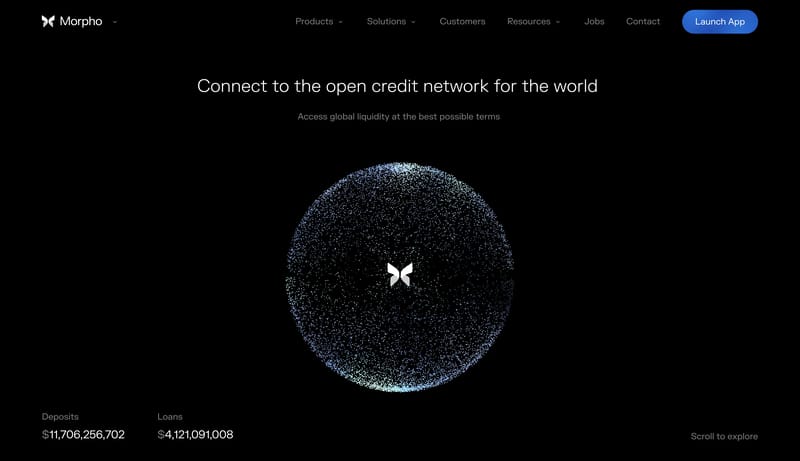
This system is almost all absence. Use a blank white field, one tiny corner code, and one large message cluster anchored to the lower-left zone of the viewport. The layout should feel calm and definitive rather than apol...
Open exampleUse these internal hubs to keep branching from Big Background Image into broader design research, structured design analysis, or adjacent website inspiration taxonomies.
Hub
Return to the broader sections hub if you want to branch into adjacent topics beyond Big Background Image.
Related Hub
Browse pages grouped by repeated design signals when you want inspiration organized by visual patterns instead of taxonomy alone.
Related Hub
Study structured design analysis, reusable tokens, and AI-readable system guidance tied back to real production websites.
Workflow Collection
Landing page references and related tools for launches, product storytelling, hero sections, and conversion-focused marketing.
Workflow Collection
SaaS landing pages, product-marketing references, and tools for teams shaping B2B software sites.
Workflow Collection
References and tools for docs-heavy products, developer tooling, terminals, dashboards, SDK workflows, and technical product surfaces.
Explore More
Switch to the categories hub to compare Big Background Image inspiration against a different browsing dimension.
Explore More
Switch to the styles hub to compare Big Background Image inspiration against a different browsing dimension.
Explore More
Switch to the markers hub to compare Big Background Image inspiration against a different browsing dimension.
Compare heading structure, supporting copy, media choice, CTA placement, content density, and how each Big Background Image section supports the broader page narrative.
A focused Big Background Image collection removes unrelated page sections, which makes it easier to spot repeated layout and messaging patterns across many sites.