Design Analysis
What stands out in Big Background Image websites
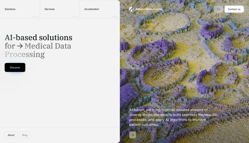
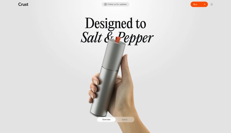
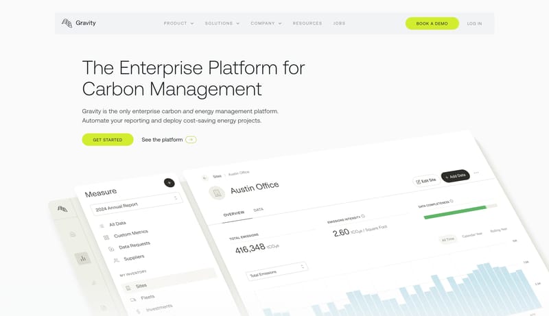
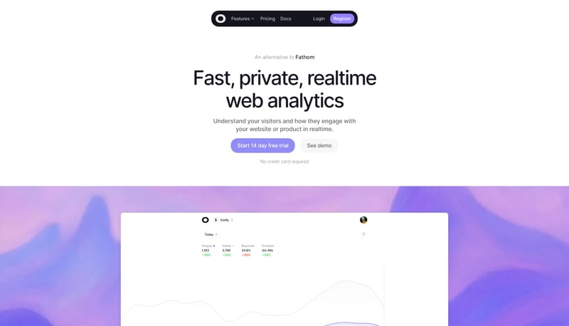
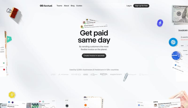
Keep the system quiet, pale, and card-led. Use serif headlines to give the otherwise technical page a measured editorial center. Let compact black CTAs punctuate the flow without making the whole page feel promotional. M... Start with technical confidence: dar...
Recurring Signals
- Keep the system quiet, pale, and card-led.
- Use serif headlines to give the otherwise technical page a measured editorial center.
- Let compact black CTAs punctuate the flow without making the whole page feel promotional.
- Most of the page should be pale gray and white.
- Black belongs to the main CTA and the strongest text.
- Blue should stay as a contained data accent rather than a primary brand fill.
Related Keywords
OverviewColorsTypographyLayoutKeep the system quiet, pale, and card-ledImage DirectionKeep white proof sections uncluttered and operationalBlend enterprise clarity with scenic emotional softeningKeep the core UI neutral, structured, and trustworthyKeep painted scenes wide and quietPair imagery with orderly comparison or dashboard blocksMake the product feel friendly, energetic, and app-native
Keep the system quiet, pale, and card-led. Use serif headlines to give the otherwise technical page a measured editorial center. Let compact black CTAs punctuate the flow without making the whole page feel promotional. M...
- Keep the system quiet, pale, and card-led.
- Use serif headlines to give the otherwise technical page a measured editorial center.
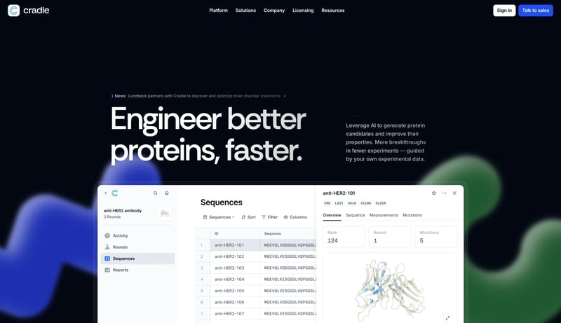
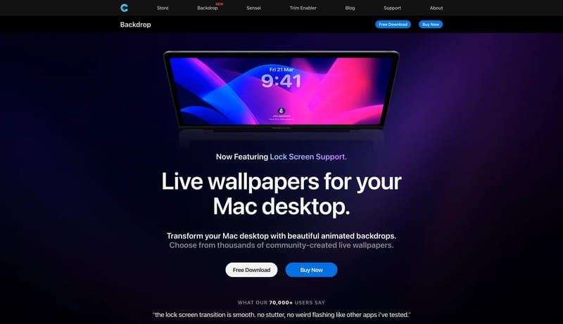
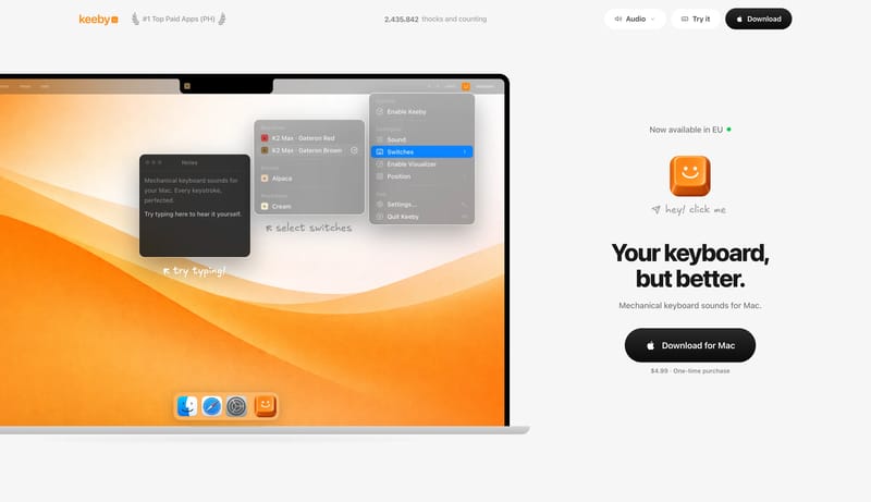
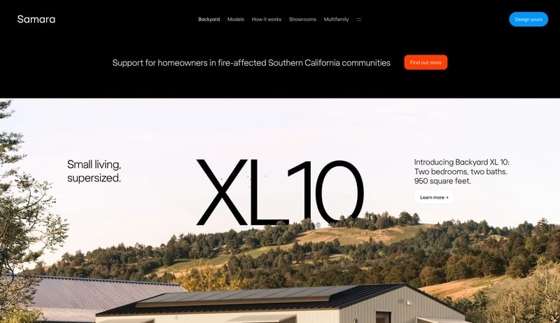
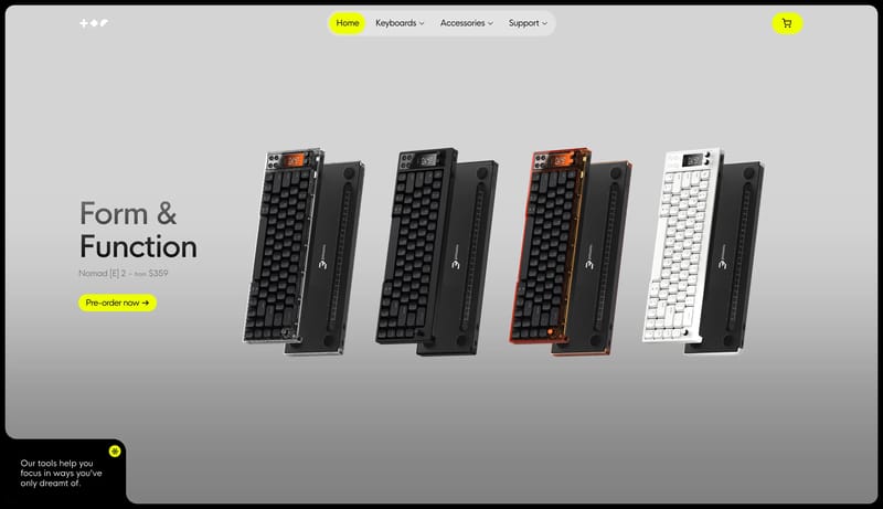
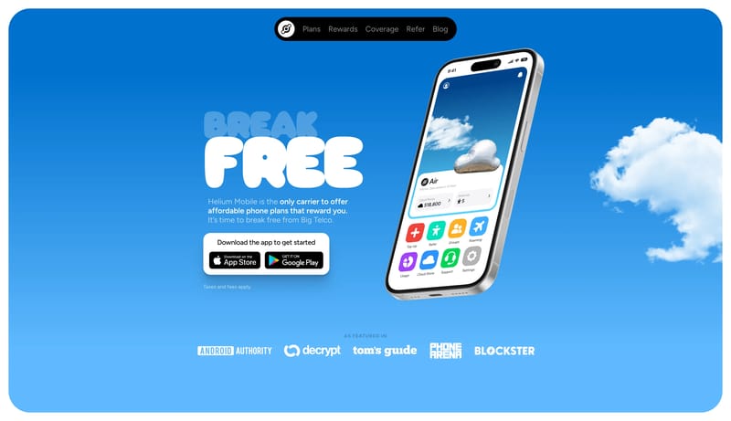
Open exampleStart with technical confidence: dark hero, strong software proof, and one bright action color. Resolve quickly into clean white sections so the brand still feels usable and scientific. Let the product window do the heav...
- Start with technical confidence: dark hero, strong software proof, and one bright action color.
- Resolve quickly into clean white sections so the brand still feels usable and scientific.
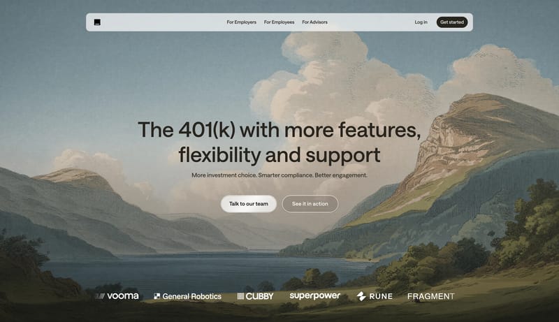
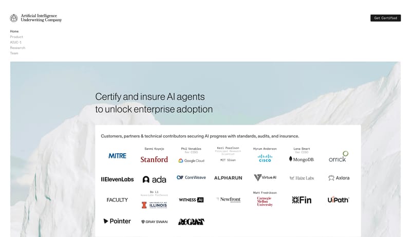
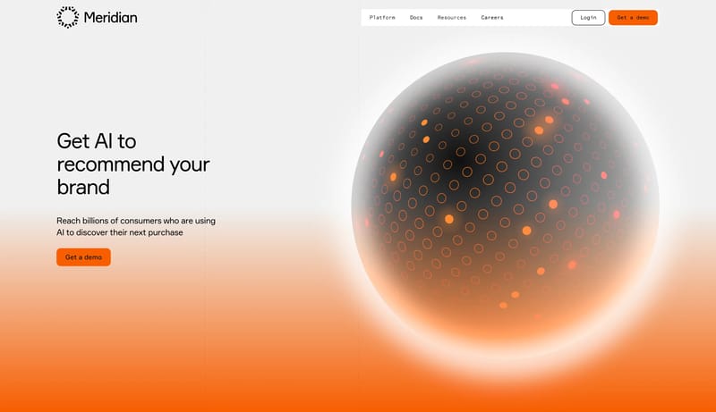
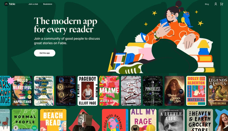
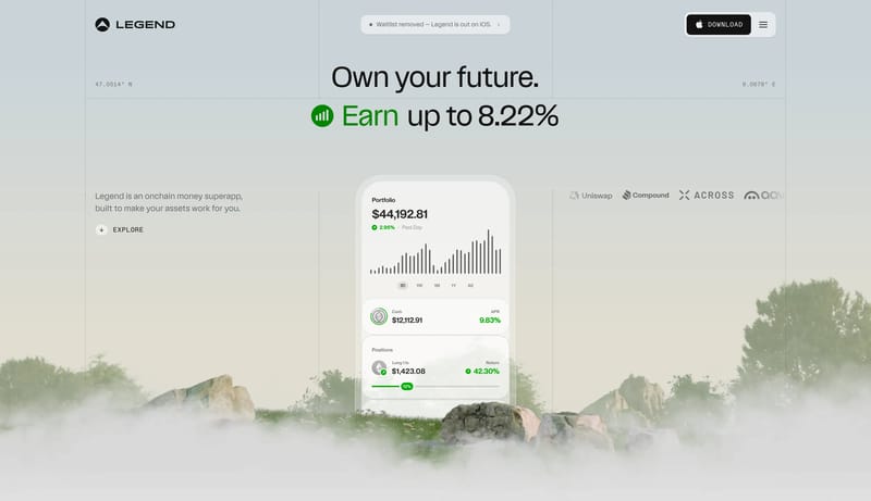
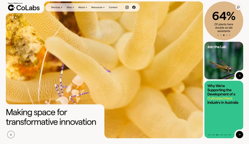
Open exampleBlend enterprise clarity with scenic emotional softening. Keep the core UI neutral, structured, and trustworthy. Use paintings as a brand atmosphere layer, not as the main information surface. Use romantic landscape pain...
- Blend enterprise clarity with scenic emotional softening.
- Keep the core UI neutral, structured, and trustworthy.
Open example