Design Analysis
What stands out in Gradient websites
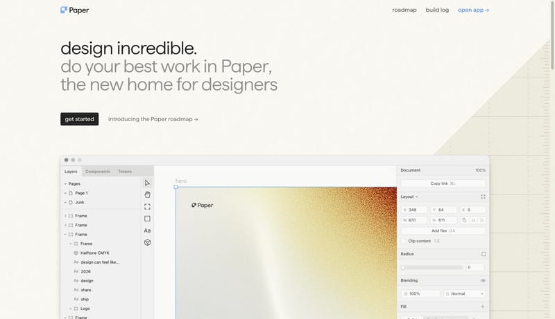
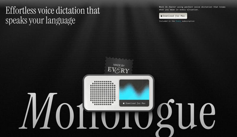
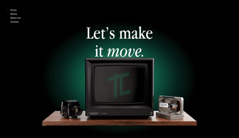
Drafting Paper Workspace is a tactile light system that feels measured, warm, and anti-generic. The page should behave like a drafting board translated into software marketing: warm paper tone, subtle texture, ruled marg... Build the page as a pale field with...
Drafting Paper Workspace is a tactile light system that feels measured, warm, and anti-generic. The page should behave like a drafting board translated into software marketing: warm paper tone, subtle texture, ruled marg...
- Primary ( 151515): Ink text and the main CTA fill.
- Secondary ( F0EBDD): Grouped surface and soft panel tone.
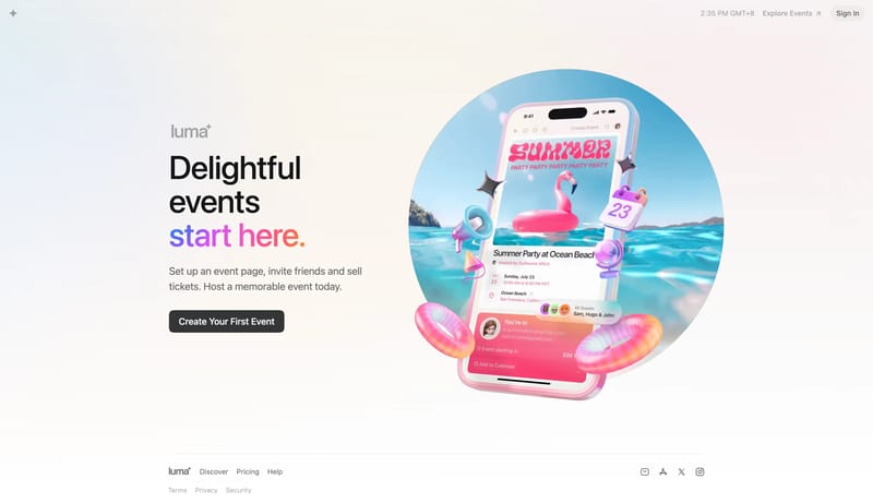
Open exampleBuild the page as a pale field with one giant serif promise and almost no noise around it. Let one dark capsule CTA and one tiny pearlescent tag do the UI punctuation. Use the hardware object as a quiet lower-stage proof...
- Build the page as a pale field with one giant serif promise and almost no noise around it.
- Let one dark capsule CTA and one tiny pearlescent tag do the UI punctuation.
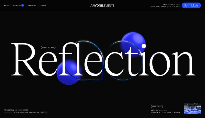
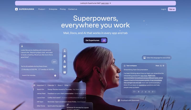
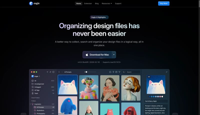
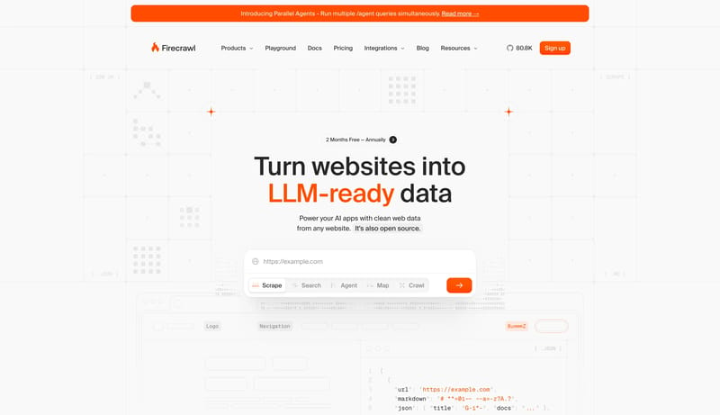
Open exampleThis design language is a sparse screen-capture workspace with giant black statements, monospaced explanatory copy, compact black navigation, and large product screenshots. The interface should feel practical and asserti...
Open example