Browse all Styles

Style

Gradient Website Inspiration

Browse 74 curated Gradient website examples to review visual direction, typography, color systems, motion, and overall brand expression.

74 curated examples24 per pagePage 4 of 4

What To Look For

Study how Gradient style decisions affect first impression, readability, visual tension, motion, and the overall feel of the product.

What To Compare

Pay attention to color contrast, type pairings, spacing density, illustration treatment, motion restraint, and how the Gradient style stays consistent across the page.

Design Analysis

What stands out in Gradient websites
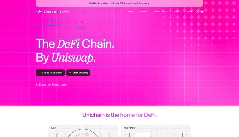
Build a dark system that feels technical, open-source-adjacent, and community alive. A cosmic publishing system built from dark violet-blue atmosphere, bright full-pill actions, and framed technical proof.

Recurring Signals

    Related Keywords

    OverviewImage DirectionColorsTypography

    Astro

    Home

    2026-01-30

    Build a dark system that feels technical, open-source-adjacent, and community alive. A cosmic publishing system built from dark violet-blue atmosphere, bright full-pill actions, and framed technical proof.

    Open example

    Gradient Inspiration FAQ

    What can this Gradient style collection help with?

    It helps you compare visual tone, typography, color systems, spacing density, illustration treatment, and motion choices used in Gradient website design.

    How should I use Gradient style references?

    Use them to calibrate creative direction, collect mood references, and decide which visual traits feel distinctive enough to adapt for your own product.