Lusion
Home
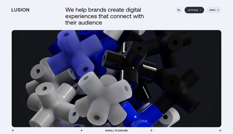
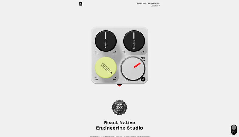
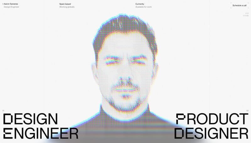
Design portfolio pages that feel like a restrained gallery around a few immaculate 3D statements. The shell should stay bright, minimal, and editorial so the stage imagery carries the brand personality.
Open exampleStyle
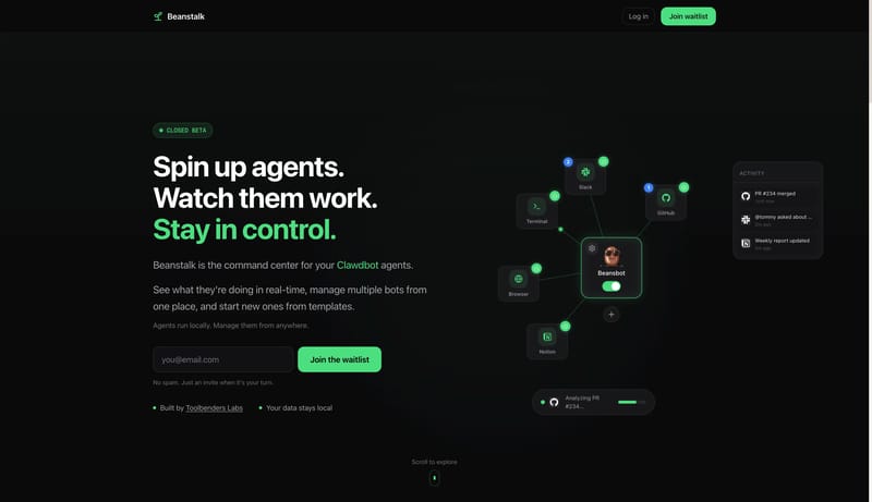
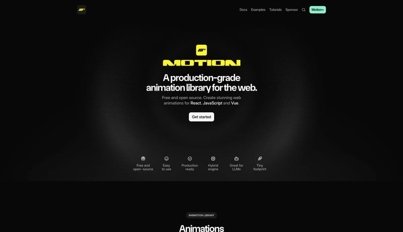
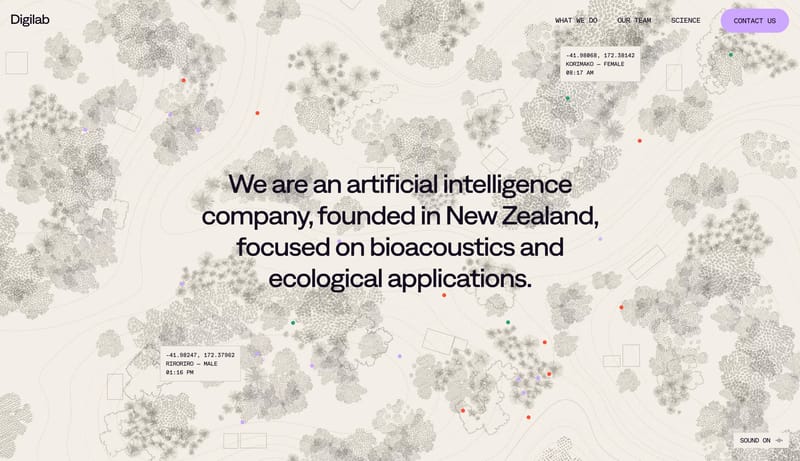
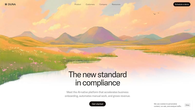
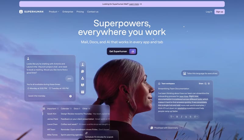
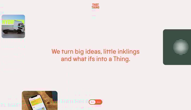
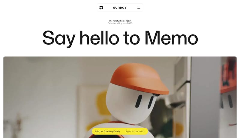
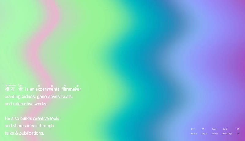
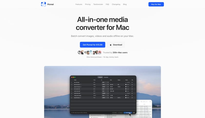
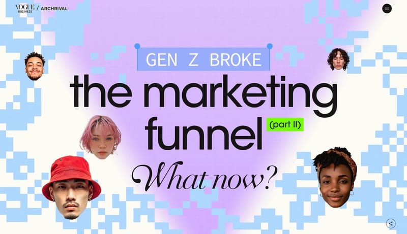
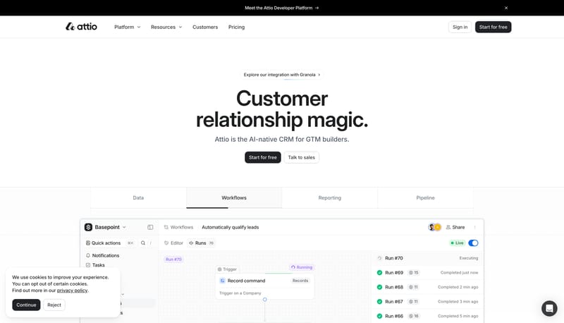
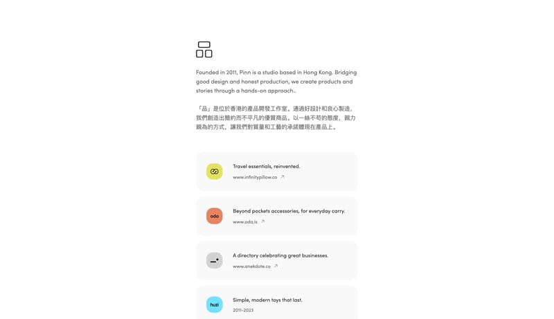
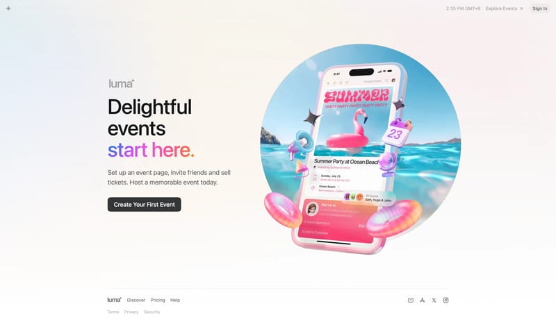
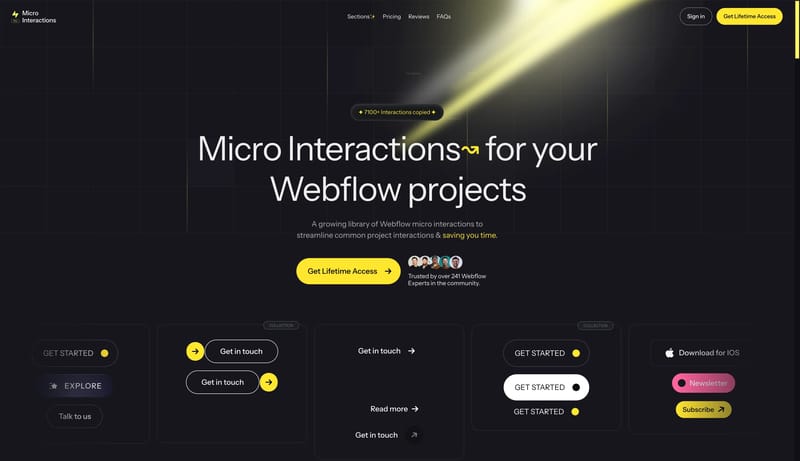
Browse 295 curated Clean website examples to review visual direction, typography, color systems, motion, and overall brand expression.
What To Look For
Study how Clean style decisions affect first impression, readability, visual tension, motion, and the overall feel of the product.
What To Compare
Pay attention to color contrast, type pairings, spacing density, illustration treatment, motion restraint, and how the Clean style stays consistent across the page.
Design Analysis
Design portfolio pages that feel like a restrained gallery around a few immaculate 3D statements. The shell should stay bright, minimal, and editorial so the stage imagery carries the brand personality. Blend operational clarity with a calm cultural atmosphere...
Lusion
Home
Design portfolio pages that feel like a restrained gallery around a few immaculate 3D statements. The shell should stay bright, minimal, and editorial so the stage imagery carries the brand personality.
Open exampleMuse
Home
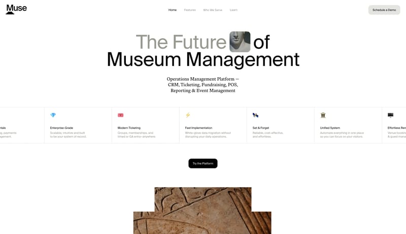
Blend operational clarity with a calm cultural atmosphere. Use giant sans word stacks and soft serif body support. Let architecture and artifact imagery provide warmth without cluttering the UI. Favor facades, galleries,...
Nothing
Home
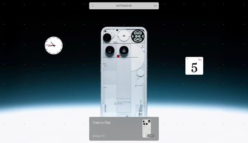
Dot Matrix Industrial Consumer Tech is a hardware-first system that uses white gallery space, black utility bars, and industrial product close-ups to create a highly ownable retail language. It should feel graphic, spars...
Open exampleUse these internal hubs to keep branching from Clean into broader design research, structured design analysis, or adjacent website inspiration taxonomies.
Hub
Return to the broader styles hub if you want to branch into adjacent topics beyond Clean.
Related Hub
Browse pages grouped by repeated design signals when you want inspiration organized by visual patterns instead of taxonomy alone.
Related Hub
Study structured design analysis, reusable tokens, and AI-readable system guidance tied back to real production websites.
Workflow Collection
Portfolio references and related tools for studios, personal brands, creative developers, and case-study-led sites.
Workflow Collection
Collections for vibe-coded sites, AI website builders, and fast-moving prompt-to-product workflows.
Workflow Collection
A broader collection of AI product references, AI website examples, design-system examples, and workflow tools.
Explore More
Switch to the categories hub to compare Clean inspiration against a different browsing dimension.
Explore More
Switch to the sections hub to compare Clean inspiration against a different browsing dimension.
Explore More
Switch to the markers hub to compare Clean inspiration against a different browsing dimension.
It helps you compare visual tone, typography, color systems, spacing density, illustration treatment, and motion choices used in Clean website design.
Use them to calibrate creative direction, collect mood references, and decide which visual traits feel distinctive enough to adapt for your own product.