Browse all Styles

Style

Clean Website Inspiration

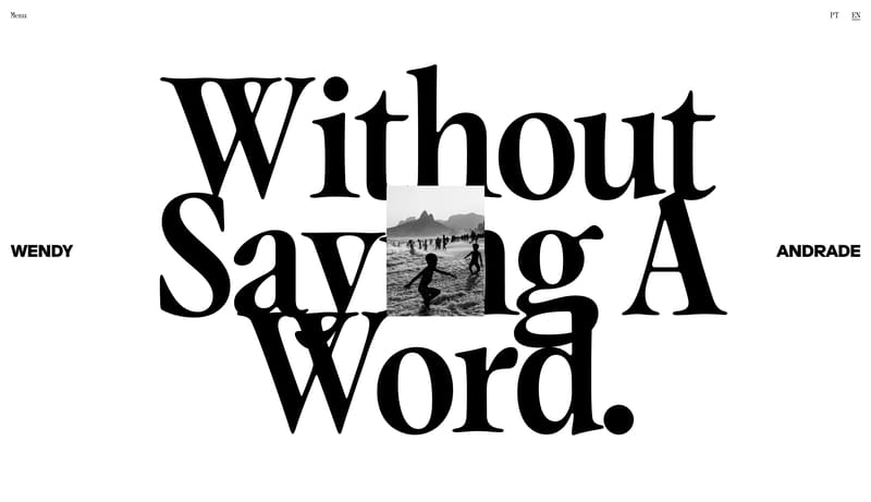
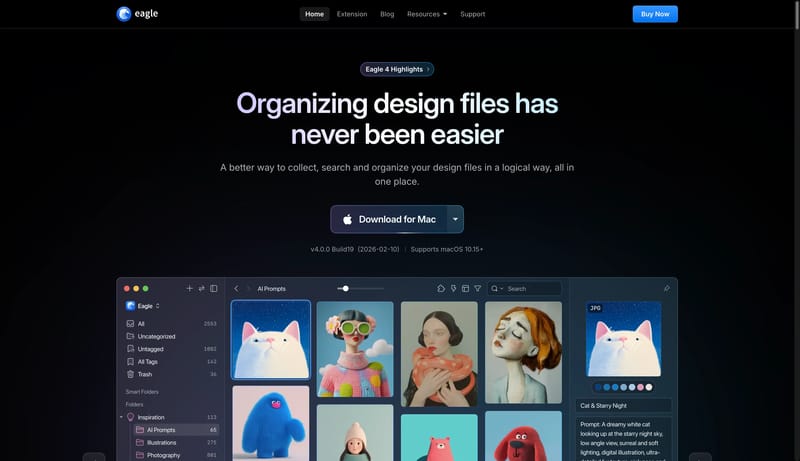
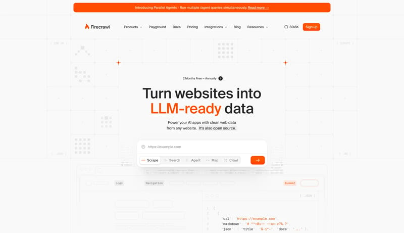
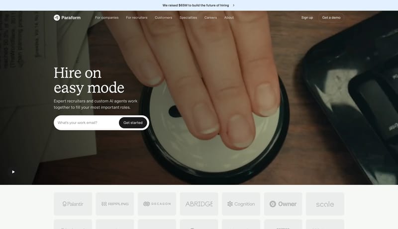
Browse 291 curated Clean website examples to review visual direction, typography, color systems, motion, and overall brand expression.

291 curated examples24 per pagePage 10 of 13

What To Look For

Study how Clean style decisions affect first impression, readability, visual tension, motion, and the overall feel of the product.

What To Compare

Pay attention to color contrast, type pairings, spacing density, illustration treatment, motion restraint, and how the Clean style stays consistent across the page.

Design Analysis

What stands out in Clean websites

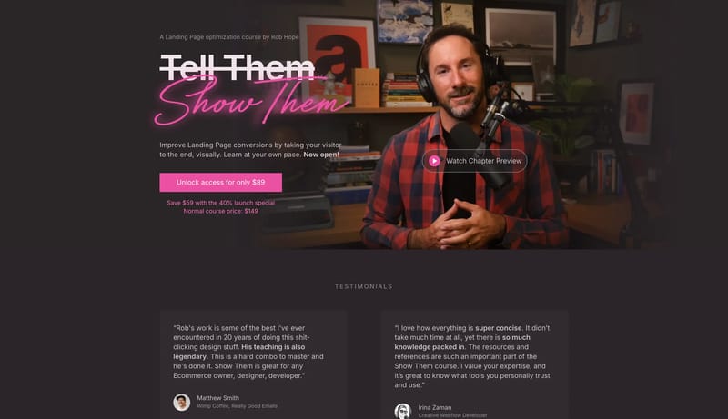
Neon Mentor Studio is a dark editorial system for selling expertise through intimacy and conviction. It should feel like a warm studio at night: documentary portraiture, smoky panels, blunt display typography, and one ha... Build a service-page system that fee...

Recurring Signals

  • Primary ( EC51A2): Purchase path and handwritten neon energy.
  • Secondary ( 342D31): Proof panels and grouped dark surfaces.
  • Tertiary ( CDC0C6): Body text and warm-muted foreground.
  • Display: Blunt modern grotesk for the main informational statement.
  • Body: Same family with relaxed spacing for persuasive reading.
  • Accent: One handwritten script layer used selectively to create emotional heat.

Related Keywords

OverviewImage DirectionColorsTypographyTertiary ( CDC0C6): Body text and warm-muted foregroundLayout

Show Them

Home

2026-01-21

Neon Mentor Studio is a dark editorial system for selling expertise through intimacy and conviction. It should feel like a warm studio at night: documentary portraiture, smoky panels, blunt display typography, and one ha...

  • Primary ( EC51A2): Purchase path and handwritten neon energy.
  • Secondary ( 342D31): Proof panels and grouped dark surfaces.
Open example

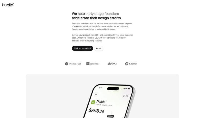
Hurdle

Home

2026-02-01

Build a service-page system that feels calm, trustworthy, and founder-friendly. A minimal founder-support system built from white space, black capsule CTAs, soft gray cards, and calm product proof.

Open example

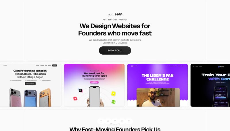
Studio Nika

Home

2026-01-08

Build the interface as a mostly white field with just enough diagonal texture to keep it from feeling empty. Let type scale and capsule shape do the heavy lifting. The experience should feel direct, not decorated. Keep t...

  • Build the interface as a mostly white field with just enough diagonal texture to keep it from feeling empty.
  • Let type scale and capsule shape do the heavy lifting. The experience should feel direct, not decorated.
Open example


Continue Exploring

Use these internal hubs to keep branching from Clean into broader design research, structured design analysis, or adjacent website inspiration taxonomies.

Clean Inspiration FAQ

What can this Clean style collection help with?
It helps you compare visual tone, typography, color systems, spacing density, illustration treatment, and motion choices used in Clean website design.

How should I use Clean style references?

Use them to calibrate creative direction, collect mood references, and decide which visual traits feel distinctive enough to adapt for your own product.