Design Analysis
What stands out in Product websites
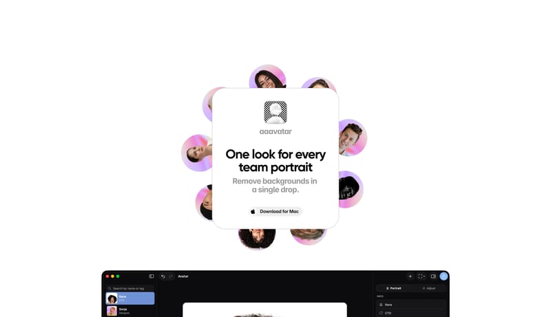
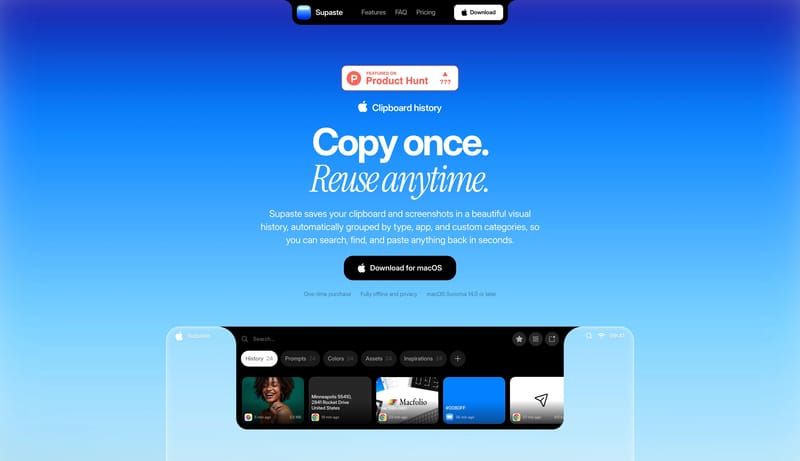
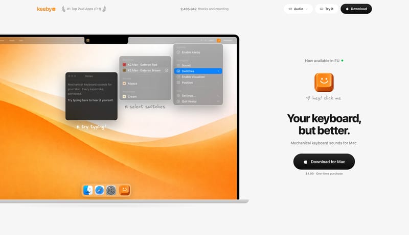
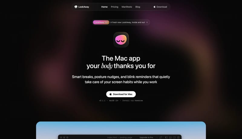
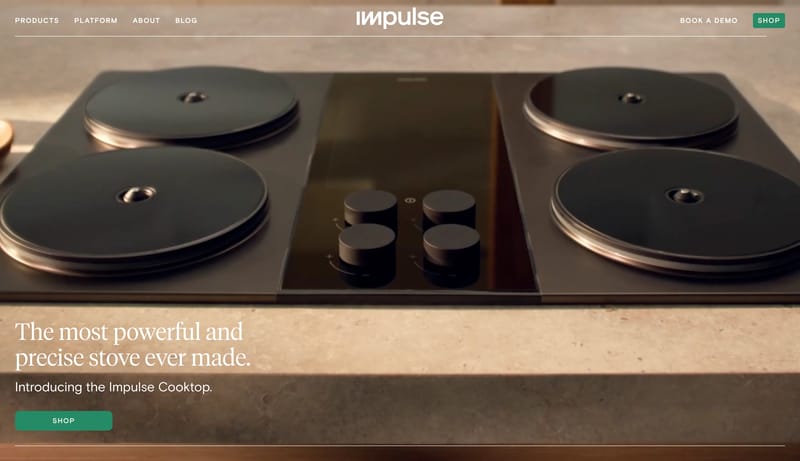
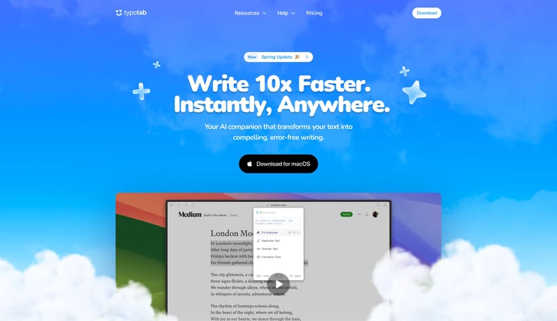
Build a selective studio shell where type, spacing, and media carry most of the brand weight. Keep interfaces visually quiet so case-study imagery or hero moments stay primary. Let one accent or one tonal inversion punct... Use object isolation as the hero dev...
Build a selective studio shell where type, spacing, and media carry most of the brand weight. Keep interfaces visually quiet so case-study imagery or hero moments stay primary. Let one accent or one tonal inversion punct...
- Build a selective studio shell where type, spacing, and media carry most of the brand weight.
- Keep interfaces visually quiet so case-study imagery or hero moments stay primary.
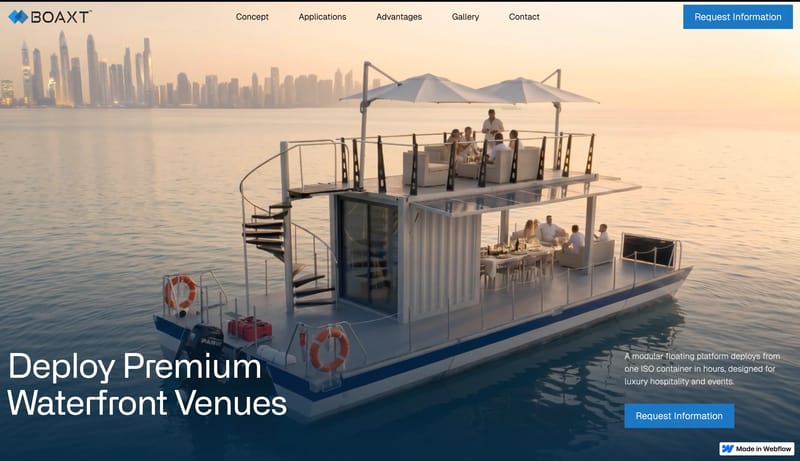
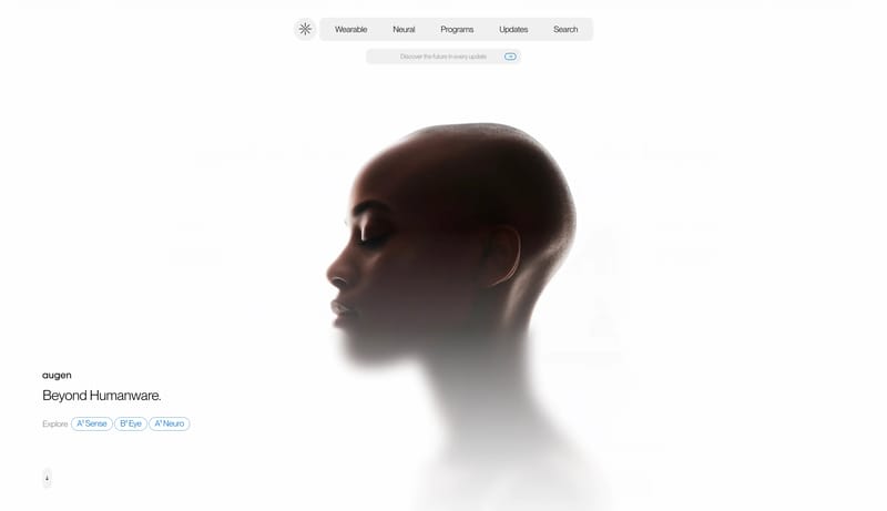
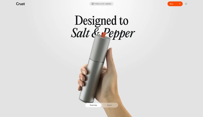
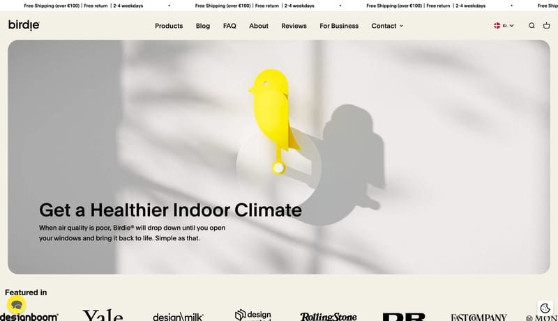
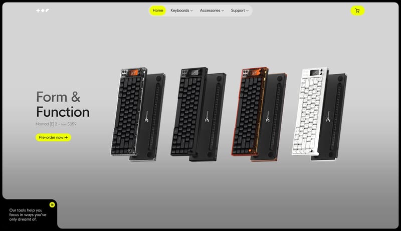
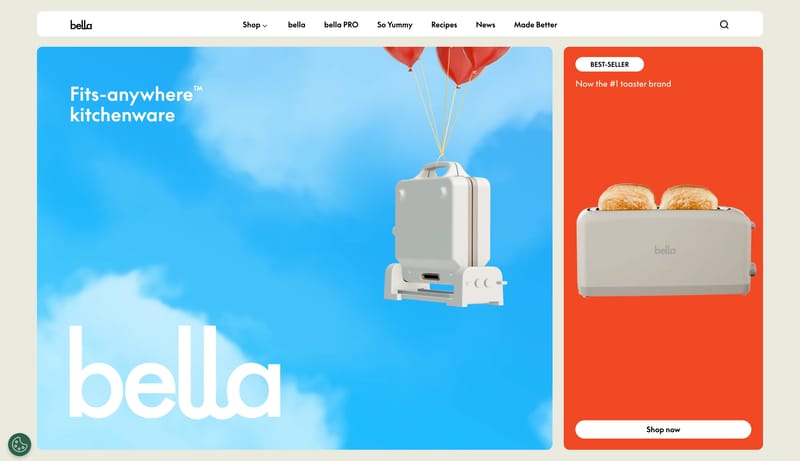
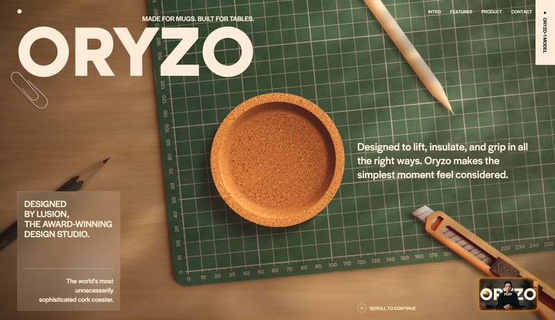
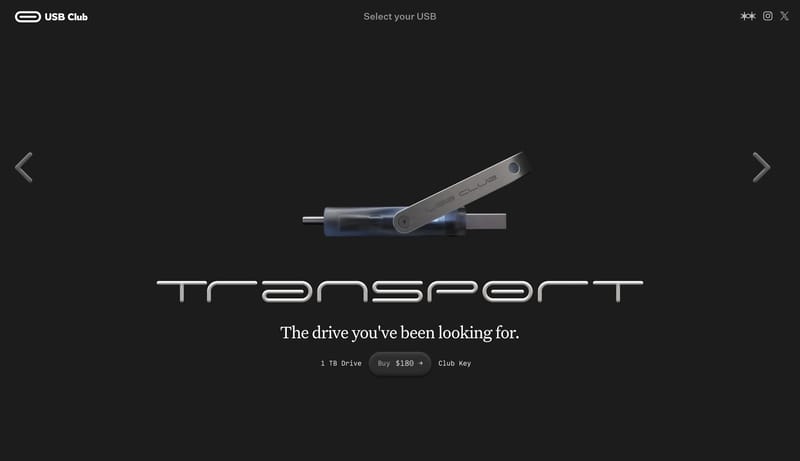
Open exampleUse object isolation as the hero device. Let serif headlines feel sculptural and quiet rather than luxurious or ornate. Use orange only where the user is asked to commit. Show one product object per chapter. Use macro de...
- Use object isolation as the hero device.
- Let serif headlines feel sculptural and quiet rather than luxurious or ornate.
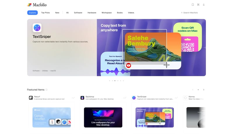
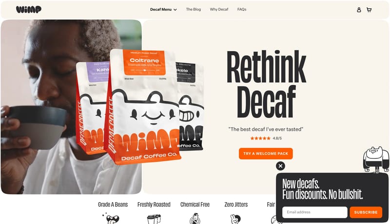
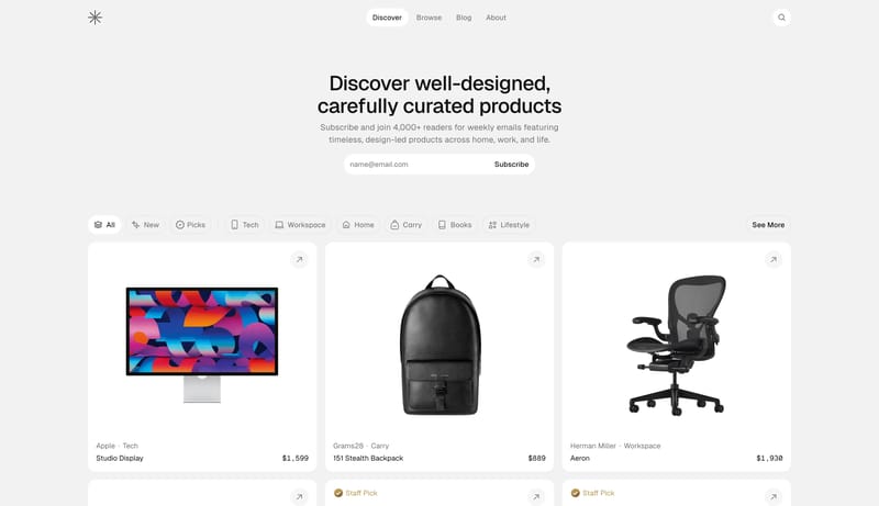
Open exampleBuild for a bright editorial catalog rather than a dark software landing page. Keep the shell quiet and spacious so the curation, not the chrome, defines the first impression. Mix practical browsing controls with more li...
- Build for a bright editorial catalog rather than a dark software landing page.
- Keep the shell quiet and spacious so the curation, not the chrome, defines the first impression.
Open example