Browse all Categories

Category

Web App Website Inspiration

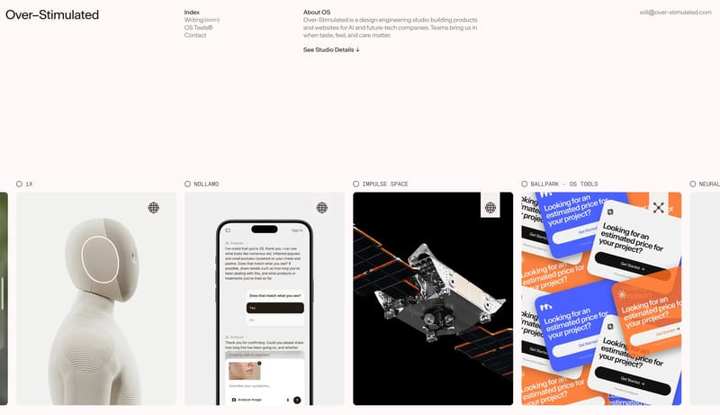
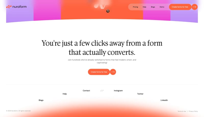
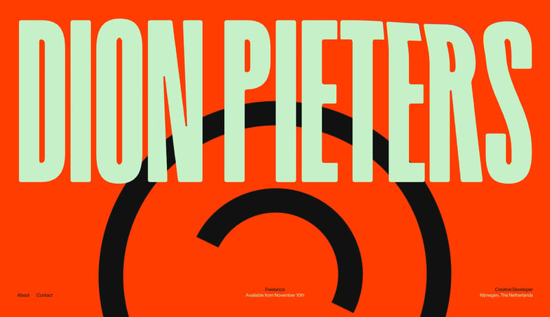
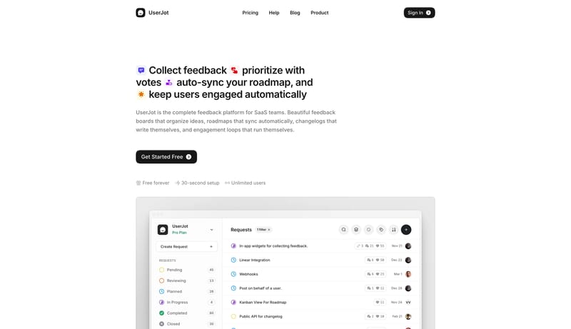
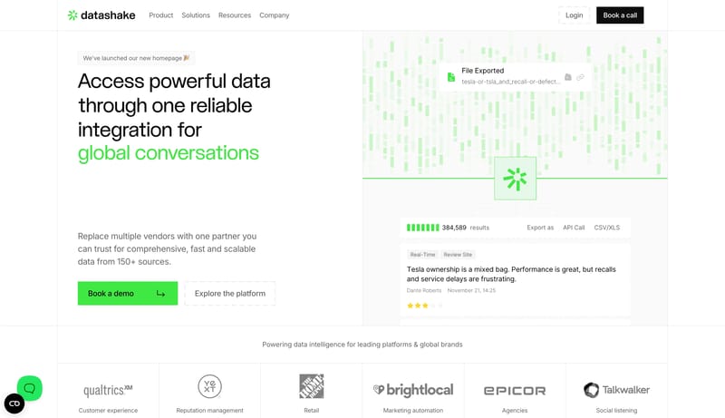
Browse 49 curated Web App website examples to study positioning, page structure, conversion patterns, and product storytelling across modern websites.

49 curated examples24 per pagePage 1 of 3

What To Study

Compare how Web App products introduce value, sequence content blocks, frame trust, and turn visitors into qualified users or customers.

What To Compare

Focus on headline angle, proof blocks, navigation depth, pricing exposure, and how quickly Web App sites communicate their offer.

Design Analysis

What stands out in Web App websites

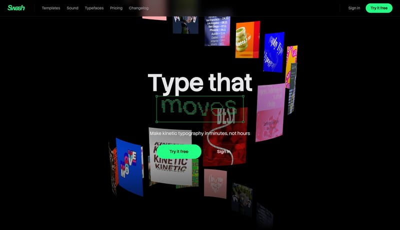
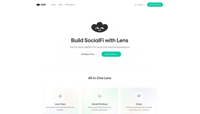
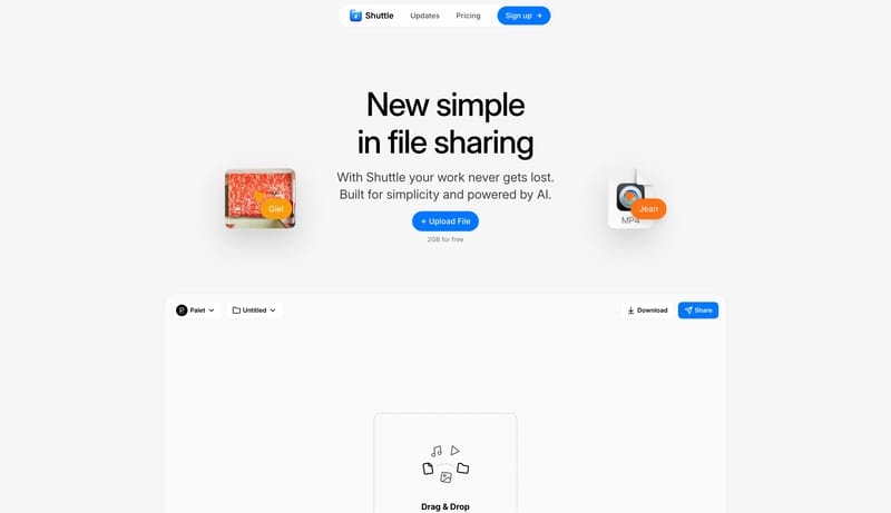
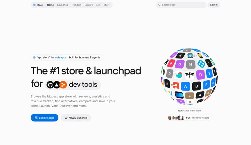
A soft off-white storefront with a bold display headline, blue primary actions and a grid of rounded app-icon tiles. Tone: friendly, clean and commercial. Density 4/5, visual variance 3/5, motion 3/5. Built for a softwar... Build a technical product shell with...

Recurring Signals

  • A soft off-white storefront with a bold display headline, blue primary actions and a grid of rounded app-icon tiles.
  • Tone: friendly, clean and commercial. Density 4/5, visual variance 3/5, motion 3/5.
  • Built for a software directory audience; keep the page readable before adding visual flourish.
  • Use FBFBFC as the page background and 1D1D1F for primary text.
  • Reserve 0071E3 for the main call to action and key emphasis.
  • Use F5F5F7 and 30D158 as supporting tones for secondary actions, labels and status accents.

Related Keywords

OverviewColorsTypographyLayoutImage DirectionKeep the interface almost austereWhite should dominateWarm beige accents should stay faint and localizedKeep the whole experience optimistic and low-noiseKeep the shell nearly whitePrimary ( 000000): Main text and iconographyUse one sans family throughout

dotstore

Home

2026-11-20

A soft off-white storefront with a bold display headline, blue primary actions and a grid of rounded app-icon tiles. Tone: friendly, clean and commercial. Density 4/5, visual variance 3/5, motion 3/5. Built for a softwar...

  • A soft off-white storefront with a bold display headline, blue primary actions and a grid of rounded app-icon tiles.
  • Tone: friendly, clean and commercial. Density 4/5, visual variance 3/5, motion 3/5.
Open example

Openable

Home

2026-06-08

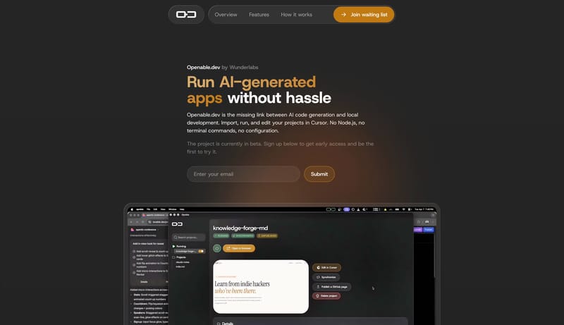
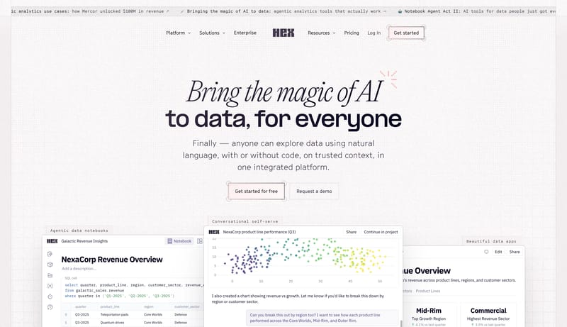
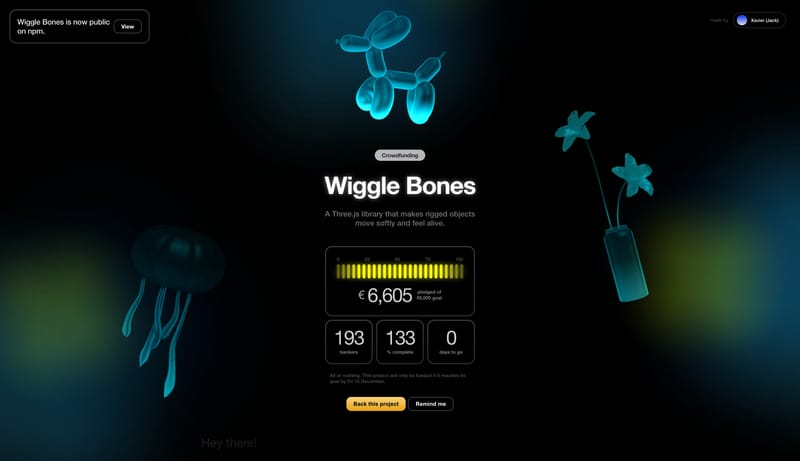
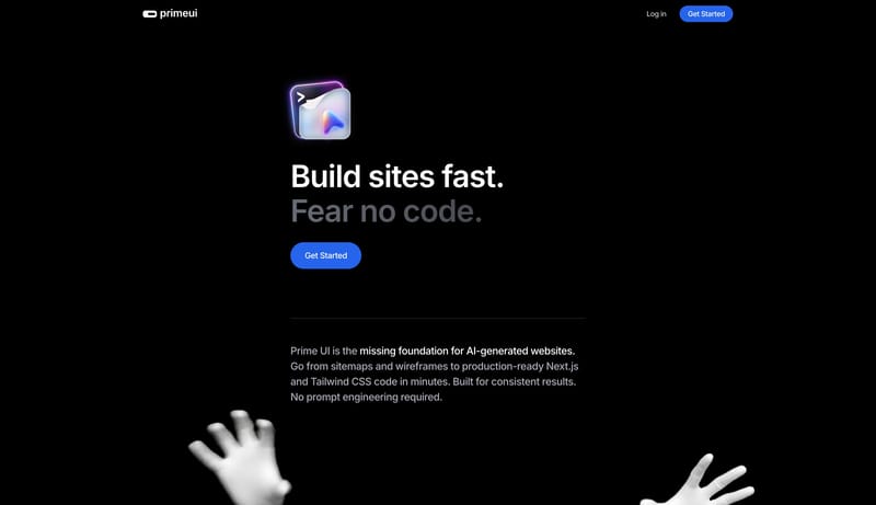
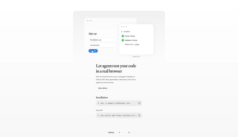
Build a technical product shell with one clear signal accent and a disciplined content hierarchy. Let the product frame, proof panels, or code-adjacent motifs carry credibility instead of decorative gradients. Use motion...

  • Build a technical product shell with one clear signal accent and a disciplined content hierarchy.
  • Let the product frame, proof panels, or code-adjacent motifs carry credibility instead of decorative gradients.
Open example

Beside

Home

2026-03-31

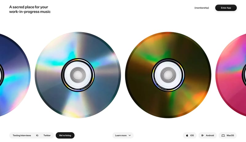
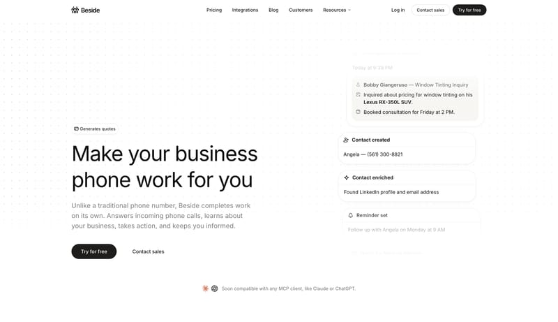
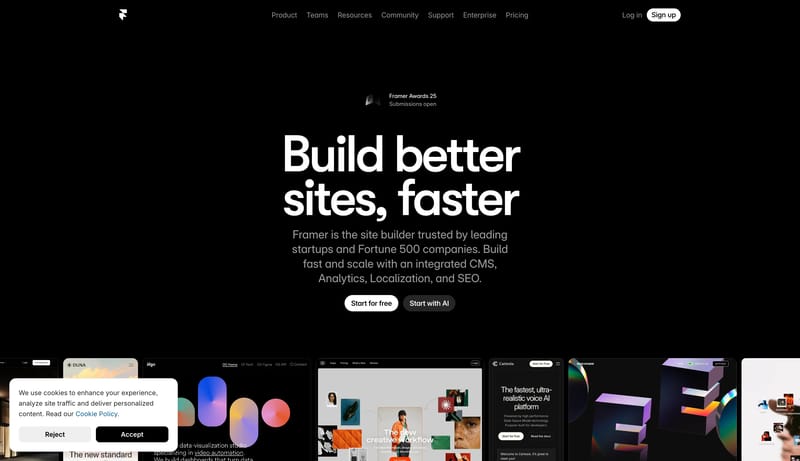
Keep the interface almost austere. Use white space and quiet confidence as the premium signal. Let the black CTA and subtle warm accents carry the few moments of emphasis. White should dominate. Black should be used for...

  • Keep the interface almost austere.
  • Use white space and quiet confidence as the premium signal.
Open example
Continue Exploring

Use these internal hubs to keep branching from Web App into broader design research, structured design analysis, or adjacent website inspiration taxonomies.

Web App Inspiration FAQ

What can I learn from Web App website examples?

You can compare how Web App websites structure positioning, product explanation, proof, conversion flow, and page hierarchy across real products.

How many Web App references are in this collection?

This page currently includes 49 curated Web App references with screenshot and version context so you can compare patterns instead of isolated visuals.