Design Analysis
What stands out in Comment websites
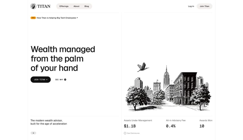
Editorial Advisor Ledger is a high-trust financial system that feels more like a modern ledger than a fintech app. Hairline rules, warm ivory grouping, and etched monochrome illustration create an atmosphere of patience... This system is almost all absence. Us...
Editorial Advisor Ledger is a high-trust financial system that feels more like a modern ledger than a fintech app. Hairline rules, warm ivory grouping, and etched monochrome illustration create an atmosphere of patience...
- Primary ( 111111): Main text and primary CTA fill.
- Secondary ( F2EEE8): Warm ivory chip grouping and subtle surface emphasis.
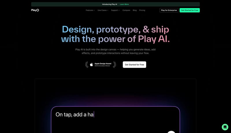
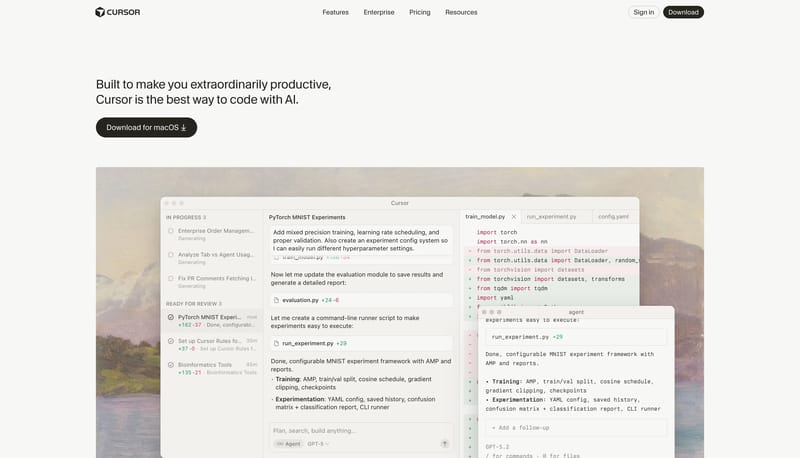
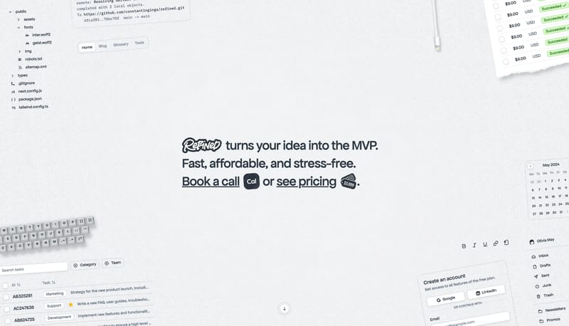
Open exampleThis system is almost all absence. Use a blank white field, one tiny corner code, and one large message cluster anchored to the lower-left zone of the viewport. The layout should feel calm and definitive rather than apol...
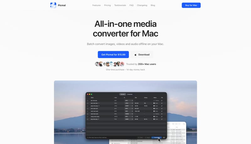
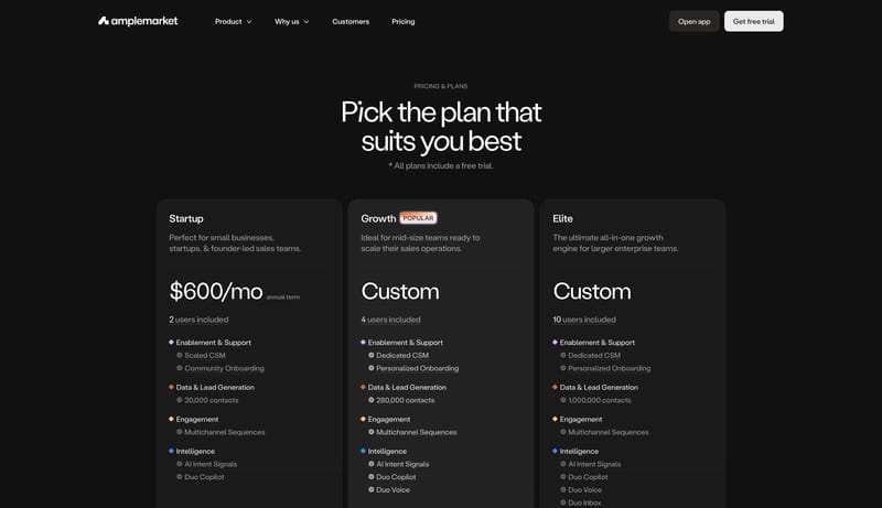
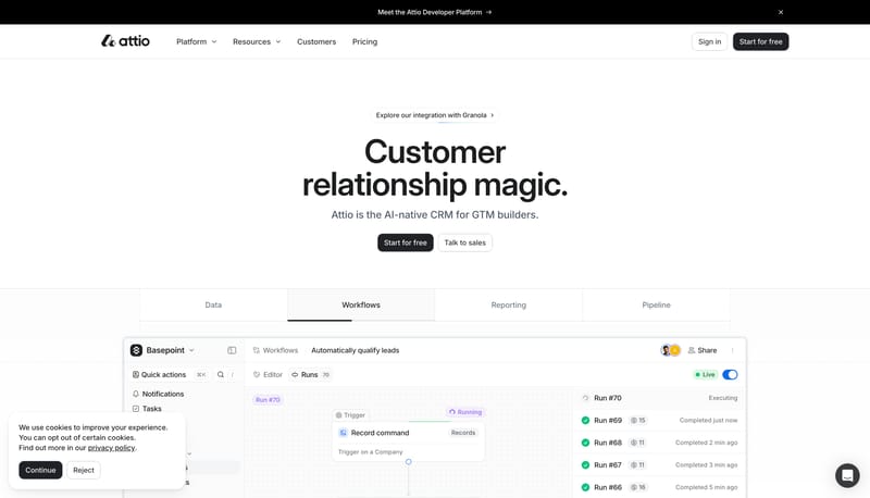
Open exampleTreat the system like a clean utility manual: direct, efficient, and screenshot-led. Use blue actions to point the way without over-branding the shell. Let docs, changelog, and marketing all feel like one family. Use app...
- Treat the system like a clean utility manual: direct, efficient, and screenshot-led.
- Use blue actions to point the way without over-branding the shell.
Open example