Design Analysis
What stands out in Saas websites
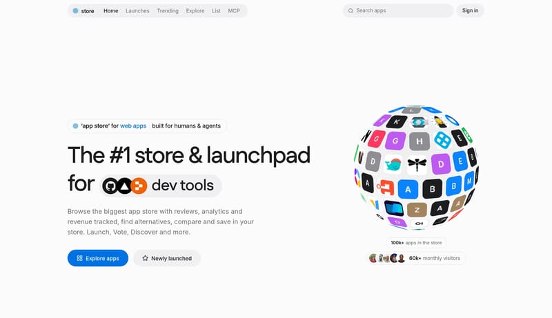
A soft off-white storefront with a bold display headline, blue primary actions and a grid of rounded app-icon tiles. Tone: friendly, clean and commercial. Density 4/5, visual variance 3/5, motion 3/5. Built for a softwar... Build a warm utility shell that feel...
A soft off-white storefront with a bold display headline, blue primary actions and a grid of rounded app-icon tiles. Tone: friendly, clean and commercial. Density 4/5, visual variance 3/5, motion 3/5. Built for a softwar...
- A soft off-white storefront with a bold display headline, blue primary actions and a grid of rounded app-icon tiles.
- Tone: friendly, clean and commercial. Density 4/5, visual variance 3/5, motion 3/5.
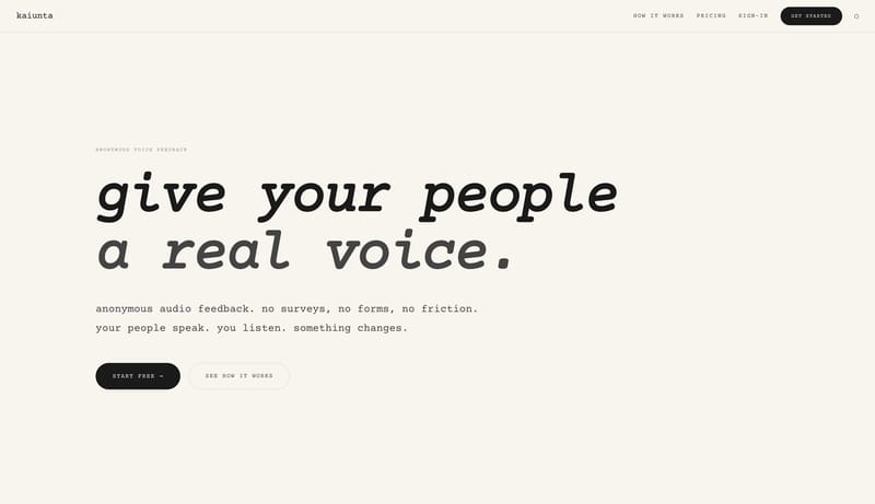
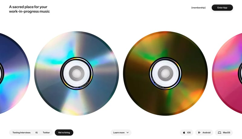
Open exampleBuild a warm utility shell that feels tactile and lightweight rather than polished and corporate. Let typography and button silhouettes carry personality before introducing graphic effects. Keep the interaction model obv...
- Build a warm utility shell that feels tactile and lightweight rather than polished and corporate.
- Let typography and button silhouettes carry personality before introducing graphic effects.
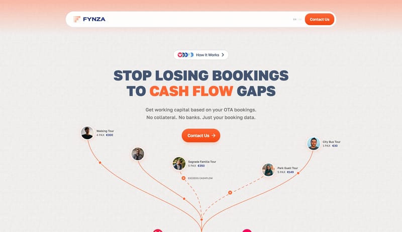
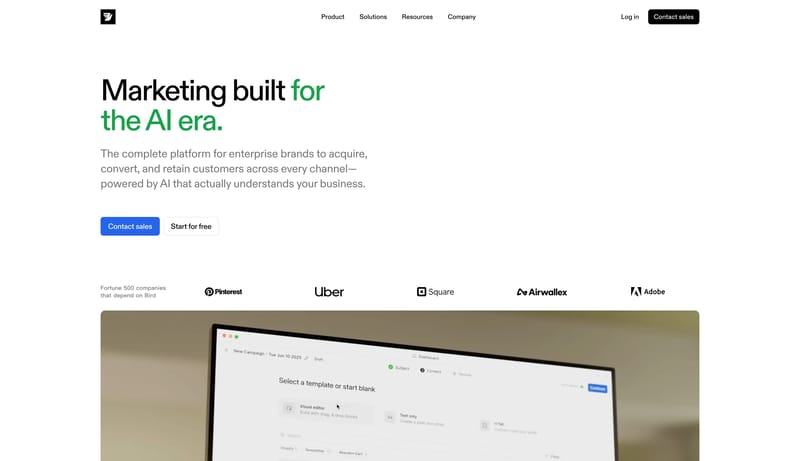
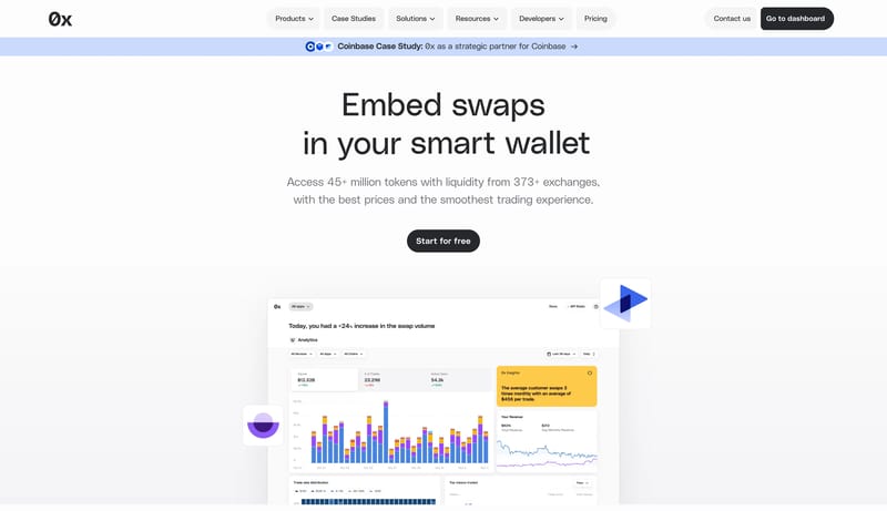
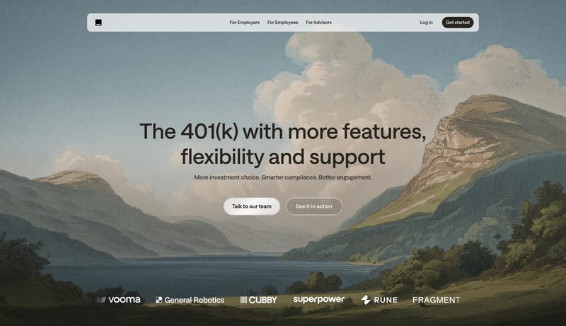
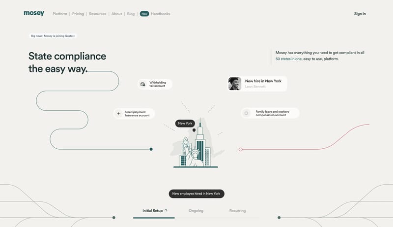
Open exampleBuild a finance shell that feels calm and operationally credible rather than flashy. Use white space, direct copy, and a narrow accent range to signal trust. Keep proof and action modules simple and grounded. Favor restr...
- Build a finance shell that feels calm and operationally credible rather than flashy.
- Use white space, direct copy, and a narrow accent range to signal trust.
Open example