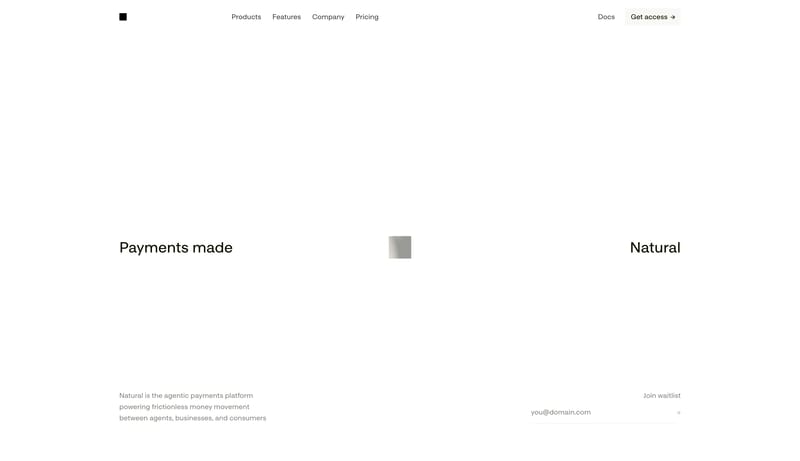
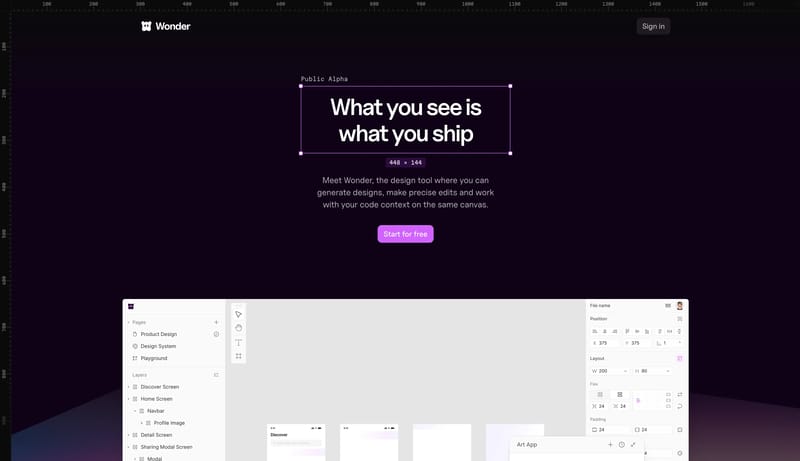
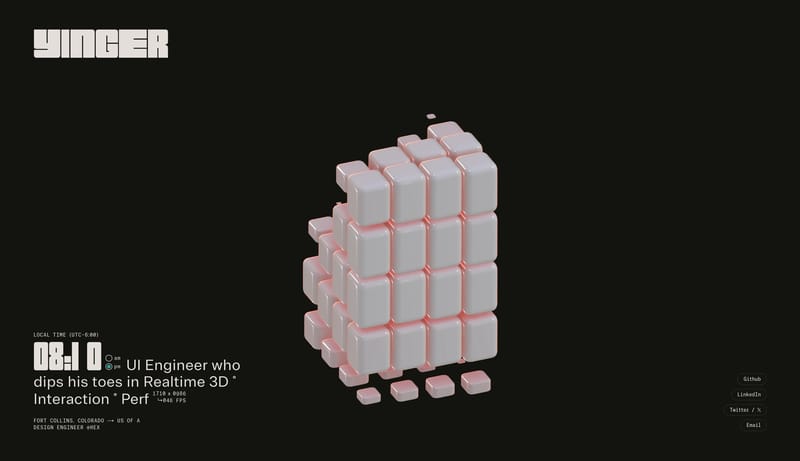
Klack
Home
--- version: alpha name: Cream Tactile Utility description: A warm Mac utility design language with cream canvas, huge bold system type, dark rounded download buttons, purple highlight marks, tactile app mockups, and lar...
Open exampleStyle
Browse 34 curated Minimal website examples to review visual direction, typography, color systems, motion, and overall brand expression.
What To Look For
Study how Minimal style decisions affect first impression, readability, visual tension, motion, and the overall feel of the product.
What To Compare
Pay attention to color contrast, type pairings, spacing density, illustration treatment, motion restraint, and how the Minimal style stays consistent across the page.
Design Analysis
--- version: alpha name: Cream Tactile Utility description: A warm Mac utility design language with cream canvas, huge bold system type, dark rounded download buttons, purple highlight marks, tactile app mockups, and lar... --- version: "alpha" name: "Acid Pri...
Klack
Home
--- version: alpha name: Cream Tactile Utility description: A warm Mac utility design language with cream canvas, huge bold system type, dark rounded download buttons, purple highlight marks, tactile app mockups, and lar...
Open examplePayy
Home
--- version: "alpha" name: "Acid Privacy Ledger" description: "A privacy-finance marketing system built from warm paper space, deep navy product surfaces, acid-lime action signals, and large editorial serif headlines." c...
Open exampleLens
Home
--- version: "alpha" name: "Social Arc Air" description: "An airy ecosystem marketing system with mint action pills, faint rainbow arc linework, charcoal headlines, and very soft knowledge-card surfaces." colors: primary...
It helps you compare visual tone, typography, color systems, spacing density, illustration treatment, and motion choices used in Minimal website design.
Use them to calibrate creative direction, collect mood references, and decide which visual traits feel distinctive enough to adapt for your own product.