Design Analysis
What stands out in Minimal websites
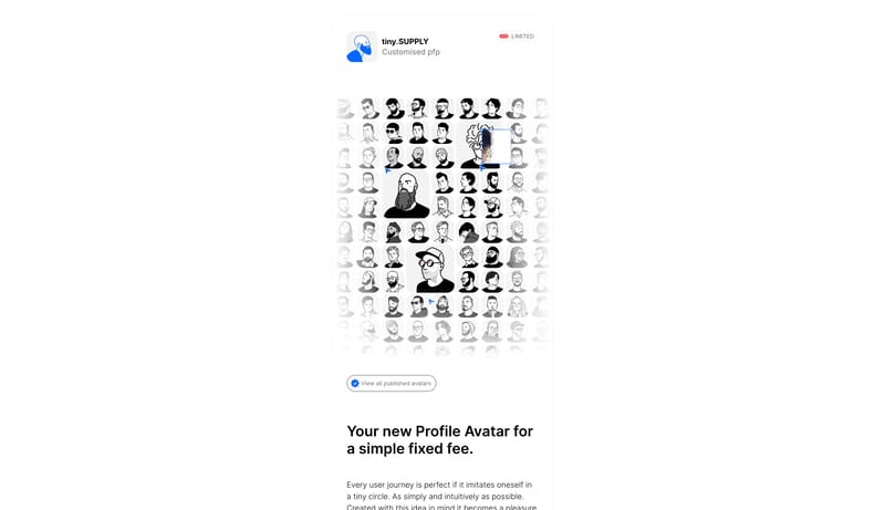
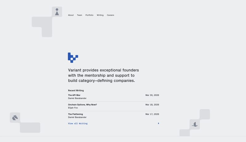
Design this system as a tiny, deliberate stack of cards in the middle of a large white page. The main idea is restraint: one narrow column, soft fog-gray surfaces, clear black copy, and just enough color to mark the main... Build a service-page system that fee...
Design this system as a tiny, deliberate stack of cards in the middle of a large white page. The main idea is restraint: one narrow column, soft fog-gray surfaces, clear black copy, and just enough color to mark the main...
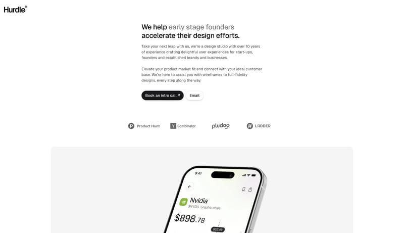
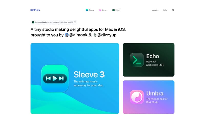
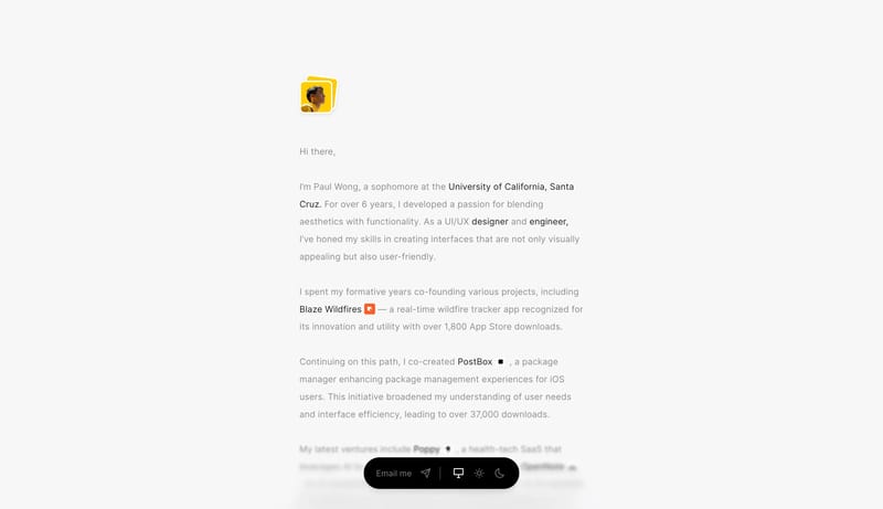
Open exampleBuild a service-page system that feels calm, trustworthy, and founder-friendly. A minimal founder-support system built from white space, black capsule CTAs, soft gray cards, and calm product proof.
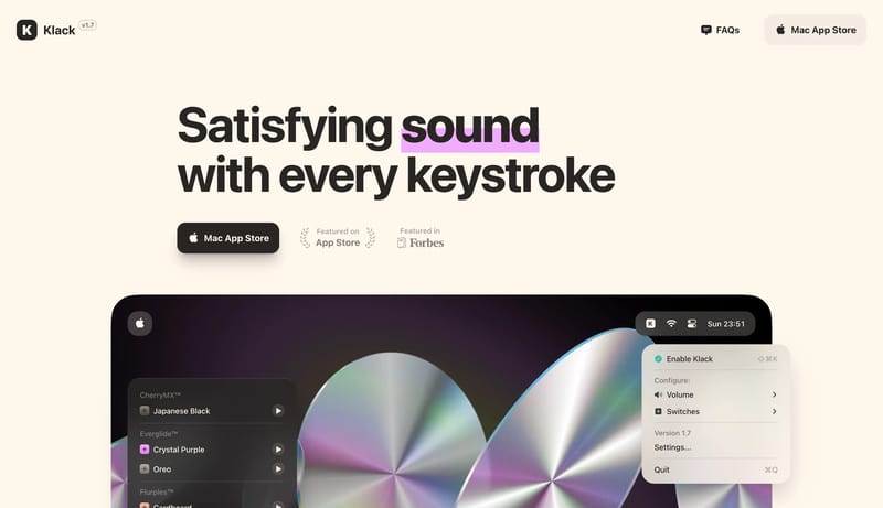
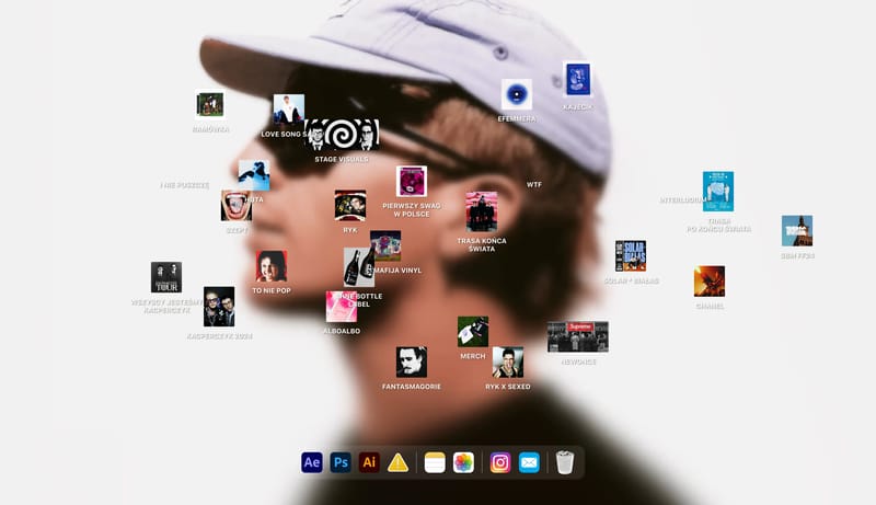
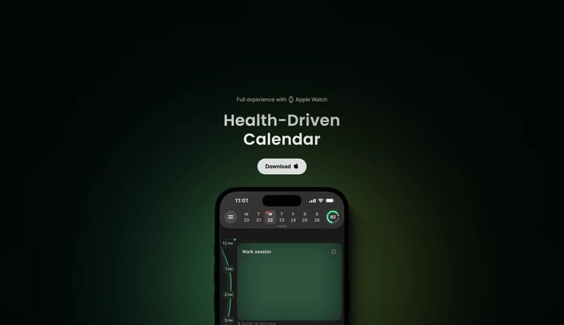
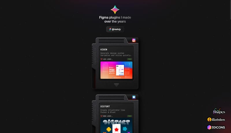
Open exampleUse a warm cream canvas, huge bold type, dark rounded download buttons, tactile product mockups, and oversized line icons. The interface should feel satisfying and physical.
Open example