Design Analysis
What stands out in Footer websites
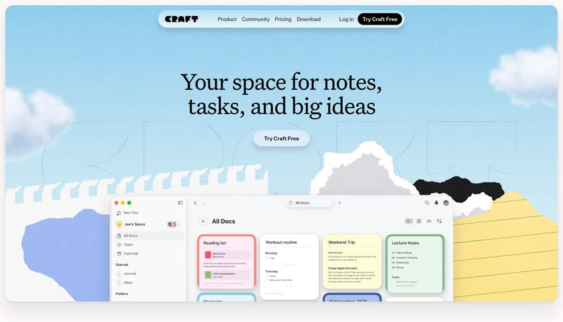
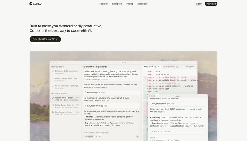
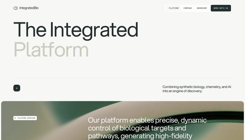
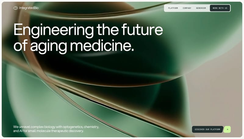
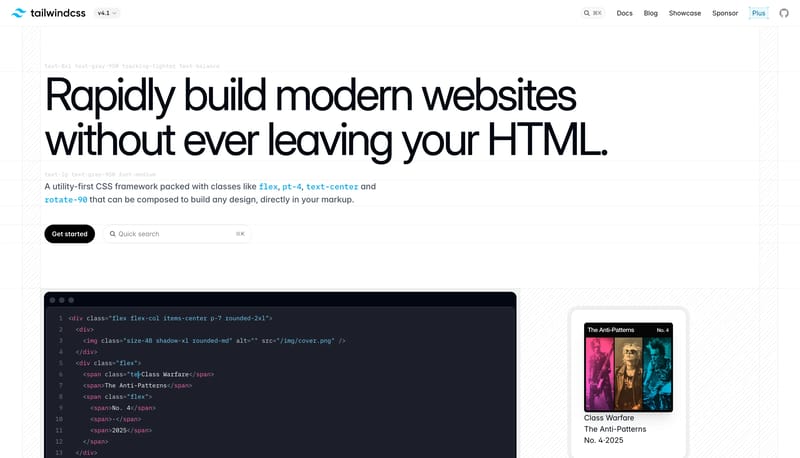
Build the page like a scenic paper stage rather than a plain app landing page. Let oversized serif headlines sit inside a sky-blue textured field framed by collage tears and clouds. Use black capsules and a floating roun... Build the system as white space, gia...
Build the page like a scenic paper stage rather than a plain app landing page. Let oversized serif headlines sit inside a sky-blue textured field framed by collage tears and clouds. Use black capsules and a floating roun...
- Build the page like a scenic paper stage rather than a plain app landing page.
- Let oversized serif headlines sit inside a sky-blue textured field framed by collage tears and clouds.
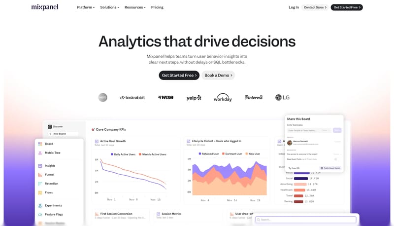
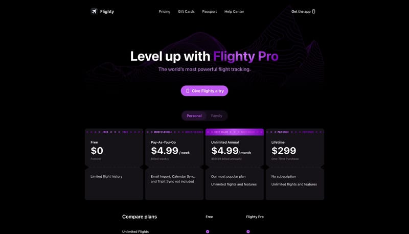
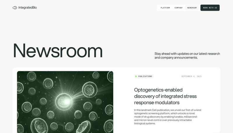
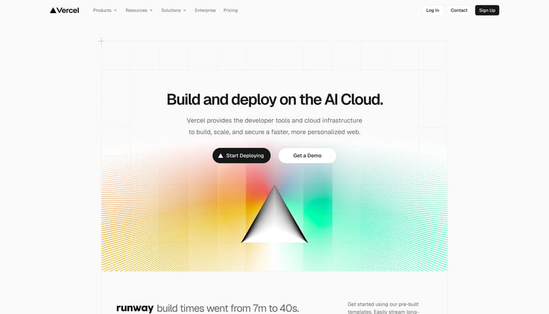
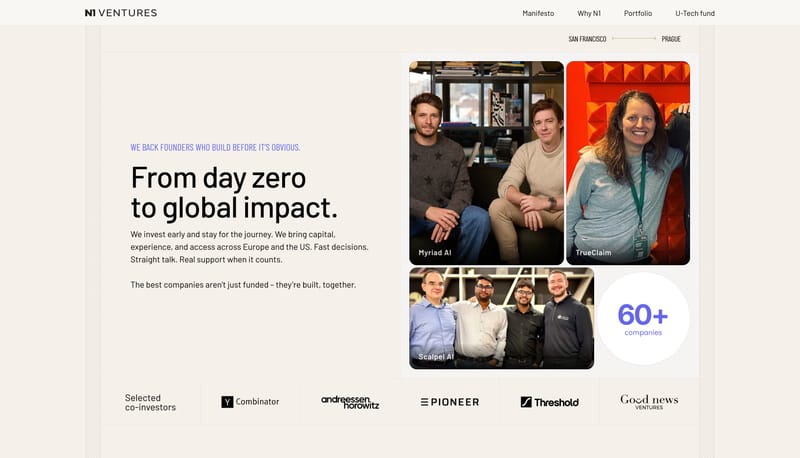
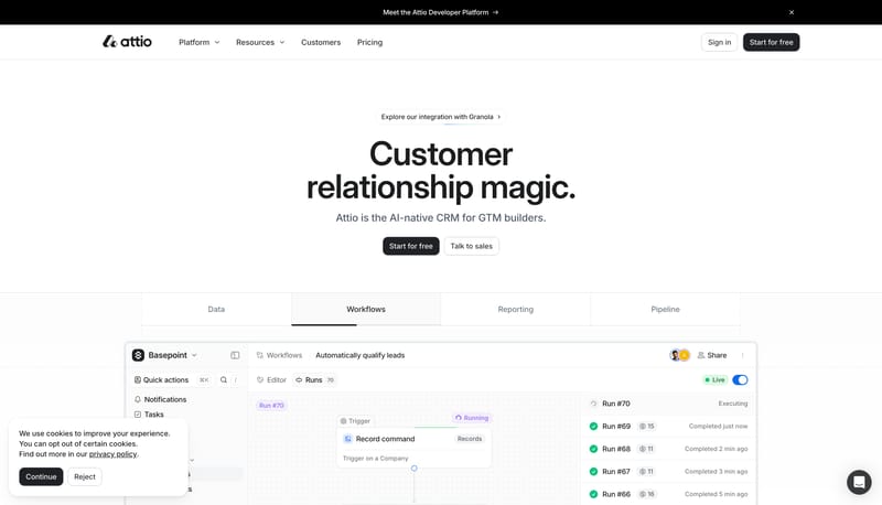
Open exampleBuild the system as white space, giant dark statements, and one orderly row of signal tiles. Use lilac and violet to energize proof without changing the page shell into an accent wash. Let monochrome pills keep the inter...
- Build the system as white space, giant dark statements, and one orderly row of signal tiles.
- Use lilac and violet to energize proof without changing the page shell into an accent wash.
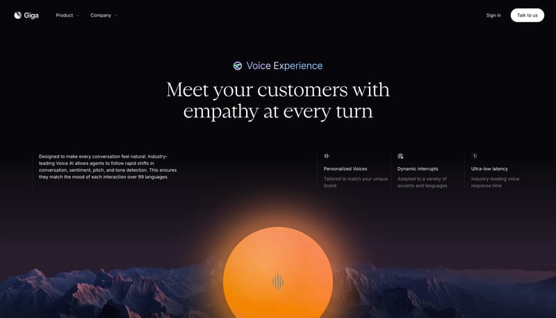
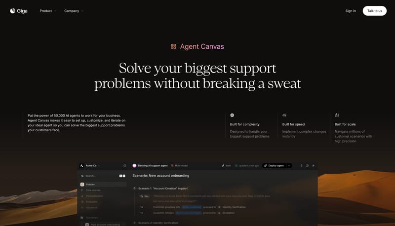
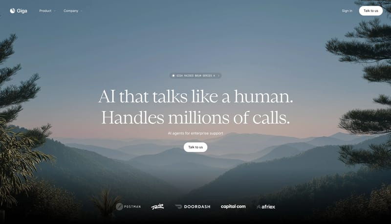
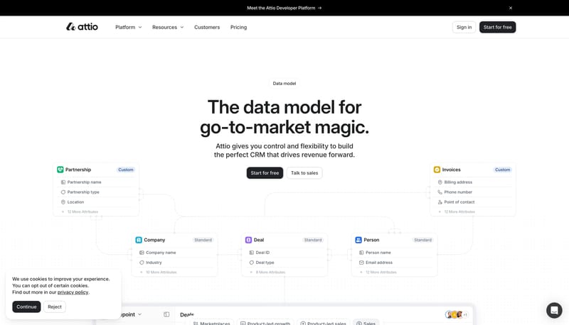
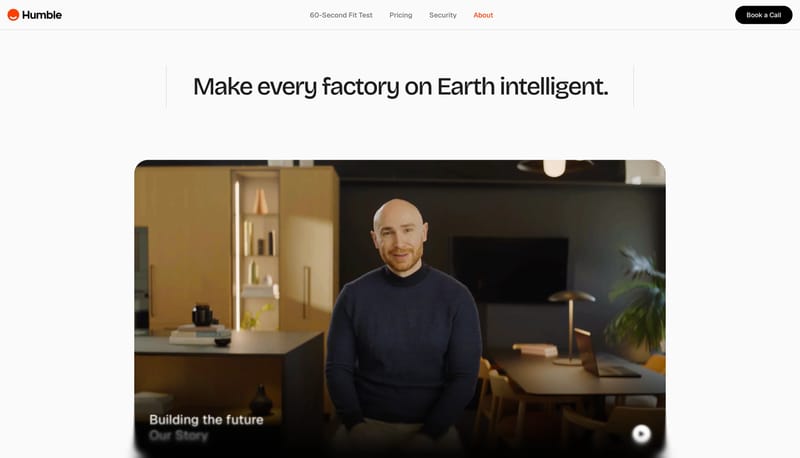
Open exampleBuild the experience as a calm horizon photograph with minimal white interface punctuation. Let the page feel cinematic and humane rather than technical for its own sake. Use small chips and one white pill to keep the in...
- Build the experience as a calm horizon photograph with minimal white interface punctuation.
- Let the page feel cinematic and humane rather than technical for its own sake.
Open example