Design Analysis
What stands out in Footer websites
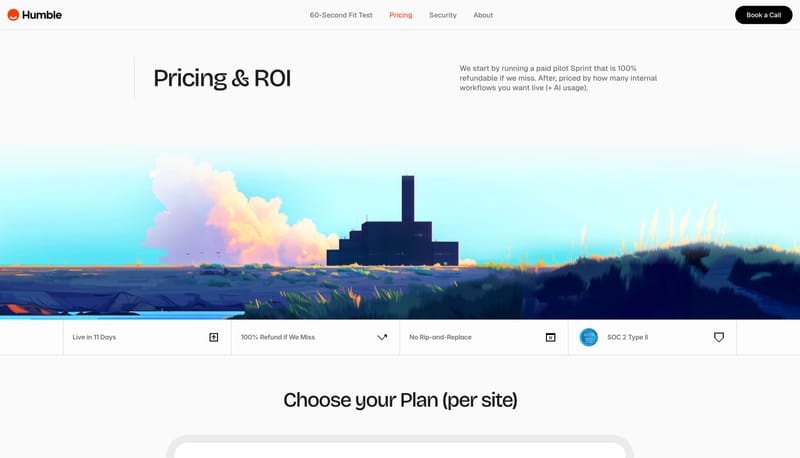
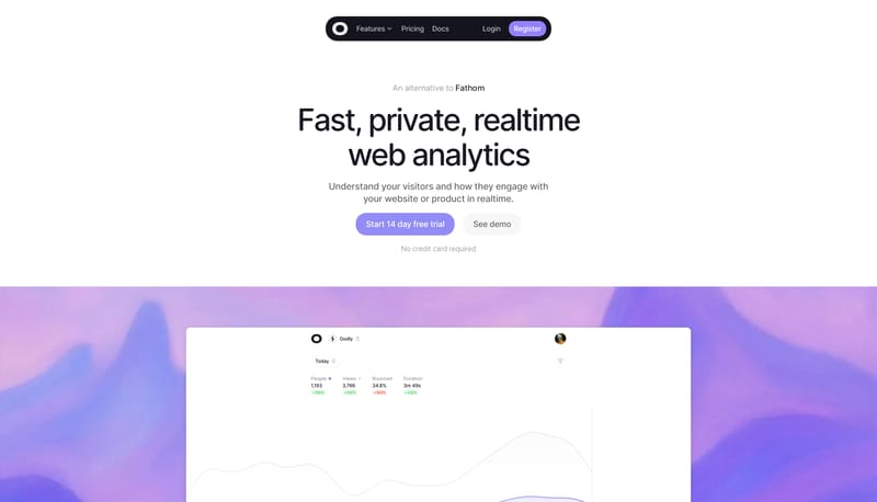
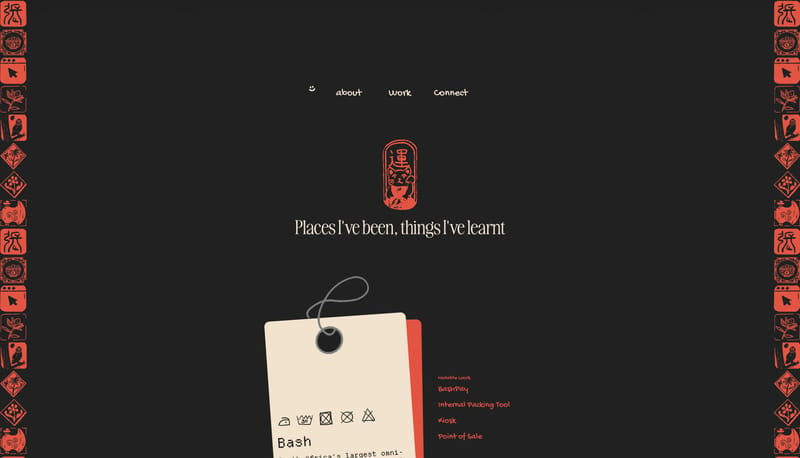
Build the experience like a launch message dropped onto a real desk. Keep one bold headline at the center and let smaller utility artifacts orbit around it. Use paper texture, cropped peripherals, and rounded cards to cr... Build the experience as an index, do...
Build the experience like a launch message dropped onto a real desk. Keep one bold headline at the center and let smaller utility artifacts orbit around it. Use paper texture, cropped peripherals, and rounded cards to cr...
- Build the experience like a launch message dropped onto a real desk.
- Keep one bold headline at the center and let smaller utility artifacts orbit around it.
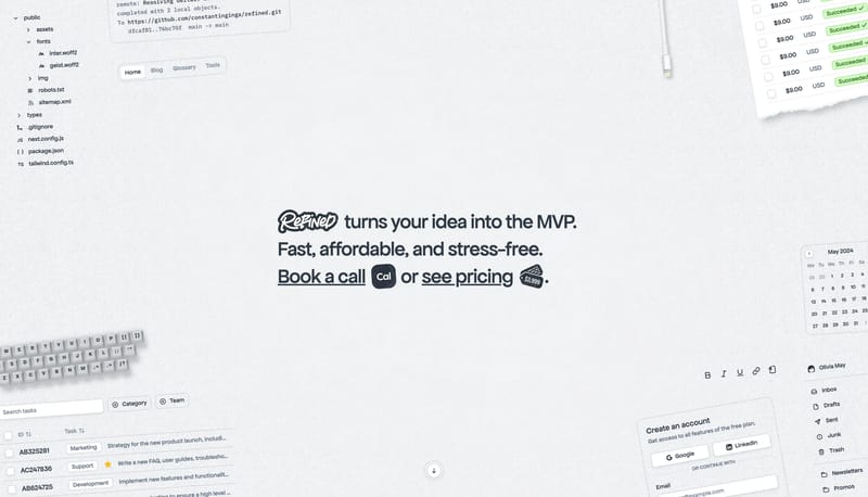
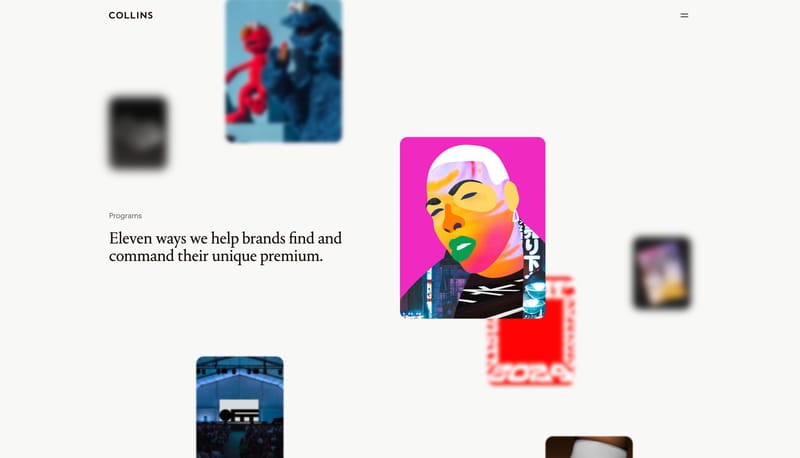
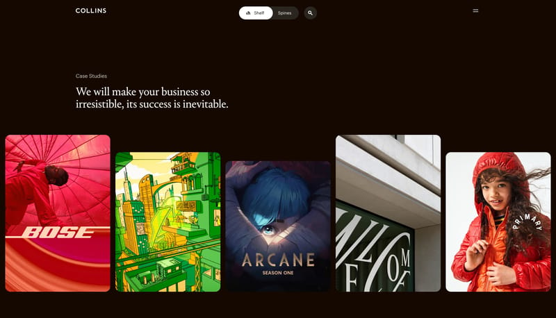
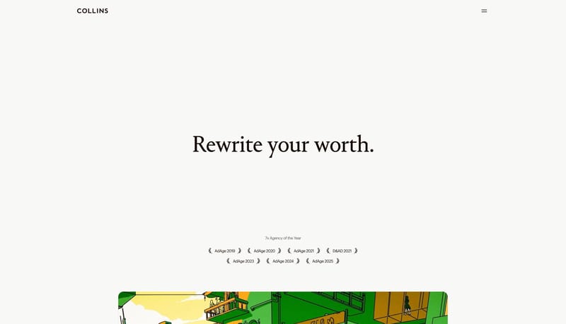
Open exampleBuild the experience as an index, dossier, or ledger rather than a promotional portfolio. Let whitespace do most of the talking. Use thin rules, utility stamps, and microtype to organize information with extreme restrain...
- Build the experience as an index, dossier, or ledger rather than a promotional portfolio.
- Let whitespace do most of the talking.
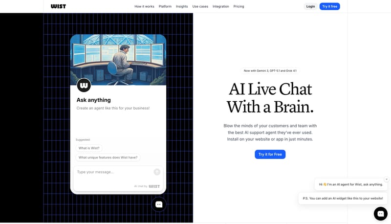
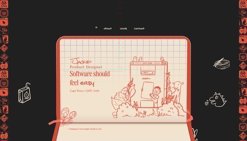
Open exampleBuild the experience as a product explainer that toggles between warm clarity and technical depth. Alternate clean white storytelling bands with deep navy blueprint interludes. Make the chat object feel central: the prod...
- Build the experience as a product explainer that toggles between warm clarity and technical depth.
- Alternate clean white storytelling bands with deep navy blueprint interludes.
Open example