Design Analysis
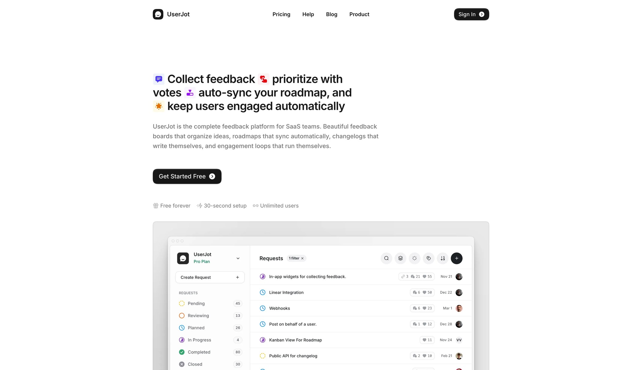
UserJot Home design analysis
This design language is for a transparent SaaS product that proves itself by showing the actual interface. It uses a white canvas, compact black pill actions, warm orange signals, and large framed product-window previews...
Overview
This design language is for a transparent SaaS product that proves itself by showing the actual interface. It uses a white canvas, compact black pill actions, warm orange signals, and large framed product-window previews. The page should feel calm and product-led. Copy introduces the promise, and the screenshot or terminal preview provides the proof.
Colors
Use white as the default canvas. Use F8F7F5 for preview backplates and soft bands. Use 282624 for headings and 474645 for body copy. Use 171717 for primary CTAs. Orange FF7A59 should stay editorial: feature eyebrows, announcement labels, command accents, and small product signals. Do not use it as a broad page background.
Typography
Use Inter or a system grotesk. Headings are medium weight, not heavy: hero text around 44px / 48px, section titles around 40px / 44px, and body copy around 18px / 28px. Use uppercase orange eyebrows for feature categories. Use mono text only in terminal or agent preview surfaces.
Layout
Use a centered content width around 992px, with hero text left-aligned. Lead with copy and CTAs, then show a large product-frame preview below. Repeat this rhythm across feature pages. Product windows should be large enough to inspect. They are proof, not decoration. Keep surrounding whitespace generous and avoid splitting the hero into many columns.