Overview
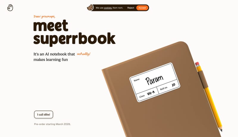
This design language treats a learning product like a tactile children’s book. It uses ivory paper, chocolate serif type, hand-drawn orange annotations, illustrated notebook scenes, meadow-like bands, and very large pauses of empty space.

AI notebook that makes learning fun. Understands what you write. Makes your books come alive. Always there to help you. And does it all without a single distraction.
Design Analysis
This design language treats a learning product like a tactile children’s book. It uses ivory paper, chocolate serif type, hand-drawn orange annotations, illustrated notebook scenes, meadow-like bands, and very large paus...
This design language treats a learning product like a tactile children’s book. It uses ivory paper, chocolate serif type, hand-drawn orange annotations, illustrated notebook scenes, meadow-like bands, and very large pauses of empty space.
Use FDFBF9 as the main canvas and FFFBF7 for raised paper surfaces. Use 2B1A07 and 171717 for text and outlines. Use FF6F1E for handwritten notes, signatures, links, and the final footer. Use green only for magic or learning-positive words. Illustrations can introduce pencil yellow, sky blue, meadow green, and soft browns. UI chrome should stay restrained.
Use a chunky storybook serif. The hero can be very large, around 104px / 100px, with playful line breaks. Section headings are smaller and calmer, around 40px / 48px. Story pages should use roomy paragraphs in a narrow reading column. Handwritten accents should stay short.
Use generous blank space as a pause in the story. Pair short copy with one large illustrated object. Alternate quiet ivory sections with illustrated bands rather than dense feature grids. Story pages should read like a letter: centered narrow column, large paragraphs, framed illustrations, and a signature moment near the end.