Design Analysis
What stands out in Mobile App websites
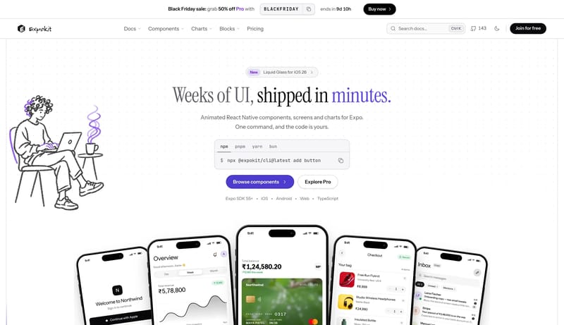
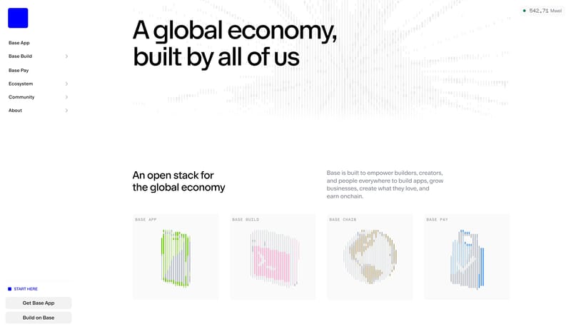
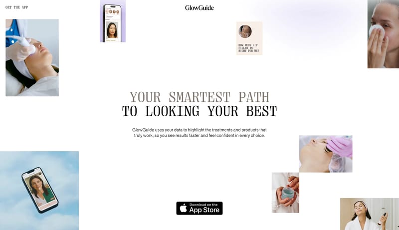
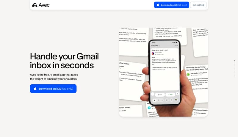
A white canvas with a violet accent, an editorial serif headline and a live component wall that rewards interaction. Tone: expressive, playful and technical. Density 3/5, visual variance 4/5, motion 4/5. Built for a mobi... Keep the interface almost austere. U...
A white canvas with a violet accent, an editorial serif headline and a live component wall that rewards interaction. Tone: expressive, playful and technical. Density 3/5, visual variance 4/5, motion 4/5. Built for a mobi...
- A white canvas with a violet accent, an editorial serif headline and a live component wall that rewards interaction.
- Tone: expressive, playful and technical. Density 3/5, visual variance 4/5, motion 4/5.
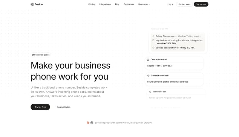
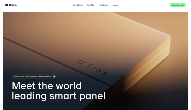
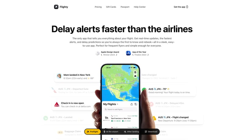
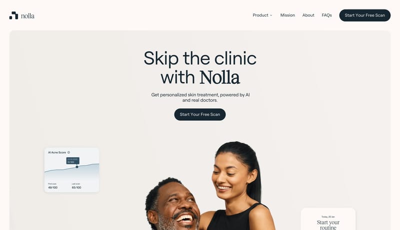
Open exampleKeep the interface almost austere. Use white space and quiet confidence as the premium signal. Let the black CTA and subtle warm accents carry the few moments of emphasis. White should dominate. Black should be used for...
- Keep the interface almost austere.
- Use white space and quiet confidence as the premium signal.
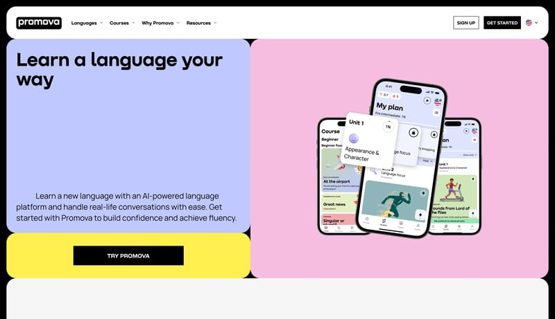
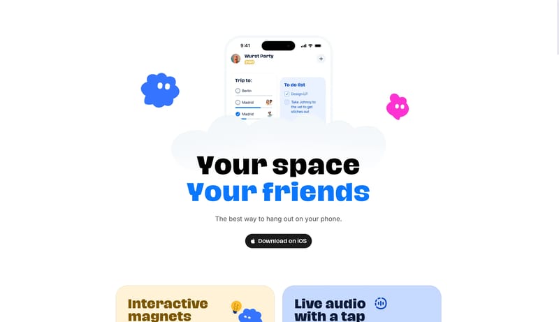
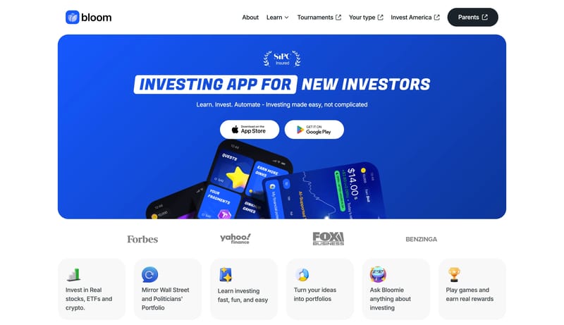
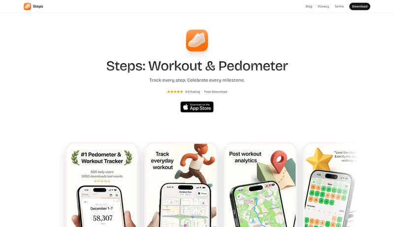
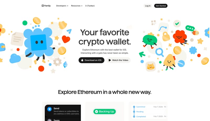
Open exampleLead with a strong cobalt hero block and bold accessible copy. Make the product feel friendly, energetic, and app-native. Keep the interface readable and light after the hero burst. Use phone screens as primary proof. Tr...
- Lead with a strong cobalt hero block and bold accessible copy.
- Make the product feel friendly, energetic, and app-native.
Open example