Design Analysis
What stands out in Education websites
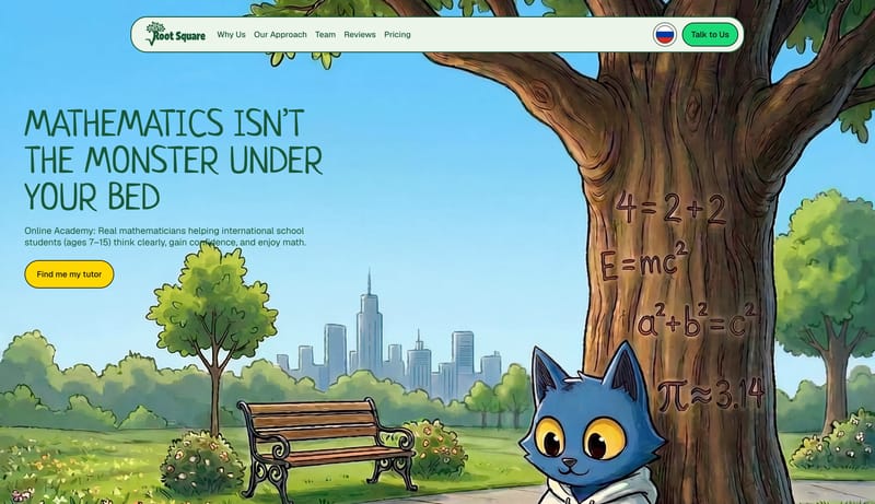
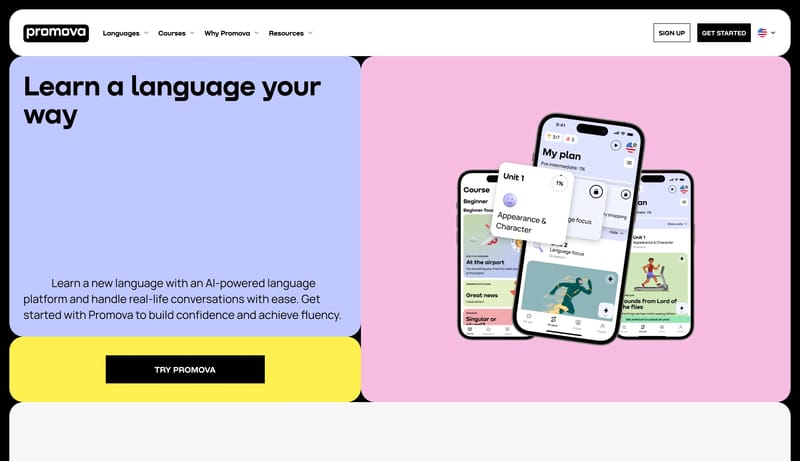
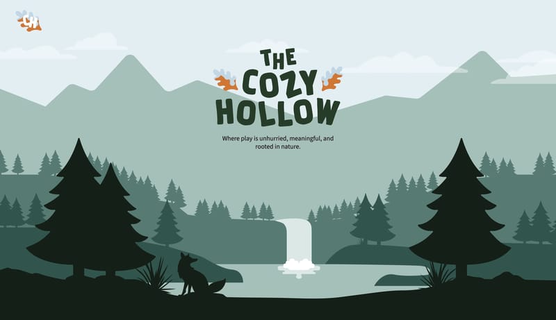
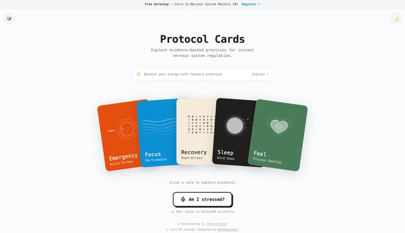
Build a learning shell that feels encouraging and characterful without becoming chaotic. Use playful type, illustration, and color as the trust engine before adding dense product UI. Keep actions obvious and high-contras... Build a campaign shell that feels li...
Build a learning shell that feels encouraging and characterful without becoming chaotic. Use playful type, illustration, and color as the trust engine before adding dense product UI. Keep actions obvious and high-contras...
- Build a learning shell that feels encouraging and characterful without becoming chaotic.
- Use playful type, illustration, and color as the trust engine before adding dense product UI.
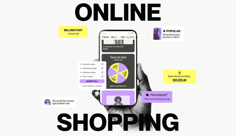
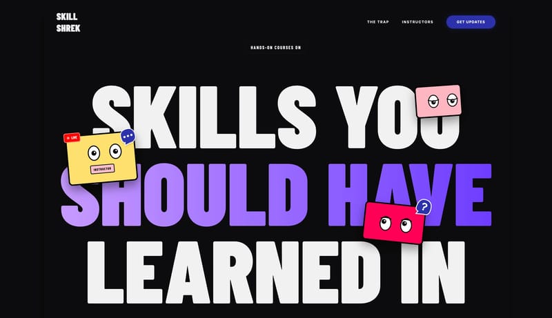
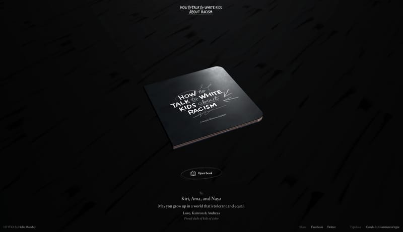
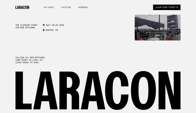
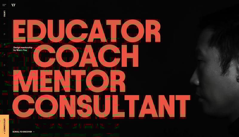
Open exampleBuild a campaign shell that feels like an editorial poster system translated into the web. Use sharp contrast, oversized type, and loud color interrupts to create argument and momentum. Let motion guide chapter transitio...
- Build a campaign shell that feels like an editorial poster system translated into the web.
- Use sharp contrast, oversized type, and loud color interrupts to create argument and momentum.
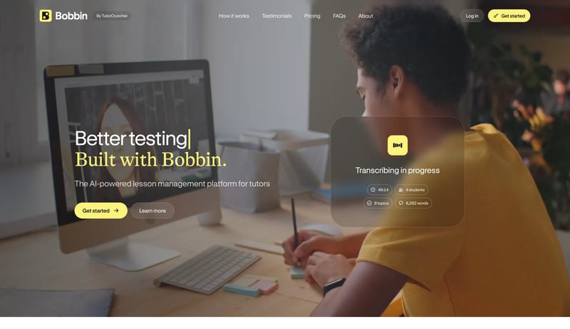
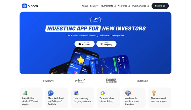
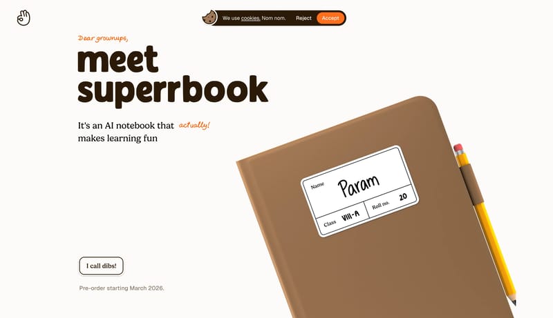
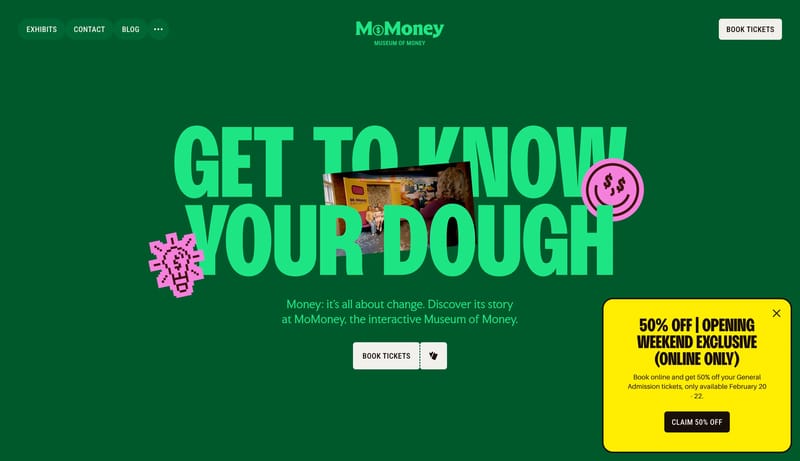
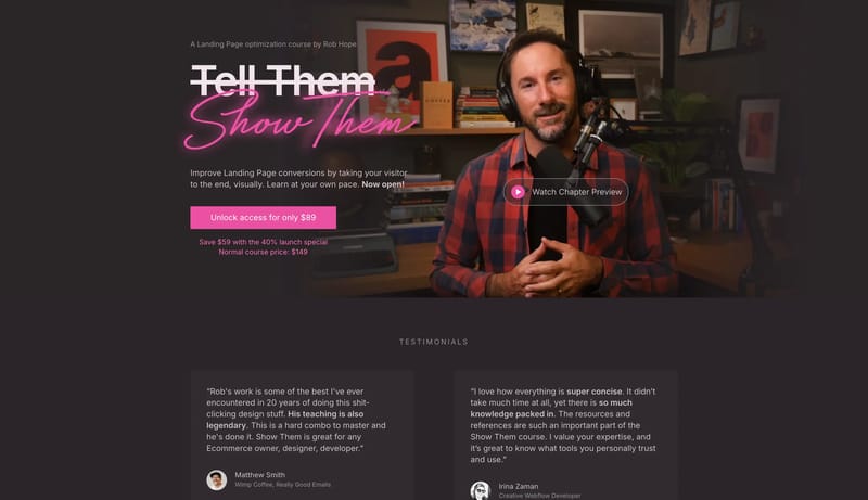
Open exampleBuild a product-marketing shell that feels direct and usable for educators rather than abstract and startup-polished. Anchor the system with one hero emphasis color and then relax into calmer supporting surfaces. Keep fo...
- Build a product-marketing shell that feels direct and usable for educators rather than abstract and startup-polished.
- Anchor the system with one hero emphasis color and then relax into calmer supporting surfaces.
Open example