10
Visits
Visit

Available Pages

Version History

Design Analysis

Refined Home design analysis

--- version: alpha name: "Desk Artifact Launchpad" description: "A bright launch-page language built from a central bold message, softly textured paper ground, floating desk artifacts, and rounded utility cards." colors:...

Key Takeaways

  • Build the experience like a launch message dropped onto a real desk.
  • Keep one bold headline at the center and let smaller utility artifacts orbit around it.
  • Use paper texture, cropped peripherals, and rounded cards to create tactility without visual heaviness.
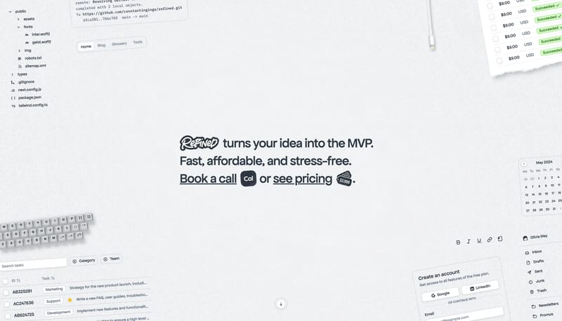
  • Use desk objects, receipts, task fragments, inbox snippets, and simple form cards as the recurring image system.
  • Crop objects at the frame edge so the scene feels larger than the viewport.
  • Keep the object layer supportive. The main message should still dominate the first read.

Overview

  • Build the experience like a launch message dropped onto a real desk.
  • Keep one bold headline at the center and let smaller utility artifacts orbit around it.
  • Use paper texture, cropped peripherals, and rounded cards to create tactility without visual heaviness.

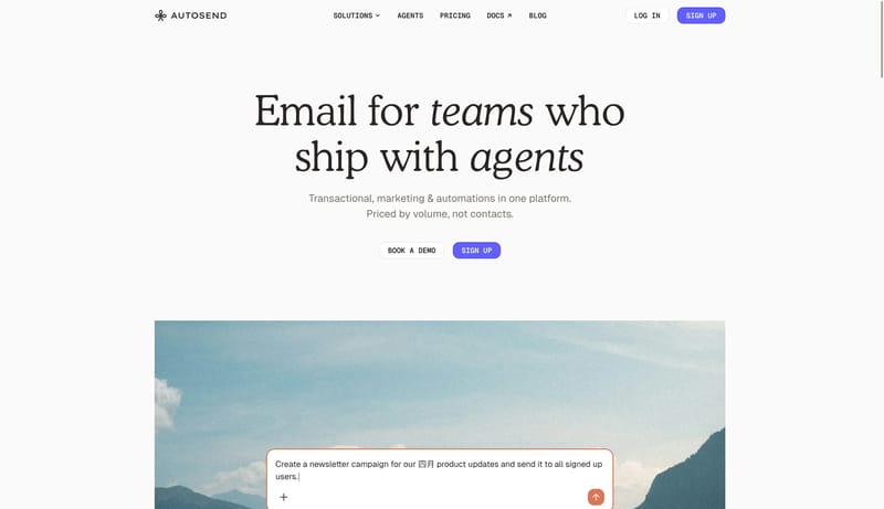
Image Direction

  • Use desk objects, receipts, task fragments, inbox snippets, and simple form cards as the recurring image system.
  • Crop objects at the frame edge so the scene feels larger than the viewport.
  • Keep the object layer supportive. The main message should still dominate the first read.

Colors

  • FFFFFF and F4F6F8 should create a bright paper-ground system rather than a sterile flat white screen.
  • 232A35 is the main ink color for copy, strong chips, and important marks.
  • D8DEE8 should stay quiet in card outlines and subtle structure.

Typography

  • Use one strong modern sans for the main hierarchy and supporting body copy.
  • Keep the headline oversized, centered, and direct.
  • Use a handwritten or stamped accent sparingly for tiny marks or labels.
SpacePlay/PauseSeek 1sShiftSeek 10s