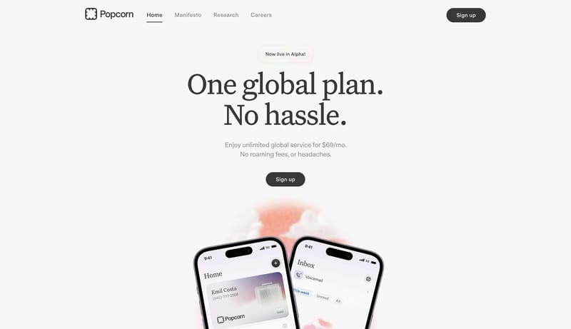
Build the page as a pale field with one giant serif promise and almost no noise around it. Let one dark capsule CTA and one tiny pearlescent tag do the UI punctuation. Use the hardware object as a quiet lower-stage proof...
- Build the page as a pale field with one giant serif promise and almost no noise around it.
- Let one dark capsule CTA and one tiny pearlescent tag do the UI punctuation.
Open examplegenerated at: "2026-04-28T20:24:00+08:00" system: name: "Factory Sunrise Operations" slug: "factory-sunrise-operations" summary: "An operations marketing system that frames product proof inside a bright shell punctuated...
- "white interface shell with black CTA punctuation"
- "painterly industrial landscapes"
Open exampleBuild the experience like a launch message dropped onto a real desk. Keep one bold headline at the center and let smaller utility artifacts orbit around it. Use paper texture, cropped peripherals, and rounded cards to cr...
- Build the experience like a launch message dropped onto a real desk.
- Keep one bold headline at the center and let smaller utility artifacts orbit around it.
Open example