
Available Pages

Version History

Design Analysis

ClickUp Home design analysis

--- version: alpha name: Gradient Productivity Stage description: Proof-led software-marketing system with white breathing room, dark product theaters, polished app windows, and concentrated iridescent gradients. colors:...

Key Takeaways

  • Primary ( 292D34): main text and dark action color.
  • Secondary ( FFFFFF): bright card and control surface.
  • Tertiary ( 5C8BFF): one cool gradient anchor.
  • Display: bold and contemporary, with tight spacing.
  • Body: practical and product-led.
  • Labels: small and consistent across app proof and marketing chrome.

Overview

Gradient Productivity Stage is a software-marketing system that feels broad, polished, and credible. White proof sections carry the main narrative, while occasional dark product theaters and concentrated gradient objects create premium emphasis.
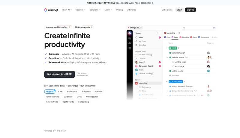
Image Direction

Use polished app windows, product mosaics, and one or two concentrated gradient objects as proof. Visual drama should come from the software and its framing, not from decorative background noise.

Colors

The palette is mostly neutral with controlled bursts of gradient energy.

  • Primary ( 292D34): main text and dark action color.
  • Secondary ( FFFFFF): bright card and control surface.
  • Tertiary ( 5C8BFF): one cool gradient anchor.

Typography

Use a clean modern sans with strong but not aggressive weight.

  • Display: bold and contemporary, with tight spacing.
  • Body: practical and product-led.
  • Labels: small and consistent across app proof and marketing chrome.
SpacePlay/PauseSeek 1sShiftSeek 10s