Kaiunta
Home
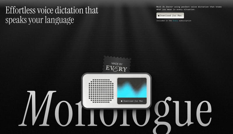
Build a warm utility shell that feels tactile and lightweight rather than polished and corporate. Let typography and button silhouettes carry personality before introducing graphic effects. Keep the interaction model obv...
- Build a warm utility shell that feels tactile and lightweight rather than polished and corporate.
- Let typography and button silhouettes carry personality before introducing graphic effects.