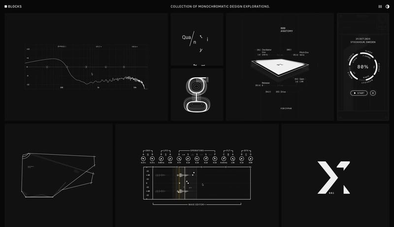
Browse all Sections

Section

Bento Grid Website Inspiration

Browse 8 curated Bento Grid website examples to compare repeated section patterns, layout systems, messaging structure, and interaction details.

8 curated examples24 per page

What To Compare

Review how teams design Bento Grid sections through layout choices, copy hierarchy, media usage, interaction patterns, and CTA placement.

What To Compare

Pay attention to heading rhythm, supporting copy, cards, imagery, interaction cues, and what each Bento Grid section asks the user to do next.

Design Analysis

What stands out in Bento Grid websites

--- version: alpha name: "Cindori Design Language" description: "A cinematic dark storefront for polished Mac utilities, driven by large product banners, premium app imagery, and clear purchase actions." colors: primary:... --- version: alpha name: Gradient Pr...

Recurring Signals

  • Build for a premium Mac-utility storefront with strong Apple-adjacent polish.
  • Let the first impression come from cinematic product art and large dark product banners.
  • Keep the voice direct and product-centered rather than editorial or narrative-heavy.
  • Use large, polished app screenshots, wallpapers, and glossy icon compositions.
  • Keep each major product module focused on one dominant scene.
  • Maintain dark, controlled image treatment with blue-violet energy rather than many competing color accents.

Related Keywords

OverviewImage DirectionColorsTypographySecondary ( FFFFFF): bright card and control surfaceTertiary ( 5C8BFF): one cool gradient anchorDisplay: bold and contemporary, with tight spacingBody: practical and product-ledAvoid mixing in extra decorative type families

Backdrop

Home

2026-04-30

--- version: alpha name: "Cindori Design Language" description: "A cinematic dark storefront for polished Mac utilities, driven by large product banners, premium app imagery, and clear purchase actions." colors: primary:...

  • Build for a premium Mac-utility storefront with strong Apple-adjacent polish.
  • Let the first impression come from cinematic product art and large dark product banners.
Open example

ClickUp

Home

2026-01-30

--- version: alpha name: Gradient Productivity Stage description: Proof-led software-marketing system with white breathing room, dark product theaters, polished app windows, and concentrated iridescent gradients. colors:...

  • Primary ( 292D34): main text and dark action color.
  • Secondary ( FFFFFF): bright card and control surface.
Open example

Wimp Decaf

Home

2026-02-01

--- version: alpha name: "Cream Pop Pantry" description: "Playful pantry-commerce system with cream shells, giant compressed headlines, and a loud orange retail accent." colors: primary: " 2A292B" secondary: " EFE5DA" te...

  • Primary ( 2A292B): Headline ink and core interface text.
  • Secondary ( EFE5DA): Navigation shell and grouped support surfaces.
Open example

Bento Grid Inspiration FAQ

What should I compare on a Bento Grid section page?

Compare heading structure, supporting copy, media choice, CTA placement, content density, and how each Bento Grid section supports the broader page narrative.

Why browse Bento Grid references as a dedicated collection?

A focused Bento Grid collection removes unrelated page sections, which makes it easier to spot repeated layout and messaging patterns across many sites.