Design Analysis
What stands out in Desktop App websites
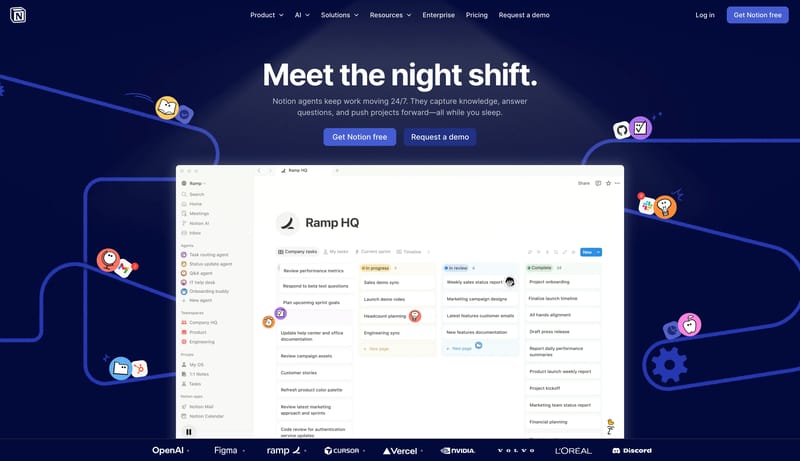
Treat the system like a clean utility manual: direct, efficient, and screenshot-led. Use blue actions to point the way without over-branding the shell. Let docs, changelog, and marketing all feel like one family. Use app... Use a warm cream canvas, huge bold t...
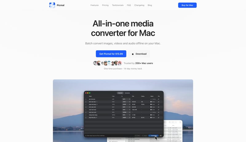
Treat the system like a clean utility manual: direct, efficient, and screenshot-led. Use blue actions to point the way without over-branding the shell. Let docs, changelog, and marketing all feel like one family. Use app...
- Treat the system like a clean utility manual: direct, efficient, and screenshot-led.
- Use blue actions to point the way without over-branding the shell.
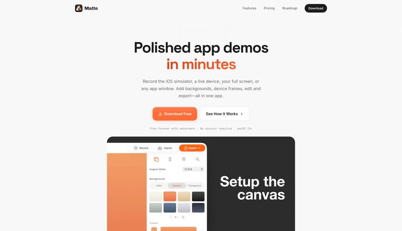
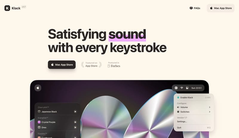
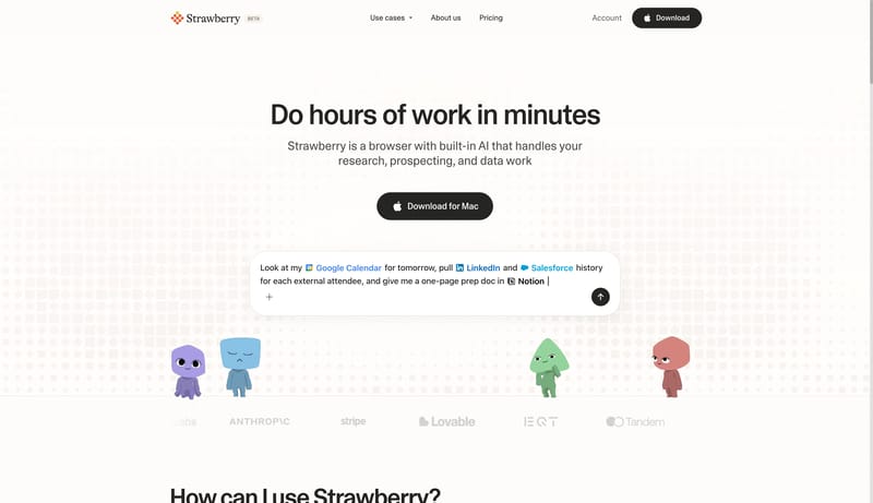
Open exampleUse a warm cream canvas, huge bold type, dark rounded download buttons, tactile product mockups, and oversized line icons. The interface should feel satisfying and physical.
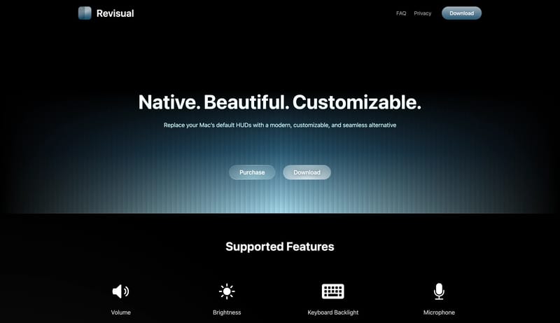
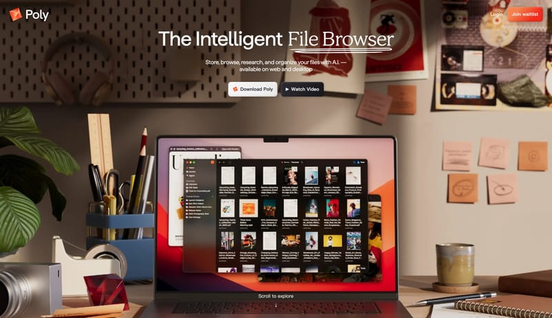
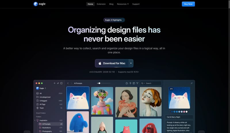
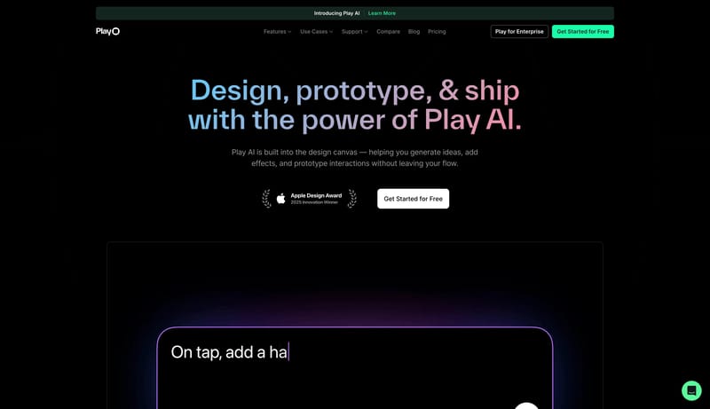
Open exampleThis design language is a dark, polished system for creative asset workflows. It should feel like a premium desktop tool: black canvas, luminous blue controls, large app-window proof, and feature cards that behave like w...
Open example