Browse all Categories

Category

Design Website Inspiration

Browse 131 curated Design website examples to study positioning, page structure, conversion patterns, and product storytelling across modern websites.

131 curated examples24 per pagePage 3 of 6

What To Study

Compare how Design products introduce value, sequence content blocks, frame trust, and turn visitors into qualified users or customers.

What To Compare

Focus on headline angle, proof blocks, navigation depth, pricing exposure, and how quickly Design sites communicate their offer.

Design Analysis

What stands out in Design websites

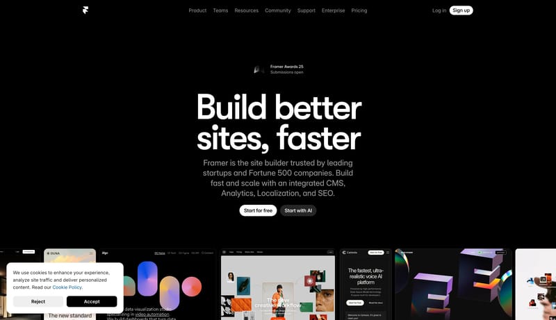
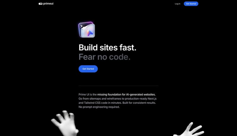
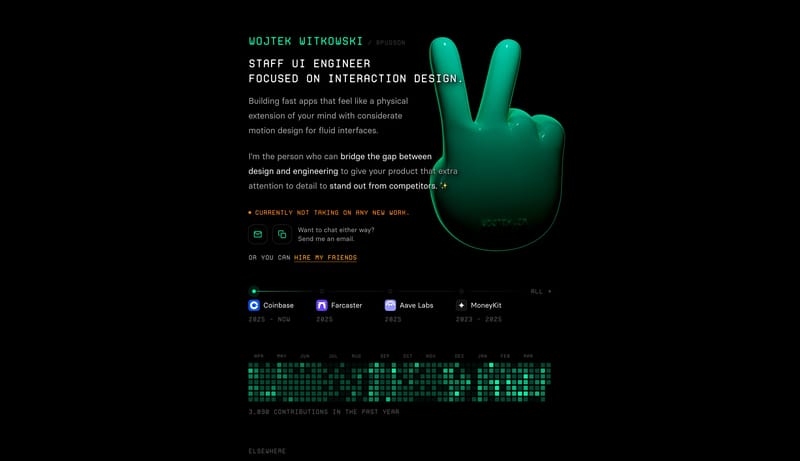
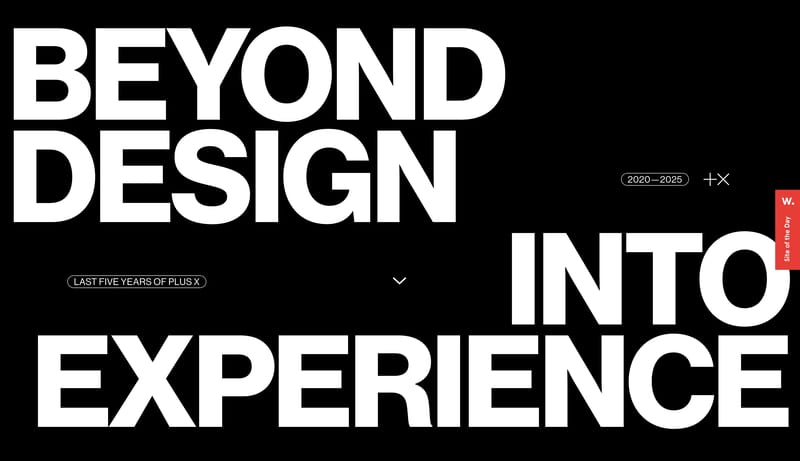
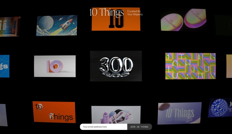
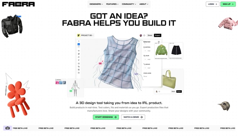
Midnight Builder Marquee is a black-first launch system that sells speed and polish through reduction. The shell should feel almost empty at first glance: one oversized white headline, one short block of cool-gray suppor... Editorial Conversion Grid is a conve...

Recurring Signals

  • Primary ( FFFFFF): Display text and the highest-intent CTA fill.
  • Secondary ( 1B1B1B): Quiet dark support action fill and panel tone.
  • Tertiary ( 8E8E93): Support copy, muted navigation, and low-priority labels.
  • Display: Very large, bold, tightly tracked, and tightly leaded.
  • Body: Neutral and readable, with restrained width under the hero.
  • Labels: Slightly heavier than body copy so small navigation items do not disappear on black.

Related Keywords

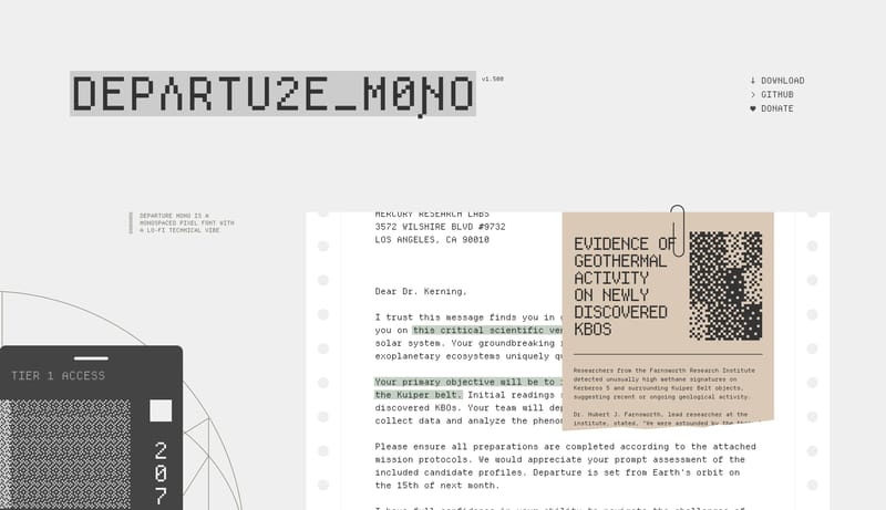
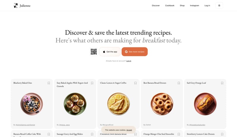
OverviewImage DirectionColorsTypographyUse pearl white as the default fieldUse soft mist for pills and neutral panelsUse one rounded grotesk family across the systemKeep display type large, open, and lightly weightedAvoid compressed headings or aggressive weight jumpsKeep the page mostly pale and airyPrimary ( 444444): Main text and structural inkKeep all visible type mono and pixel-driven

Framer

Home

2026-01-23

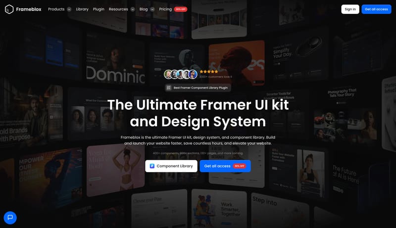
Midnight Builder Marquee is a black-first launch system that sells speed and polish through reduction. The shell should feel almost empty at first glance: one oversized white headline, one short block of cool-gray suppor...

  • Primary ( FFFFFF): Display text and the highest-intent CTA fill.
  • Secondary ( 1B1B1B): Quiet dark support action fill and panel tone.
Open example

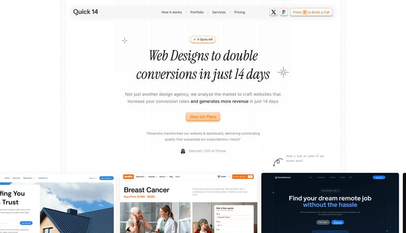
Quick14

Home

2026-02-07

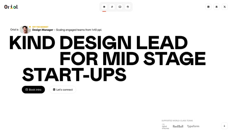
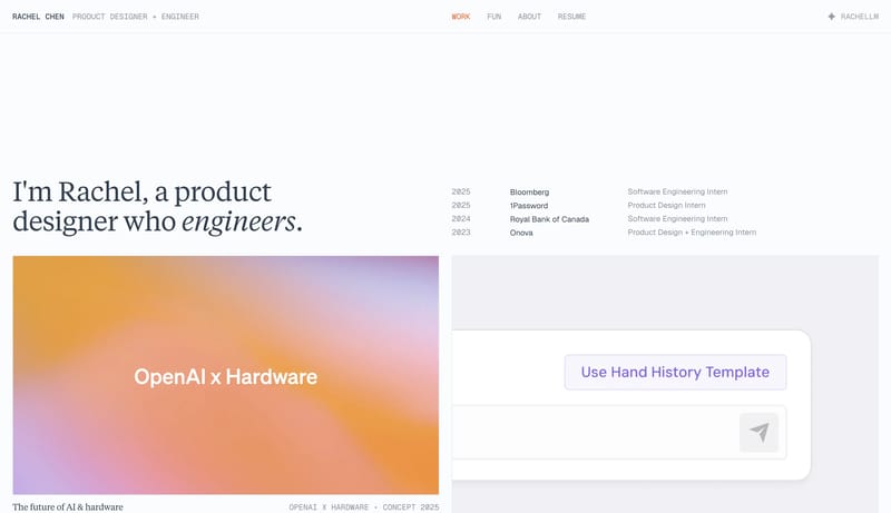
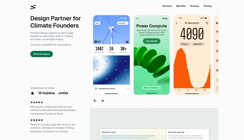
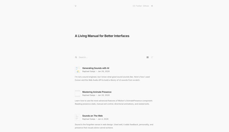
Editorial Conversion Grid is a conversion studio system that trades generic startup polish for sharp typography, clean white space, and visible annotation energy. It should feel fast, opinionated, and highly legible.

Open example

Jackie Zhang

Home

2025-12-29

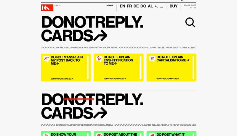
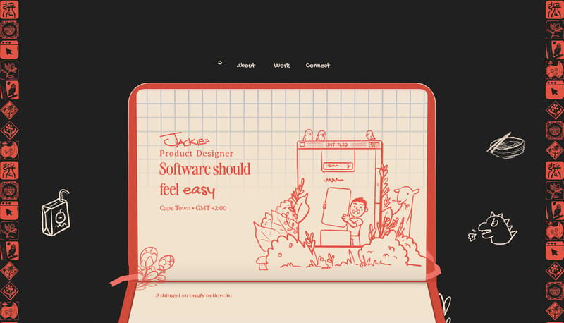
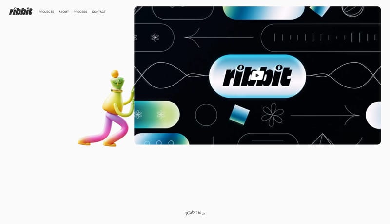
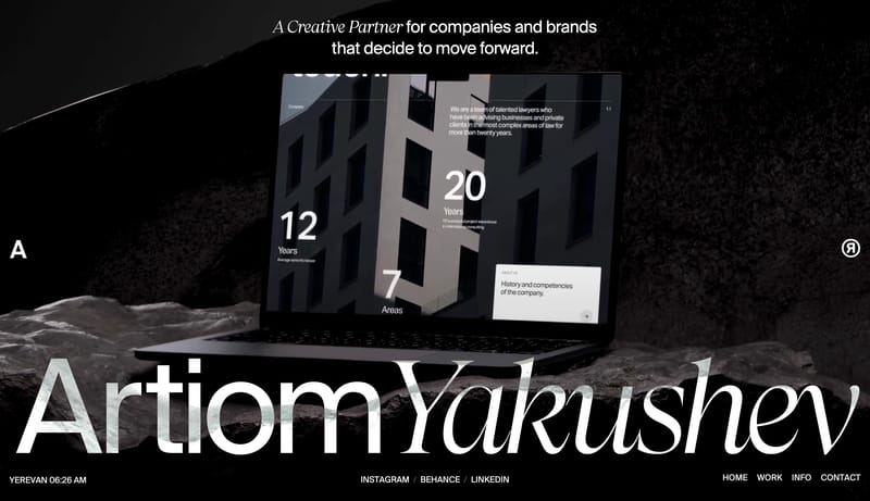
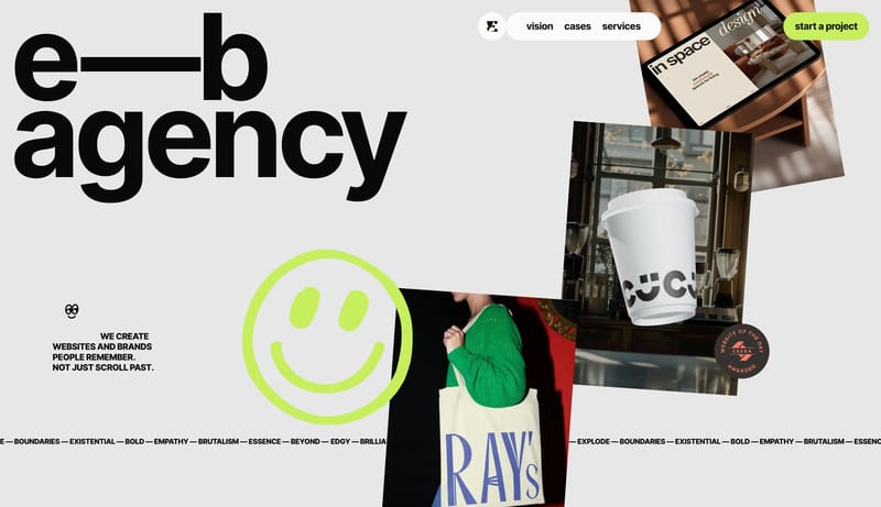
Build the experience as a dark stage with one dominant warm paper object carrying the main story. Let the interface feel handmade, but not sloppy: every doodle, sticker, and offset layer should still support clear readin...

  • Build the experience as a dark stage with one dominant warm paper object carrying the main story.
  • Let the interface feel handmade, but not sloppy: every doodle, sticker, and offset layer should still support clear reading order.
Open example

Continue Exploring

Use these internal hubs to keep branching from Design into broader design research, structured design analysis, or adjacent website inspiration taxonomies.

Design Inspiration FAQ

What can I learn from Design website examples?

You can compare how Design websites structure positioning, product explanation, proof, conversion flow, and page hierarchy across real products.

How many Design references are in this collection?

This page currently includes 131 curated Design references with screenshot and version context so you can compare patterns instead of isolated visuals.