Browse all Styles

Style

Transitions Website Inspiration

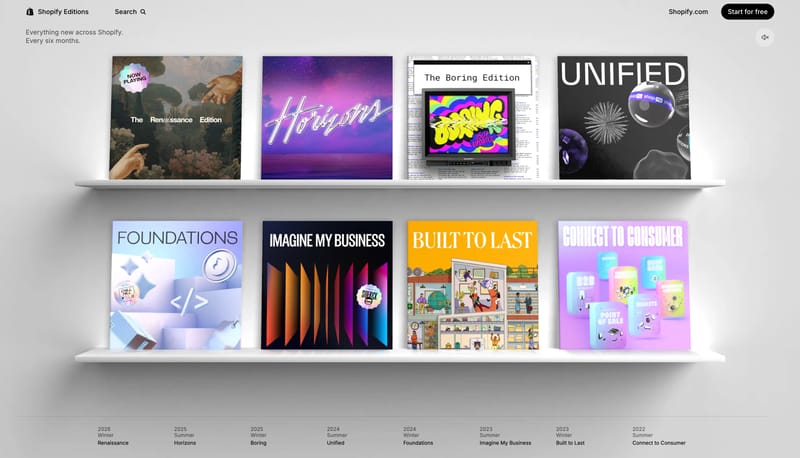
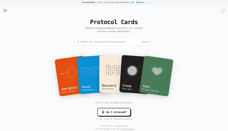
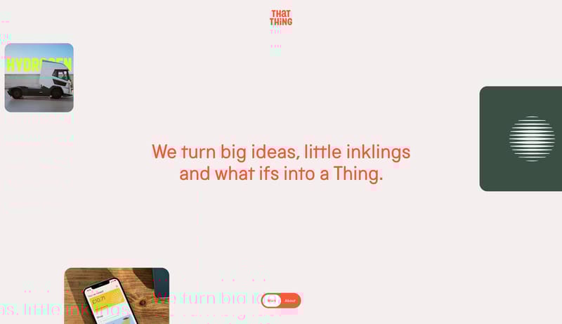
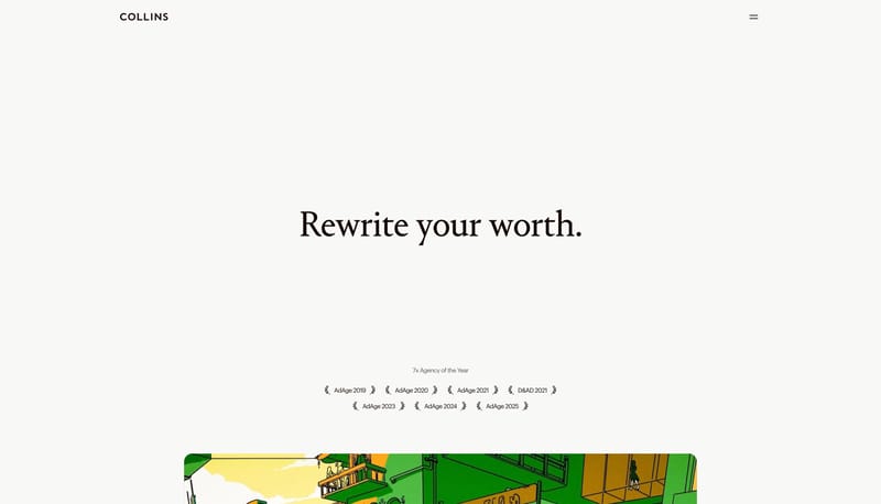
Browse 36 curated Transitions website examples to review visual direction, typography, color systems, motion, and overall brand expression.

36 curated examples24 per pagePage 2 of 2

What To Look For

Study how Transitions style decisions affect first impression, readability, visual tension, motion, and the overall feel of the product.

What To Compare

Pay attention to color contrast, type pairings, spacing density, illustration treatment, motion restraint, and how the Transitions style stays consistent across the page.

Design Analysis

What stands out in Transitions websites

--- version: alpha name: "Aurora Telemetry Light" description: "A bright analytics marketing language built from white cards, periwinkle CTAs, aurora backdrops, and friendly data visualization." colors: primary: " 8B82FF... --- version: alpha name: Speculative...

Recurring Signals

  • Build the experience as a lightweight analytics product that feels welcoming rather than technical.
  • Keep the page mostly white, then use blue-violet energy around hero product moments.
  • Let rounded cards and gentle shadows carry dense information without making it feel heavy.
  • Use dashboard mockups, map views, charts, and small data cards as the main image language.
  • Float hero product frames over soft aurora or sky-toned gradient fields.
  • Keep visuals bright, crisp, and consumer-friendly even when they represent analytics.

Related Keywords

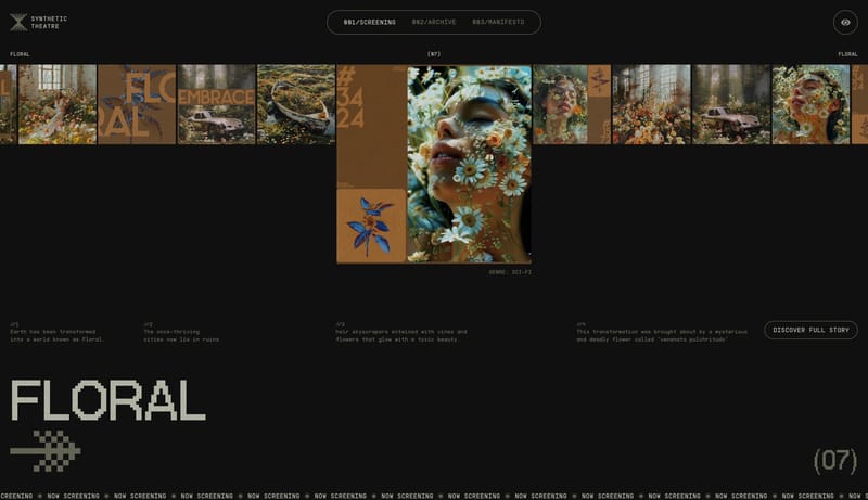
OverviewImage DirectionColorsTypographyPrimary ( 07080B): the main black theater fieldSecondary ( F7F7F5): text and light-surface counterpartDisplay: sparse, high-stakes, and slightly luxuriousBody: crisp and technicalUtility: tiny mono-style labels for controls and segmentationLet monochrome pills keep the interaction posture groundedKeep proof tidy and clearly categorizedUse white and dark graphite as the base

Visitors

Home

2025-12-30

--- version: alpha name: "Aurora Telemetry Light" description: "A bright analytics marketing language built from white cards, periwinkle CTAs, aurora backdrops, and friendly data visualization." colors: primary: " 8B82FF...

  • Build the experience as a lightweight analytics product that feels welcoming rather than technical.
  • Keep the page mostly white, then use blue-violet energy around hero product moments.
Open example

GTE

Home

2026-01-29

--- version: alpha name: Speculative Market Ledger description: High-stakes trading-platform system with black theater stages, serif headlines, orange signal controls, and technical diagram chapters. colors: primary: " 0...

  • Primary ( 07080B): the main black theater field.
  • Secondary ( F7F7F5): text and light-surface counterpart.
Open example

Mixpanel

Home

2026-01-14

--- version: "alpha" name: "Lilac Signal Ledger" description: "A bright analytics marketing system with giant dark headlines, lilac signal tiles, fine violet outlines, monochrome pills, and a soft lavender glow." colors:...

  • Build the system as white space, giant dark statements, and one orderly row of signal tiles.
  • Use lilac and violet to energize proof without changing the page shell into an accent wash.
Open example

Transitions Inspiration FAQ

What can this Transitions style collection help with?
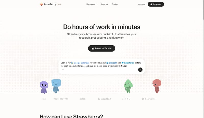
It helps you compare visual tone, typography, color systems, spacing density, illustration treatment, and motion choices used in Transitions website design.

How should I use Transitions style references?

Use them to calibrate creative direction, collect mood references, and decide which visual traits feel distinctive enough to adapt for your own product.