Design Analysis
What stands out in Transitions websites
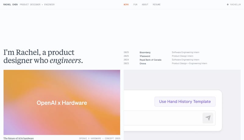
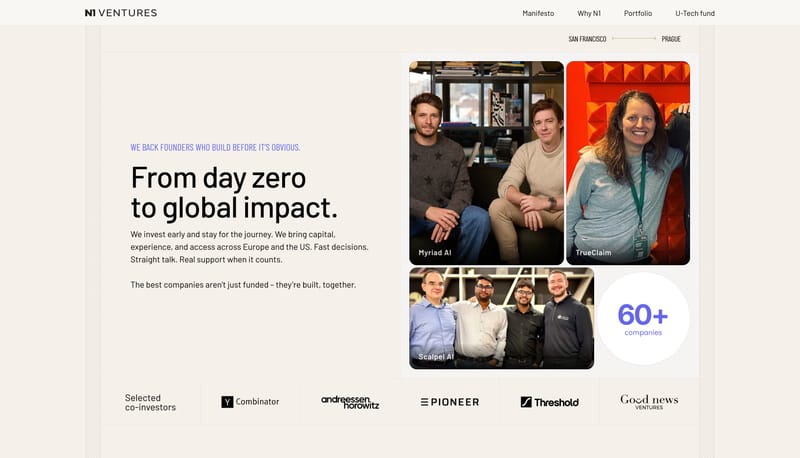
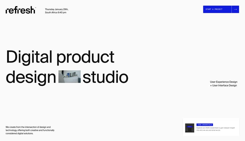
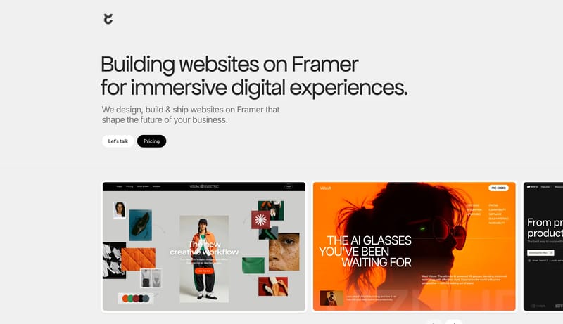
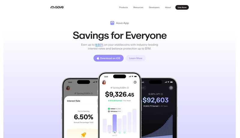
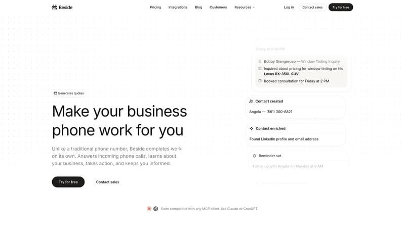
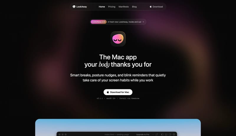
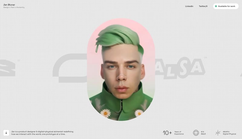
Build a selective studio shell where type, spacing, and media carry most of the brand weight. Keep interfaces visually quiet so case-study imagery or hero moments stay primary. Let one accent or one tonal inversion punct... Build a technical product shell with...
Build a selective studio shell where type, spacing, and media carry most of the brand weight. Keep interfaces visually quiet so case-study imagery or hero moments stay primary. Let one accent or one tonal inversion punct...
- Build a selective studio shell where type, spacing, and media carry most of the brand weight.
- Keep interfaces visually quiet so case-study imagery or hero moments stay primary.
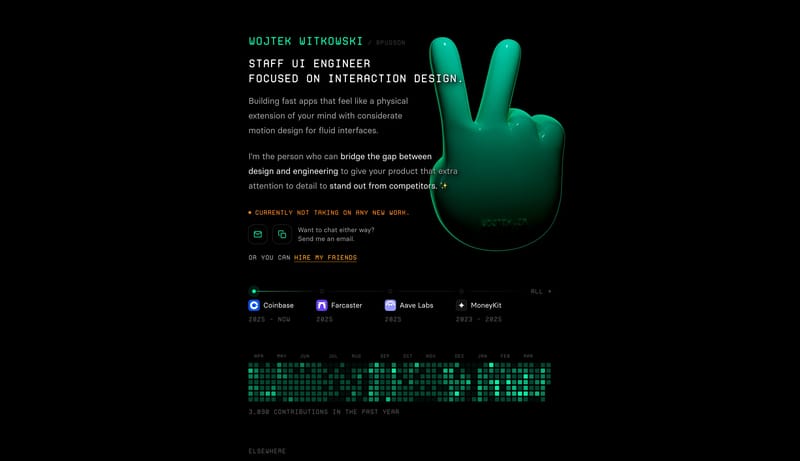
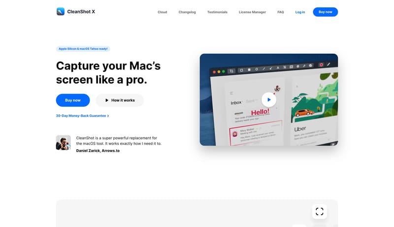
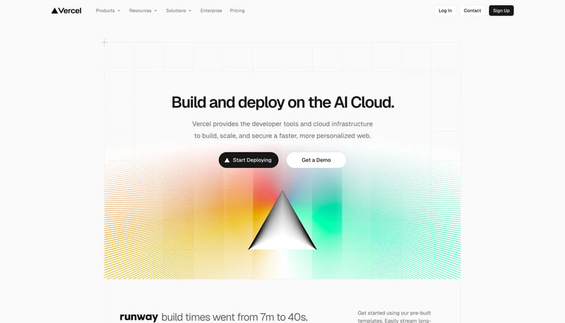
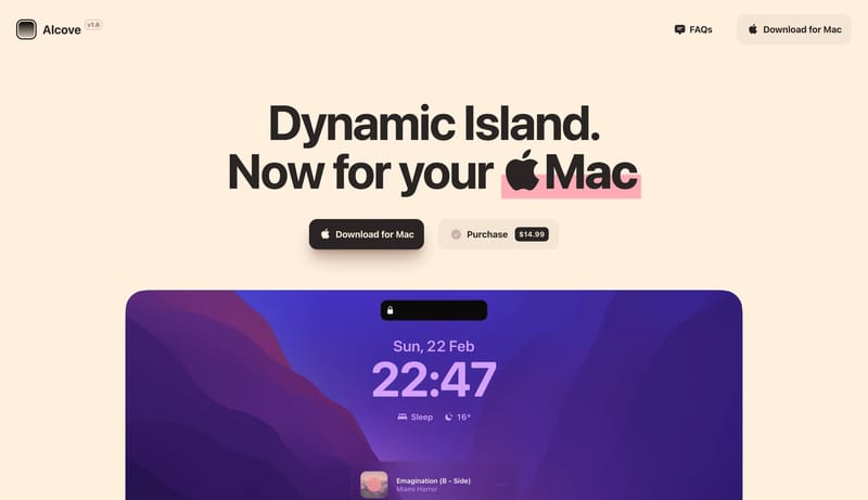
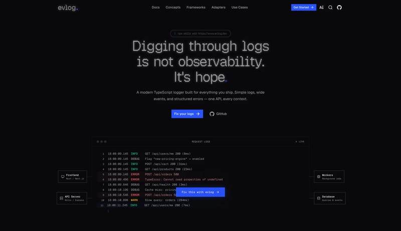
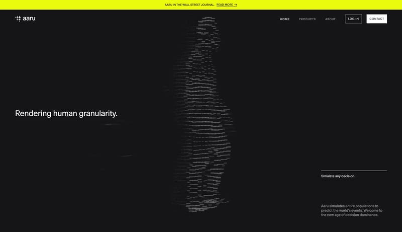
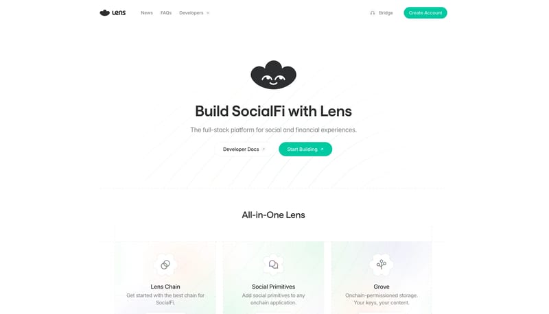
Open exampleBuild a technical product shell with one clear signal accent and a disciplined content hierarchy. Let the product frame, proof panels, or code-adjacent motifs carry credibility instead of decorative gradients. Use motion...
- Build a technical product shell with one clear signal accent and a disciplined content hierarchy.
- Let the product frame, proof panels, or code-adjacent motifs carry credibility instead of decorative gradients.
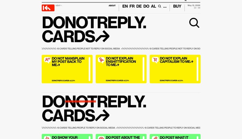
Open exampleBuild a selective studio shell where type, spacing, and media carry most of the brand weight. Keep interfaces visually quiet so case-study imagery or hero moments stay primary. Let one accent or one tonal inversion punct...
- Build a selective studio shell where type, spacing, and media carry most of the brand weight.
- Keep interfaces visually quiet so case-study imagery or hero moments stay primary.
Open example


