Design Analysis
What stands out in Parallax websites
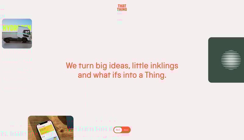
Signal Coral Story Studio should feel like a brand studio that thinks in chapters, not in modules. The page alternates between off-white emptiness and bold coral fields, while one blunt grotesk family delivers everything... Robotic Editorial Calm is a hardware...
Recurring Signals
- Use coral as a true structural color for chapters, active pills, and emphasis.
- Keep the default shell close to off-white paper.
- Use black as a dense content tone, not as a luxury gloss move.
- Keep the system on one blunt grotesk family.
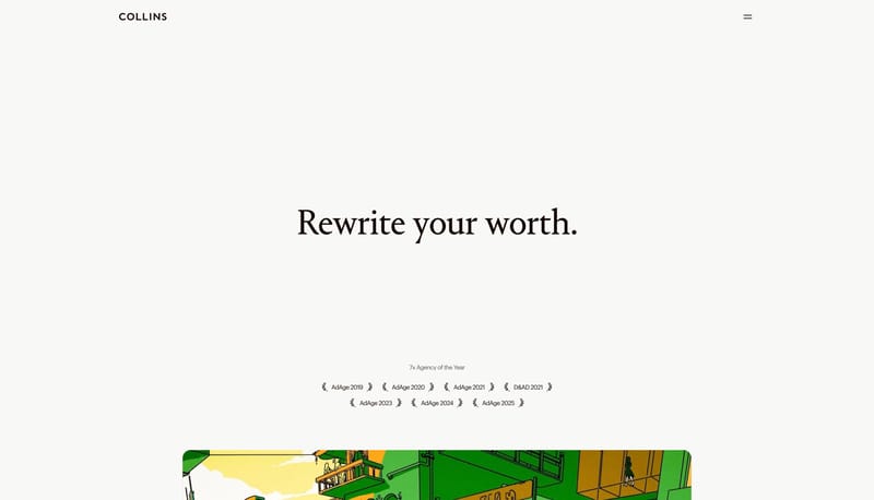
- Use very large lines and generous spacing to create drama.
- Avoid decorative type mixing; the strength comes from scale, not from typographic variety.
Related Keywords
OverviewImage DirectionColorsTypographyKeep the default shell close to off-white paperKeep the system on one blunt grotesk familySecondary ( D7E0DB): calm technical backdropTertiary ( EEDB3C): tiny observational signalDisplay: very large, sparse, and low-dramaBody: concise, explanatory, and calmLabels: minimal, mostly for navigation or tiny metadataUse full-bleed landscape media as the first impression
Signal Coral Story Studio should feel like a brand studio that thinks in chapters, not in modules. The page alternates between off-white emptiness and bold coral fields, while one blunt grotesk family delivers everything...
- Use coral as a true structural color for chapters, active pills, and emphasis.
- Keep the default shell close to off-white paper.
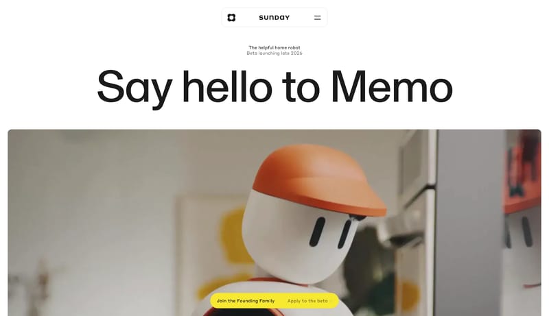
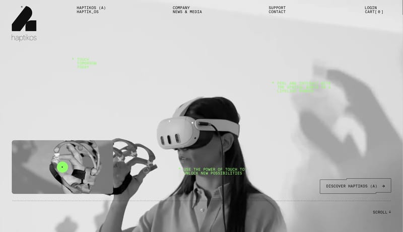
Open exampleRobotic Editorial Calm is a hardware-marketing system that builds trust through stillness. Large quiet headlines, pale material fields, and tactile imagery do most of the persuasion, while darker technical chapters arriv...
- Primary ( 1F2322): main text and dark action color.
- Secondary ( D7E0DB): calm technical backdrop.
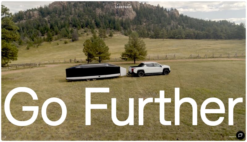
Open exampleUse full-bleed landscape media as the first impression. Let the page oscillate between cinematic outdoor scale and grounded technical panels. Keep the controls black, minimal, and secondary to the image story. Favor moun...
- Use full-bleed landscape media as the first impression.
- Let the page oscillate between cinematic outdoor scale and grounded technical panels.
Open example