Design Analysis
What stands out in Grid websites
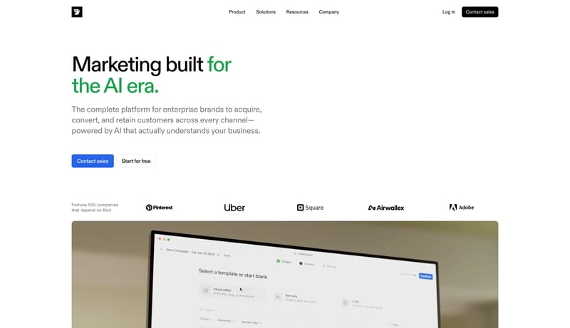
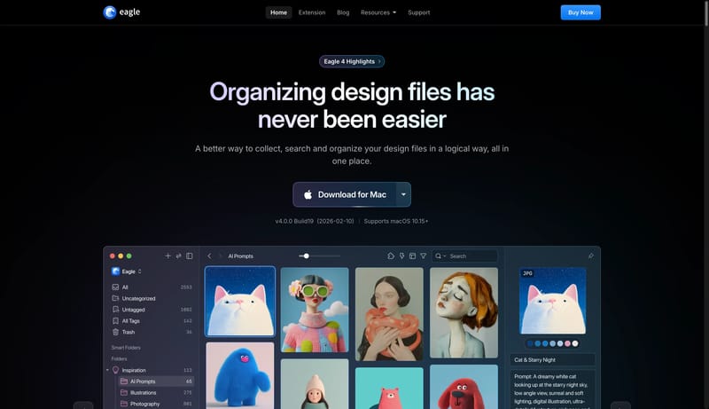
Build a technical product shell with one clear signal accent and a disciplined content hierarchy. Let the product frame, proof panels, or code-adjacent motifs carry credibility instead of decorative gradients. Use motion... Build a property-marketing shell whe...
Build a technical product shell with one clear signal accent and a disciplined content hierarchy. Let the product frame, proof panels, or code-adjacent motifs carry credibility instead of decorative gradients. Use motion...
- Build a technical product shell with one clear signal accent and a disciplined content hierarchy.
- Let the product frame, proof panels, or code-adjacent motifs carry credibility instead of decorative gradients.
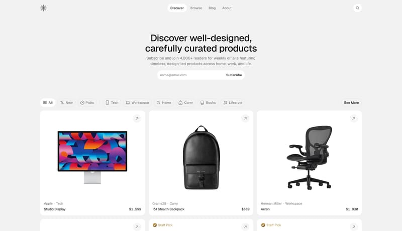
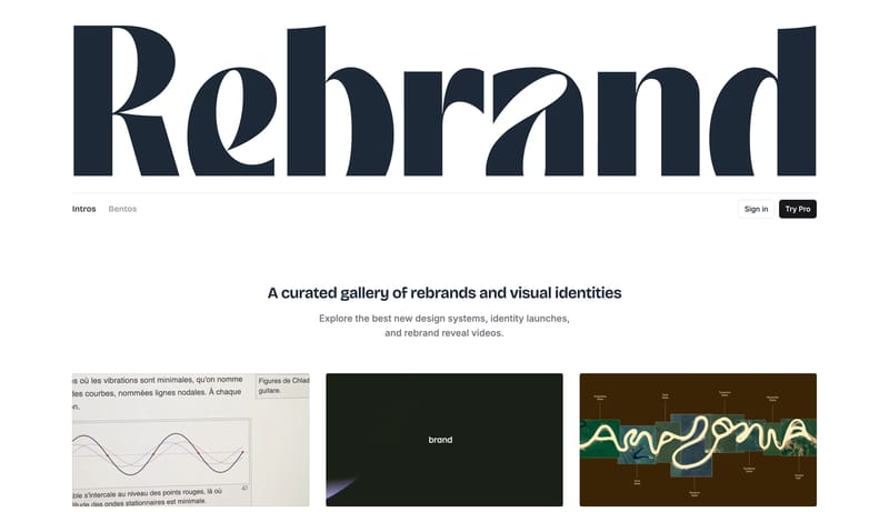
Open exampleBuild a property-marketing shell where imagery, place, and atmosphere do more work than interface novelty. Keep the framework premium and calm even when the brand uses bold introductory motion or color-coded navigation....
- Build a property-marketing shell where imagery, place, and atmosphere do more work than interface novelty.
- Keep the framework premium and calm even when the brand uses bold introductory motion or color-coded navigation.
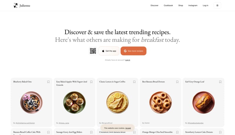
Open exampleBuild for a cheerful consumer writing tool with a strong first-screen personality. Let the hero feel bright, buoyant, and instantly legible. Keep secondary pages calmer and cleaner, but still clearly part of the same fri...
- Build for a cheerful consumer writing tool with a strong first-screen personality.
- Let the hero feel bright, buoyant, and instantly legible.
Open example