Design Analysis
What stands out in Science websites
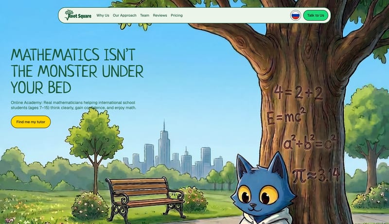
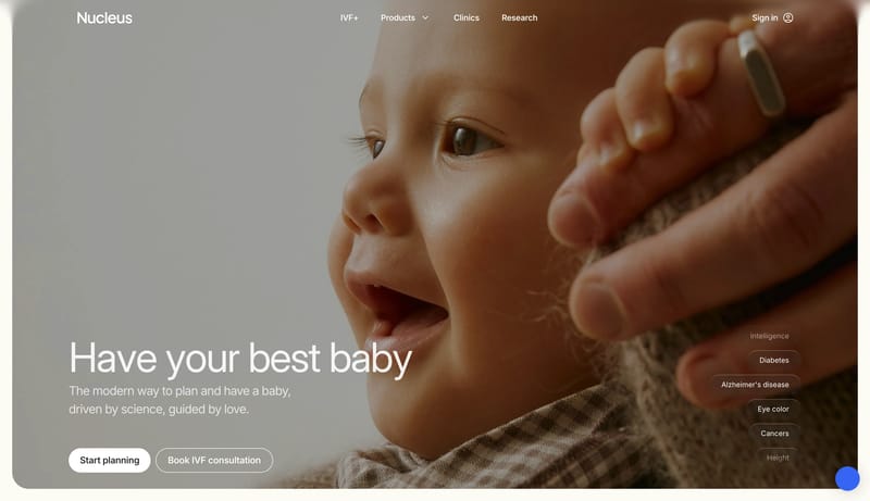
Build a learning shell that feels encouraging and characterful without becoming chaotic. Use playful type, illustration, and color as the trust engine before adding dense product UI. Keep actions obvious and high-contras... Start with technical confidence: dar...
Build a learning shell that feels encouraging and characterful without becoming chaotic. Use playful type, illustration, and color as the trust engine before adding dense product UI. Keep actions obvious and high-contras...
- Build a learning shell that feels encouraging and characterful without becoming chaotic.
- Use playful type, illustration, and color as the trust engine before adding dense product UI.
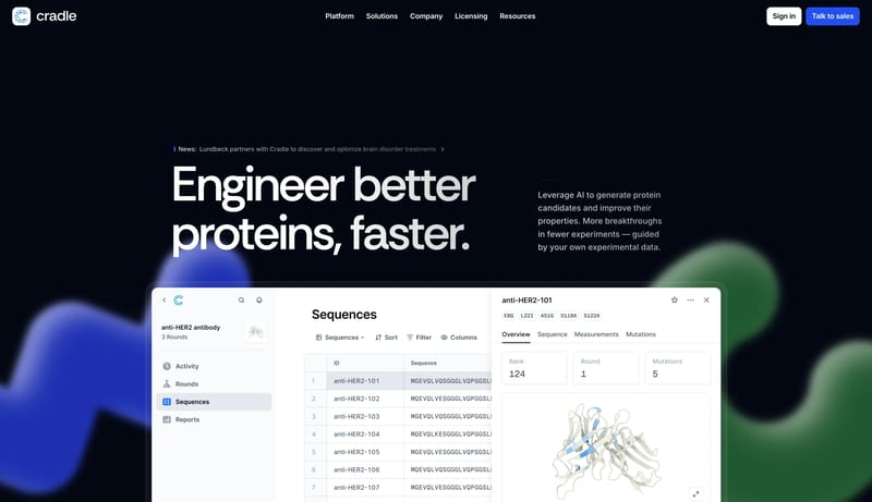
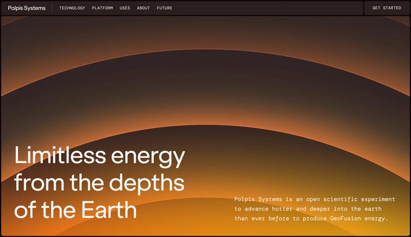
Open exampleStart with technical confidence: dark hero, strong software proof, and one bright action color. Resolve quickly into clean white sections so the brand still feels usable and scientific. Let the product window do the heav...
- Start with technical confidence: dark hero, strong software proof, and one bright action color.
- Resolve quickly into clean white sections so the brand still feels usable and scientific.
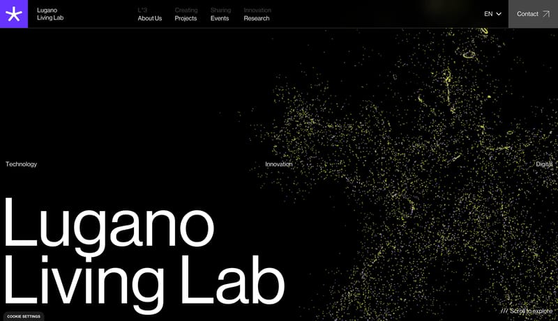
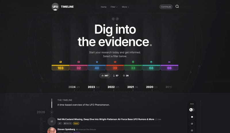
Open exampleThis design language is for dense research archives and event chronologies. It uses a grainy charcoal shell, huge white entry headlines, bright category counters, a horizontal year ruler, a vertical event timeline, and a...
Open example