
Jackie Zhang

Jackie Zhang

Hey there, I'm Jackie, a product designer based in beautiful Cape Town, South Africa. ☀️. I design tools that help people do their best work.

4.0
64
Visits
Visit

Available Pages

Design Analysis

Jackie Zhang Home design analysis

--- version: alpha name: "Notebook Collage Noir" description: "A charcoal editorial portfolio language built from cream graph-paper surfaces, coral marker accents, and scrapbook-framed project artifacts." colors: primary...

Key Takeaways

  • Build the experience as a dark stage with one dominant warm paper object carrying the main story.
  • Let the interface feel handmade, but not sloppy: every doodle, sticker, and offset layer should still support clear reading order.
  • Treat the page like a curated notebook spread rather than a polished product dashboard.
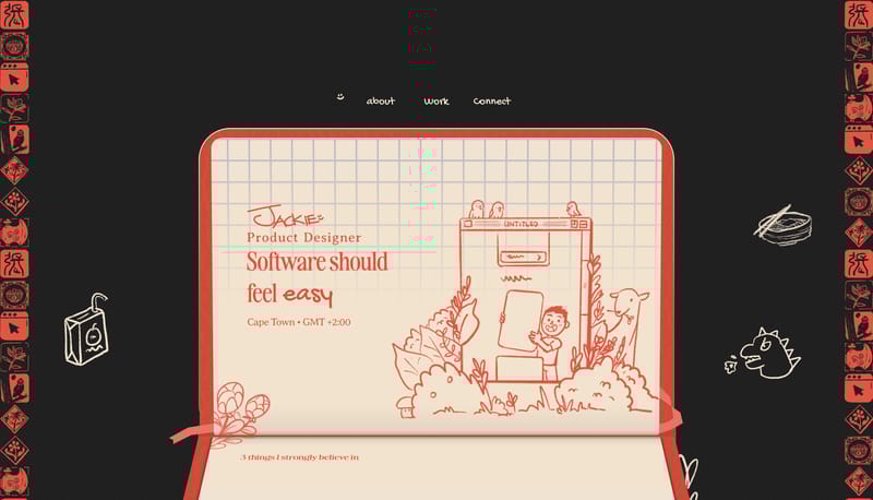
  • Use a recurring scrapbook image language: graph paper, clipped screenshots, pinned inserts, cutout portraits, and hand-drawn perimeter objects.
  • Keep one major content surface in focus and let supporting graphics orbit the edge rather than compete for attention.
  • Favor cream paper, charcoal voids, coral marker lines, and sparse yellow highlights over broad multicolor illustration.

Overview

  • Build the experience as a dark stage with one dominant warm paper object carrying the main story.
  • Let the interface feel handmade, but not sloppy: every doodle, sticker, and offset layer should still support clear reading order.
  • Treat the page like a curated notebook spread rather than a polished product dashboard.

Image Direction

  • Use a recurring scrapbook image language: graph paper, clipped screenshots, pinned inserts, cutout portraits, and hand-drawn perimeter objects.
  • Keep one major content surface in focus and let supporting graphics orbit the edge rather than compete for attention.
  • Favor cream paper, charcoal voids, coral marker lines, and sparse yellow highlights over broad multicolor illustration.

Colors

  • 212121 is the anchor color. Use it for the outer stage, deep negative space, and moments where warm paper needs room to breathe.
  • F2E3CF and F5E1CE are the main content surfaces. They should read as warm paper, not flat beige UI.
  • E35342 is the primary signal color. Use it for outlines, dividers, line art, handwritten emphasis, and selected navigation treatment.

Typography

  • Use a soft editorial serif for major statements and section headlines. The display voice should feel human and slightly nostalgic, not luxury-magazine polished.
  • Use a simple geometric sans for paragraph copy and explanatory text. The body system should be readable enough to carry case-study writing without visual fatigue.
  • Use a handwritten accent face sparingly for labels, notes, and route emphasis. It should behave like annotation, not like body copy.
SpacePlay/PauseSeek 1sShiftSeek 10s