Available Pages

Version History

Design Analysis

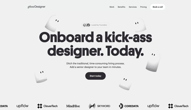
Ghost Designer Home design analysis

--- version: "alpha" name: "Soft Mascot Subscription" description: "A pale subscription-sales system with giant graphite headlines, white chips, dark slabs, and soft mascot punctuation." colors: primary: " 2D2A32" second...

Key Takeaways

  • Lead with one giant statement, one simple CTA, and one playful mascot cue.
  • Use white chips and dark slabs to keep the commercial structure obvious.
  • Keep the personality soft rather than hyper-illustrated.

  • Use soft mascot blobs, cropped portfolio proof, and very simple collage strips.
  • Treat imagery as punctuation around the sales story, not as a separate art direction.
  • Keep the shell pale gray rather than stark white.

Overview

  • Lead with one giant statement, one simple CTA, and one playful mascot cue.
  • Use white chips and dark slabs to keep the commercial structure obvious.
  • Keep the personality soft rather than hyper-illustrated.

Image Direction

  • Use soft mascot blobs, cropped portfolio proof, and very simple collage strips.
  • Treat imagery as punctuation around the sales story, not as a separate art direction.

Colors

  • Keep the shell pale gray rather than stark white.
  • Use graphite-plum as the big anchor tone and white as the chip surface.
  • Let color intensity come mainly from contrast, not from rainbow accents.

Typography

  • Use one heavy grotesk with tight spacing for the main promise.
  • Keep the body copy short and secondary.
SpacePlay/PauseSeek 1sShiftSeek 10s