Endless

Endless

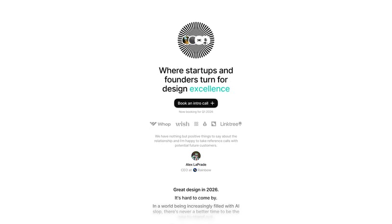
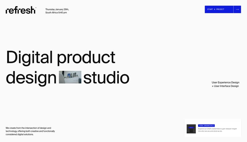
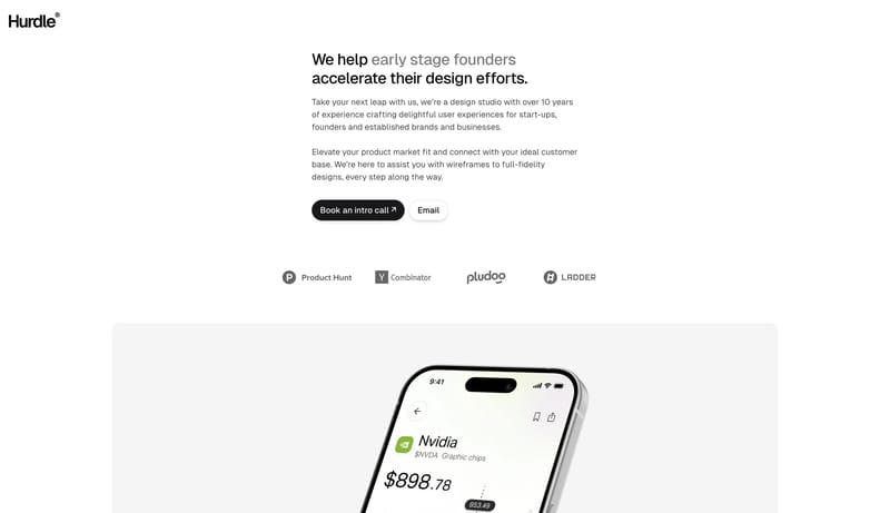
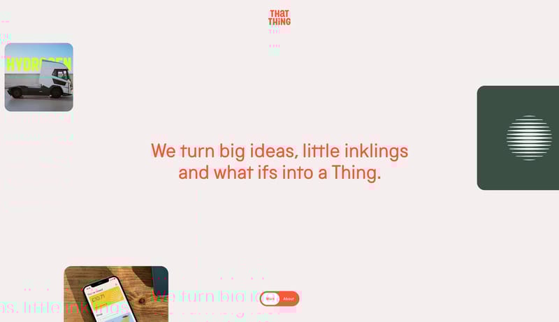
Design partner for startups and founders.

2.0
6
Visits
Visit

Available Pages

Version History

Design Analysis

Endless Home design analysis

--- version: alpha name: "Gallery Strip Minimalism" description: "A quiet studio portfolio language built from a narrow information rail, a long vertical gallery strip, and almost no decorative chrome." colors: primary:...

Key Takeaways

  • Build the experience like a quiet exhibition catalog.
  • Use a narrow left rail for metadata, navigation, and lightweight framing.
  • Let the main work live in a long vertical gallery strip with minimal interruption.

  • Use product samples as catalogued plates rather than as cinematic hero moments.
  • Favor clean mockups, isolated web captures, and softly sunwashed visual plates.
  • Keep imagery aligned and orderly inside the broader gallery strip.

Overview

  • Build the experience like a quiet exhibition catalog.
  • Use a narrow left rail for metadata, navigation, and lightweight framing.
  • Let the main work live in a long vertical gallery strip with minimal interruption.

Image Direction

  • Use product samples as catalogued plates rather than as cinematic hero moments.
  • Favor clean mockups, isolated web captures, and softly sunwashed visual plates.
  • Keep imagery aligned and orderly inside the broader gallery strip.

Colors

  • FFFFFF should dominate the page and keep the studio shell nearly invisible.
  • 151515 anchors the system through text, marks, and the rare firm detail.
  • E4E4E0 should create barely-there rules and structural separation.

Typography

  • Use one neutral grotesk family for the main hierarchy and body.
  • Use mono for tiny labels, navigation detail, and rail metadata.
  • Keep typographic contrast subtle. The structure should feel cataloged, not advertised.
SpacePlay/PauseSeek 1sShiftSeek 10s