
Dot

Dot

The fastest menu bar calendar for Mac. See your schedule, join Zoom, Meet, or Teams meetings with one click, and create events with natural language. Native macOS app.

5.0
11
Visits
Visit

Categories

Sections

Available Pages

Version History

Design Analysis

Dot Home design analysis

--- version: alpha name: Warm Menu Bar Calendar description: A warm off-white desktop utility language with floating pill navigation, editorial hero type, dark tactile actions, rounded calendar cards, and tiny colored ev...

Overview

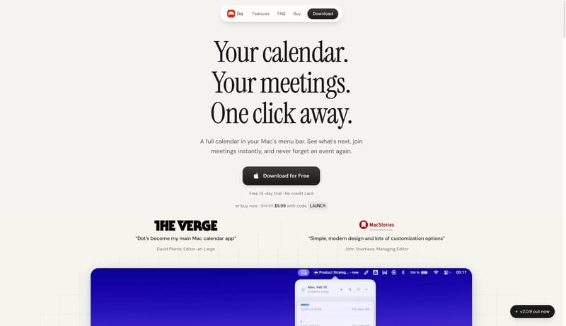
This design language presents a desktop utility as quiet, warm, and immediately understandable. The page should feel like a refined paper surface with one centered promise, a floating pill nav, a dark tactile action, and a small amount of calendar evidence. Use one product object per viewport. Calendar cards, menu-bar strips, and release pills should be compact proof points, not a crowded dashboard.
Colors

Use FDFBF7 as the main canvas and 1C1917 for primary text and dark actions. Use FFFFFF for floating navigation and calendar cards. Use F5F3EE for recessed rows, soft panels, and hover states. Use red as a small identity or release signal. Event colors should appear as dots, small chips, or timeline marks only.

Typography

Use a warm editorial serif for the largest hero line and oversized footer wordmarks. Use a rounded product sans for body copy, controls, metadata, and all calendar UI. Hero text can be very large, around 72px / 78px, with calm centered composition. Product sections should step down to 32px / 40px, with body copy at 16px / 24px.

Layout

Keep the first viewport sparse: floating nav at the top, centered headline, short copy, one action row, and one proof object or press row below. Let warm whitespace separate sections before introducing dividers. Feature areas should use soft two-column or three-card grids. Cards should be wide, rounded, and quiet, with small nested rows or calendar cells inside.

SpacePlay/PauseSeek 1sShiftSeek 10s