Devouring Details

Devouring Details

An interactive reference manual for interaction-curious designers.

4.0
6
Visits
Visit

Design Analysis

Devouring Details Home design analysis

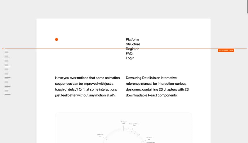
--- version: "alpha" name: "Monograph Interaction Atlas" description: "An editorial reference system with paper-white margins, ink typography, orange signals, and low-chrome diagram cards." colors: primary: " 171717" sec...

Key Takeaways

  • Build the page like a calm interaction monograph rather than a product launch site.
  • Let diagrams and reference fragments carry the identity.
  • Use orange only when the page needs to point or commit.

  • Favor line diagrams, cropped UI artifacts, and atlas-style galleries over photography.
  • Treat each card like a paper exhibit tile.
  • Keep the shell almost entirely paper white.

Overview

  • Build the page like a calm interaction monograph rather than a product launch site.
  • Let diagrams and reference fragments carry the identity.
  • Use orange only when the page needs to point or commit.

Image Direction

  • Favor line diagrams, cropped UI artifacts, and atlas-style galleries over photography.
  • Treat each card like a paper exhibit tile.

Colors

  • Keep the shell almost entirely paper white.
  • Use quiet gray for supporting explanation and orange for the rare signal or CTA.
  • Let cards stay only slightly darker than the page.

Typography

  • Use a clean editorial sans for the main reading voice.
  • Bring in italic or serif flavor only as a small tonal shift, not as the structural type system.
SpacePlay/PauseSeek 1sShiftSeek 10s