Design Analysis
What stands out in Saas websites
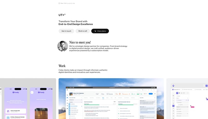
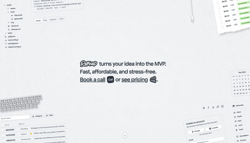
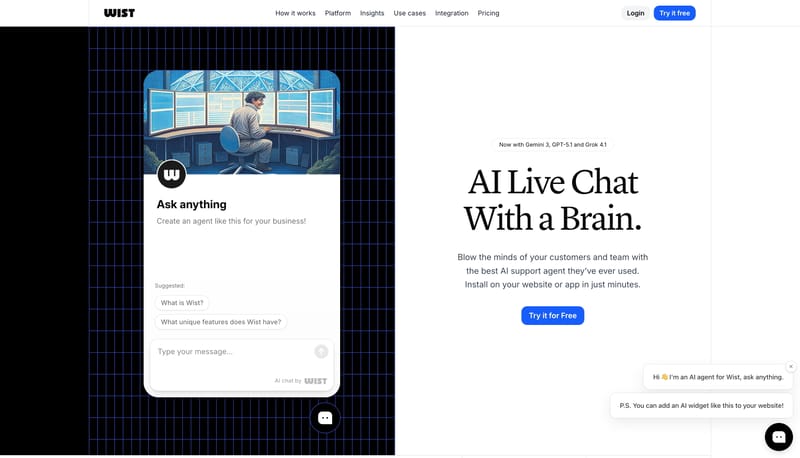
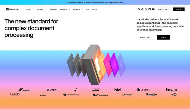
Soft Agent Workspace is a light-first system that makes advanced software feel collaborative and approachable. The first impression should be one giant italic statement over a near-white canvas, followed by a polished wh... Build the system as white space, gia...
Recurring Signals
- Primary ( 222222): High-intent button fill and dark utility emphasis.
- Secondary ( FFFFFF): Card, button, and workspace window surface.
- Tertiary ( 0072F5): Small interactive signal, link, and icon accent.
- Display: Oversized, italic, tightly tracked, and highly confident.
- Body: Calm, friendly, and evenly spaced.
- Labels: Slightly weightier than body copy to preserve clarity on very light surfaces.
Related Keywords
OverviewImage DirectionColorsTypographyDisplay: Oversized, italic, tightly tracked, and highly confidentBody: Calm, friendly, and evenly spacedLet monochrome pills keep the interaction posture groundedKeep proof tidy and clearly categorizedUse white and dark graphite as the baseSecondary ( FFFFFF): bright card and control surfaceTertiary ( 5C8BFF): one cool gradient anchorDisplay: bold and contemporary, with tight spacing
Soft Agent Workspace is a light-first system that makes advanced software feel collaborative and approachable. The first impression should be one giant italic statement over a near-white canvas, followed by a polished wh...
- Primary ( 222222): High-intent button fill and dark utility emphasis.
- Secondary ( FFFFFF): Card, button, and workspace window surface.
Open exampleBuild the system as white space, giant dark statements, and one orderly row of signal tiles. Use lilac and violet to energize proof without changing the page shell into an accent wash. Let monochrome pills keep the inter...
- Build the system as white space, giant dark statements, and one orderly row of signal tiles.
- Use lilac and violet to energize proof without changing the page shell into an accent wash.
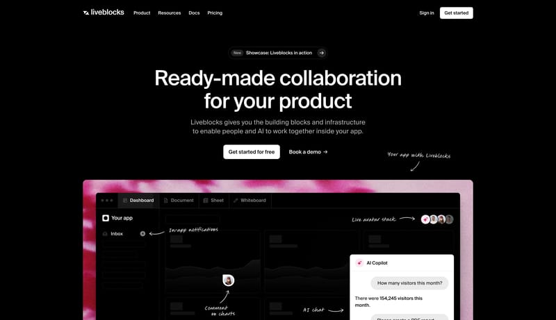
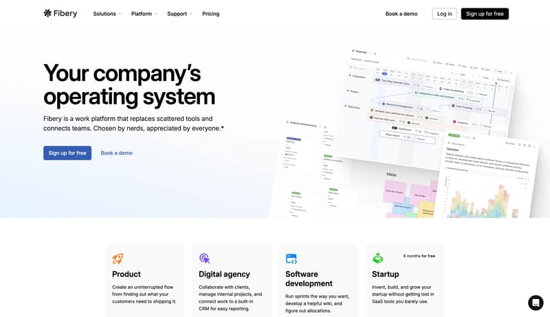
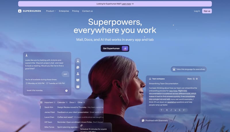
Open exampleGradient Productivity Stage is a software-marketing system that feels broad, polished, and credible. White proof sections carry the main narrative, while occasional dark product theaters and concentrated gradient objects...
- Primary ( 292D34): main text and dark action color.
- Secondary ( FFFFFF): bright card and control surface.
Open example