Bud - Your AI Worker

Bud - Your AI Worker

Bud is your AI Worker. Bud is an AI agent with its own computer, browser, number, and telegram to do anything a human can do.

4.0
6
Visits
Visit

Available Pages

Version History

Design Analysis

Bud - Your AI Worker Home design analysis

--- version: alpha name: Quiet Agent Workspace description: A sparse white AI workspace with a persistent icon rail, centered task surfaces, soft nested panels, compact pill controls, and tiny warm or green signals. colo...

Overview

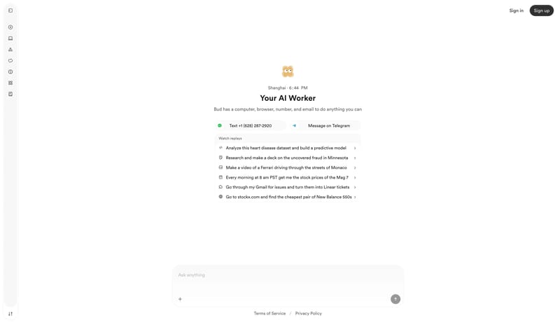
This design language is a quiet workspace for delegating tasks to an AI assistant. The screen should feel spacious, personal, and utilitarian: a mostly white canvas, a slim persistent tool rail, one centered work object, and compact controls that do not fight for attention. The system works best when the main surface is obvious: a composer, suggestion list, pricing panel, reading article, or task replay. Avoid turning the page into a broad marketing dashboard.
Colors

Use white as the dominant canvas and active surface. Use very pale grays for containment: F7F7F7 for active pills, nested bands, and rail fills; F8F8F8 for hover surfaces and replay trays; EEEEEE for hairline borders. Use 1B1B1B for primary text and dark action buttons. Use 585858 for secondary copy, inactive navigation, metadata, and footer links. Use B7B7B7 for placeholders and disabled affordances.

Typography

Use a rounded circular grotesk for nearly everything. Most product text should be medium weight and compact. Page and section headings are modest at 24px / 32px, while body copy is 16px / 24px. Navigation and controls use 14px / 20px. An occasional soft slab display treatment can appear on identity-rich headers, around 48px / 48px, but it should be rare. Do not make the application feel editorial by default.

Layout

Keep a narrow icon rail pinned to the left and leave the rest of the canvas open. Center the primary work surface horizontally. Typical task surfaces can be around 448px wide; a bottom composer can be wider, around 708px, but should still feel centered and calm. Use narrow reading columns around 544px for documentation-like content, paired with a compact sticky outline. Pricing or option cards can sit in a row on desktop, but their interiors should remain soft and uncluttered.

SpacePlay/PauseSeek 1sShiftSeek 10s