
Ugur Turgut

Ugur Turgut

My work involves assisting clients in creating impactful, informed, and authentic digital identities, along with innovative user experiences.

4.0
4
Visits
Visit

Available Pages

Version History

Design Analysis

Ugur Turgut Home design analysis

--- version: alpha name: Soft Monochrome Partner Capsule description: Pearl-white solo-partner system with graphite typography, large capsule controls, and powder-blue support panels. colors: primary: " 4A4A4A" secondary...

Key Takeaways

  • Use pearl white as the default field.
  • Keep graphite as the main text and dark-action color.
  • Use soft mist for pills and neutral panels.
  • Use one rounded grotesk family across the system.
  • Keep display type large, open, and lightly weighted.
  • Avoid compressed headings or aggressive weight jumps.

Overview

Soft Monochrome Partner Capsule should feel like a highly disciplined one-person practice that never needs to shout. The shell is almost entirely pearl white, the type is soft graphite rather than harsh black, and the main visual identity comes from detached capsule controls, broad rounded panels, and one carefully staged object per section.
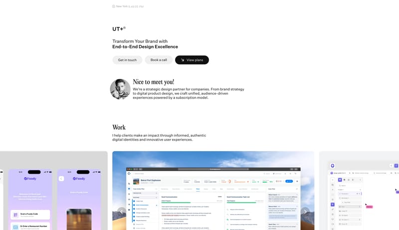
Image Direction

Use original portraiture, project boards, or service visuals that sit inside generous white space with soft edge treatment. The imagery should feel deliberate and isolated, with enough calm around it that the typography and pill controls stay legible and composed.

Colors

  • Use pearl white as the default field.
  • Keep graphite as the main text and dark-action color.
  • Use soft mist for pills and neutral panels.

Typography

  • Use one rounded grotesk family across the system.
  • Keep display type large, open, and lightly weighted.
  • Avoid compressed headings or aggressive weight jumps.
SpacePlay/PauseSeek 1sShiftSeek 10s