Design Analysis
What stands out in Fun websites
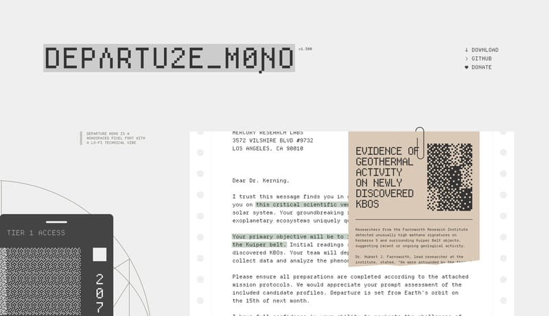
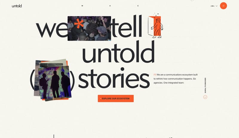
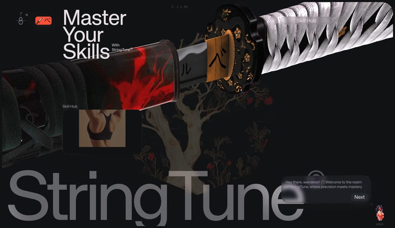
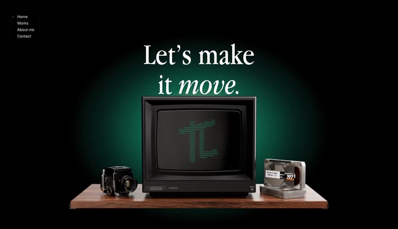
Retro Terminal Artifact treats the page like a designed dossier instead of a conventional product site. Pixel mono type, faded industrial neutrals, and printed-paper fragments create the sense of a found technical object... Playful Wallet Utility is a consumer...
Retro Terminal Artifact treats the page like a designed dossier instead of a conventional product site. Pixel mono type, faded industrial neutrals, and printed-paper fragments create the sense of a found technical object...
- Primary ( 444444): Main text and structural ink.
- Secondary ( C0C0C0): Support lines, dividers, and quiet specimen layering.
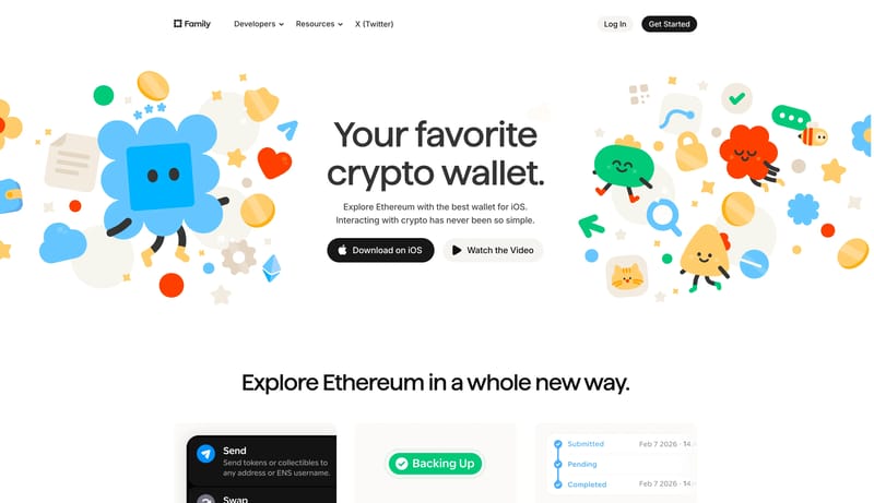
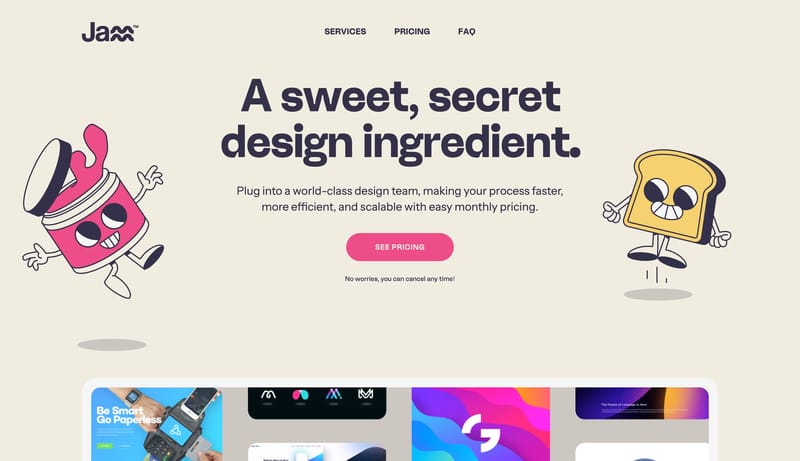
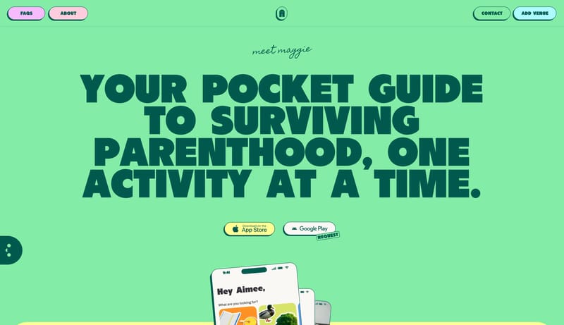
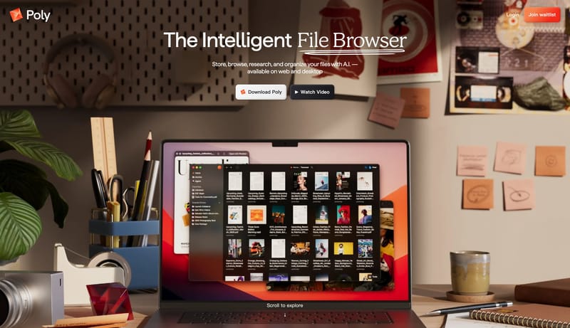
Open examplePlayful Wallet Utility is a consumer-facing system that softens financial software with mascots, rounded controls, and bright support accents while keeping the actual decision points crisp and black. It should feel appro...
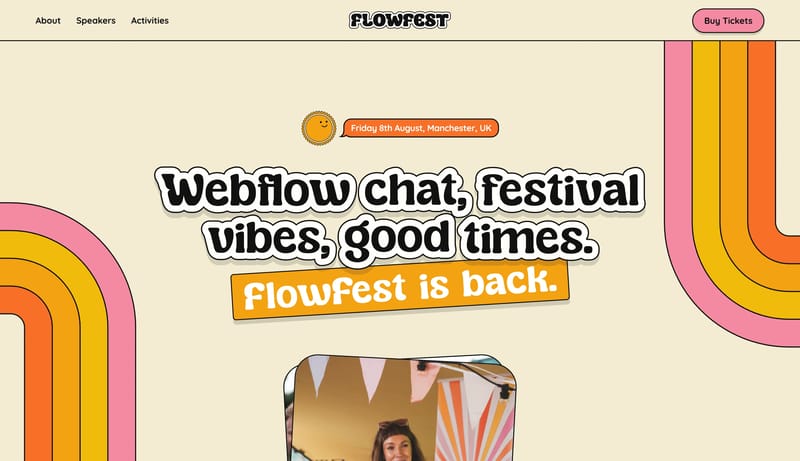
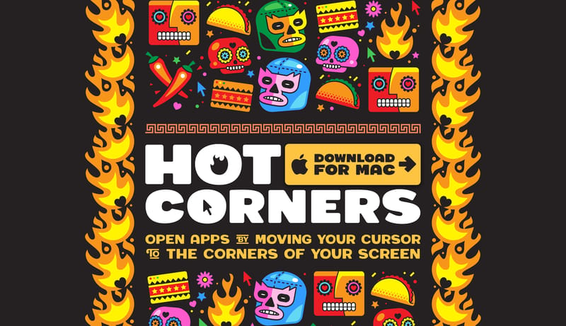
Open exampleBuild a system that feels like joyful printed ephemera brought online. A poster-like event system built from cream paper, chunky bubble display, outlined stickers, and candy-bright ticket controls.
Open example