Browse all Styles

Style

Animation Website Inspiration

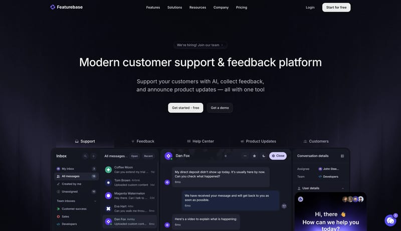
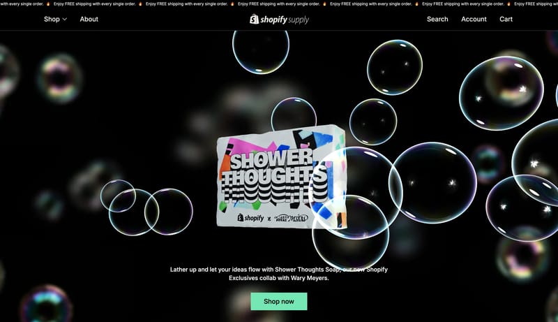
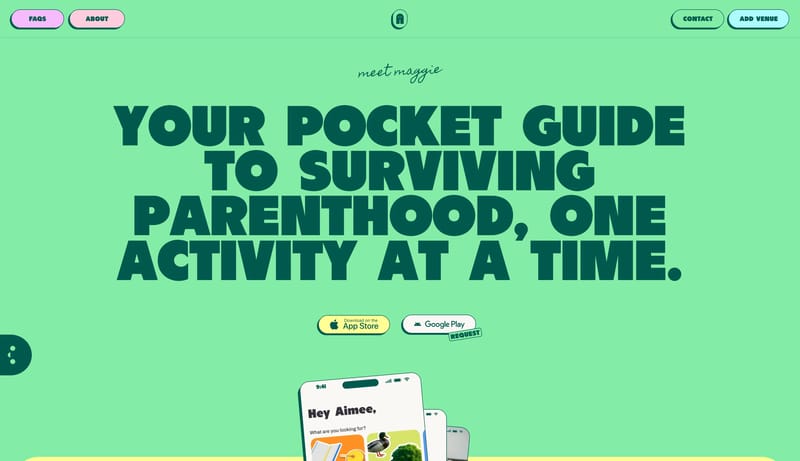
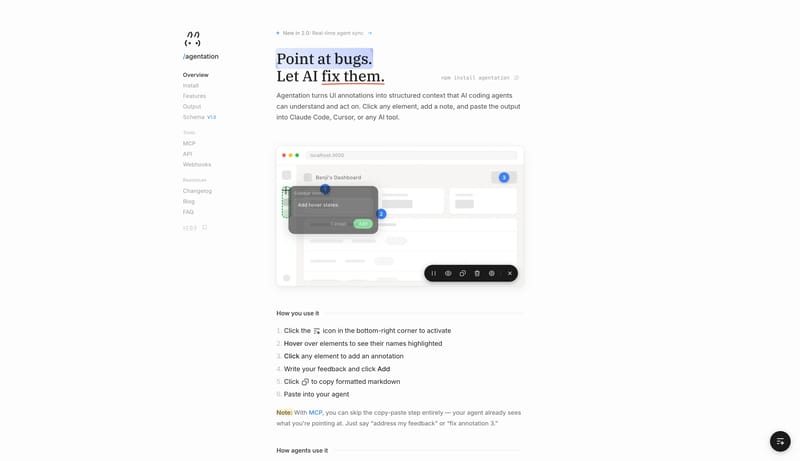
Browse 183 curated Animation website examples to review visual direction, typography, color systems, motion, and overall brand expression.

183 curated examples24 per pagePage 6 of 8

What To Look For

Study how Animation style decisions affect first impression, readability, visual tension, motion, and the overall feel of the product.

What To Compare

Pay attention to color contrast, type pairings, spacing density, illustration treatment, motion restraint, and how the Animation style stays consistent across the page.

Design Analysis

What stands out in Animation websites

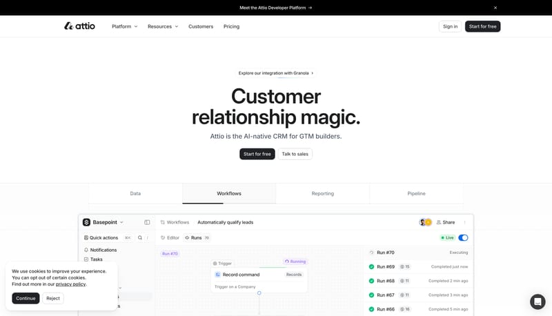
Build the experience as a near-white CRM field that feels spacious, exact, and product-led. Let faint guide systems, soft product windows, and crisp black CTAs carry the structure instead of dense feature clutter. Keep t... Build the experience as an index, do...

Recurring Signals

  • Build the experience as a near-white CRM field that feels spacious, exact, and product-led.
  • Let faint guide systems, soft product windows, and crisp black CTAs carry the structure instead of dense feature clutter.
  • Keep the control language disciplined: the site relies on rounded rectangles, not pills.
  • Use prompt bars, tabbed product windows, workflow surfaces, pricing cards, and structured proof modules as the main visual objects.
  • Keep one product artifact in focus beneath each large statement instead of stacking many equal-weight screenshots.
  • Let guide lines or dot fields remain visible around the product object so the composition still feels governed when it is sparse.

Related Keywords

OverviewImage DirectionColorsTypographyLet whitespace do most of the talkingLayoutKeep every visual element didactic and graphicUse black and chalk as the base pair

Attio

Home

2026-01-07

Build the experience as a near-white CRM field that feels spacious, exact, and product-led. Let faint guide systems, soft product windows, and crisp black CTAs carry the structure instead of dense feature clutter. Keep t...

  • Build the experience as a near-white CRM field that feels spacious, exact, and product-led.
  • Let faint guide systems, soft product windows, and crisp black CTAs carry the structure instead of dense feature clutter.
Open example

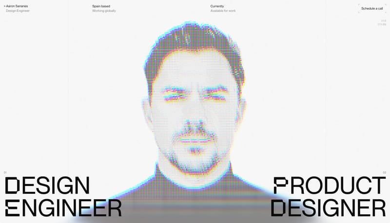
Aaron Sananes

Home

2026-01-06

Build the experience as an index, dossier, or ledger rather than a promotional portfolio. Let whitespace do most of the talking. Use thin rules, utility stamps, and microtype to organize information with extreme restrain...

  • Build the experience as an index, dossier, or ledger rather than a promotional portfolio.
  • Let whitespace do most of the talking.
Open example

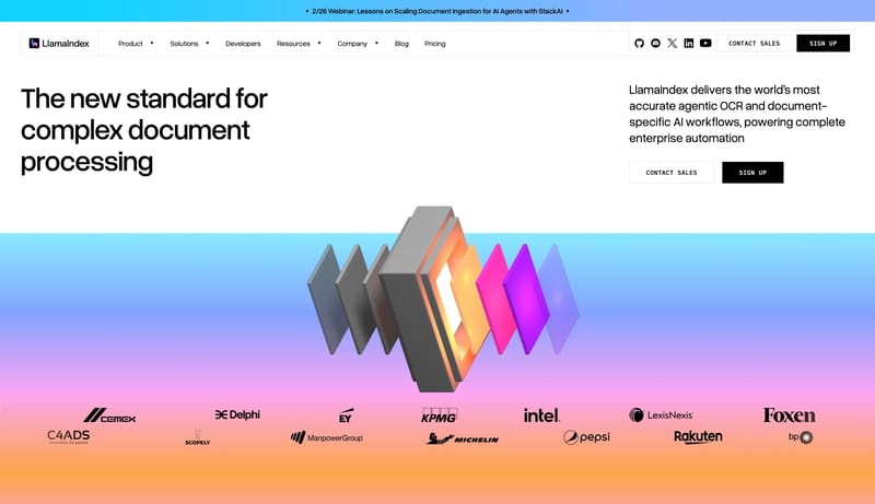
LlamaIndex

Home

2026-02-16

This design language is a high-contrast engineering system for document intelligence and agent workflows. It uses white space, hard black controls, large rounded-grotesk type, technical tables, and structured gradient ob...

Open example

Continue Exploring

Use these internal hubs to keep branching from Animation into broader design research, structured design analysis, or adjacent website inspiration taxonomies.

Animation Inspiration FAQ

What can this Animation style collection help with?
It helps you compare visual tone, typography, color systems, spacing density, illustration treatment, and motion choices used in Animation website design.

How should I use Animation style references?

Use them to calibrate creative direction, collect mood references, and decide which visual traits feel distinctive enough to adapt for your own product.