Design Analysis
What stands out in Supports websites
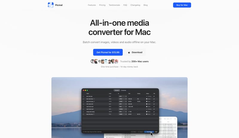
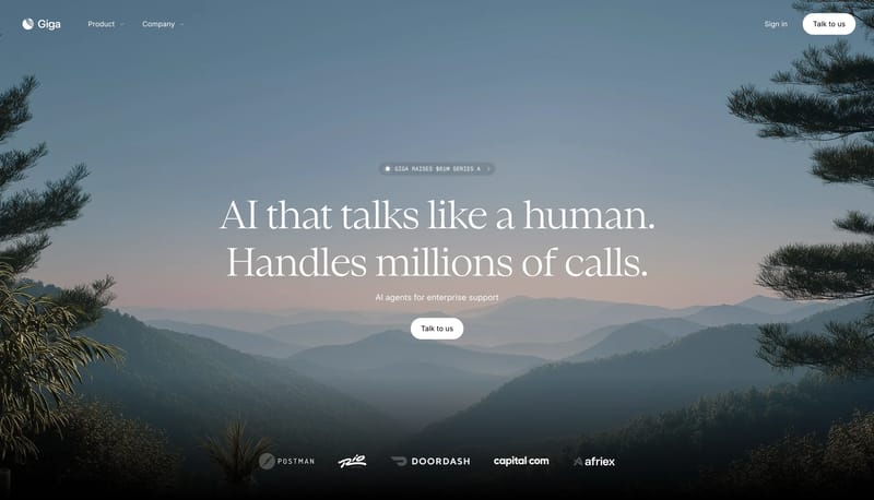
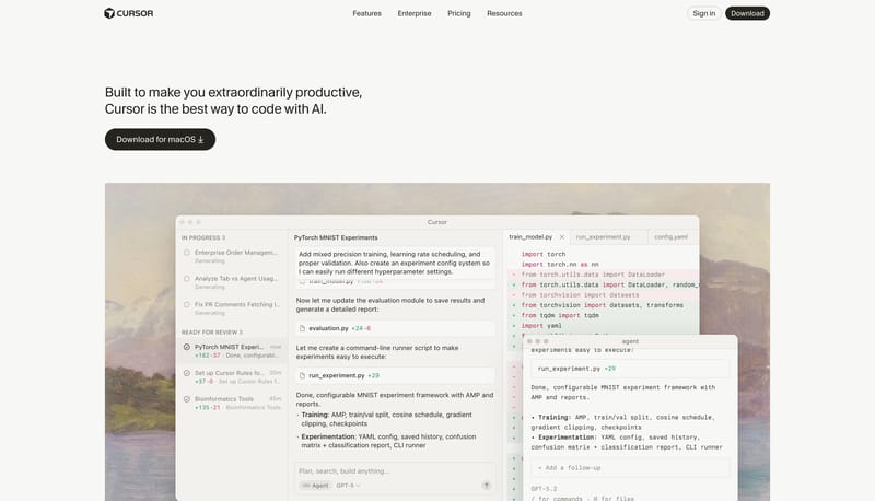
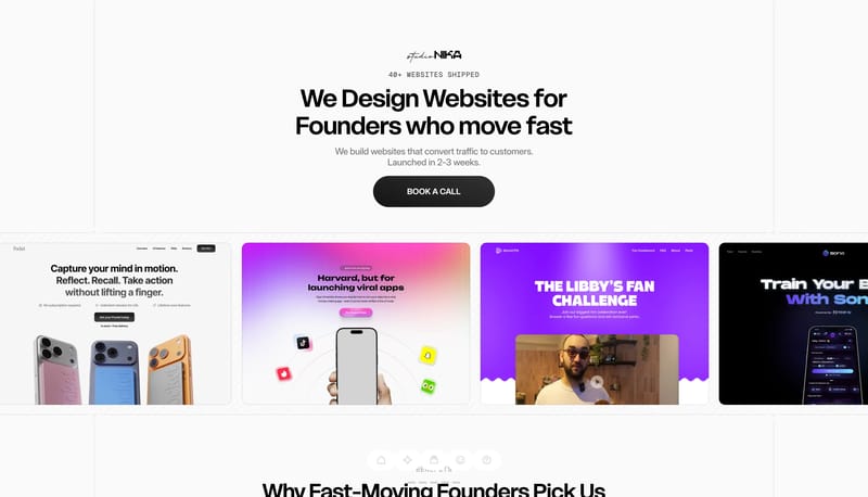
Treat the system like a clean utility manual: direct, efficient, and screenshot-led. Use blue actions to point the way without over-branding the shell. Let docs, changelog, and marketing all feel like one family. Use app... Build the first fold as a clean conv...
Treat the system like a clean utility manual: direct, efficient, and screenshot-led. Use blue actions to point the way without over-branding the shell. Let docs, changelog, and marketing all feel like one family. Use app...
- Treat the system like a clean utility manual: direct, efficient, and screenshot-led.
- Use blue actions to point the way without over-branding the shell.
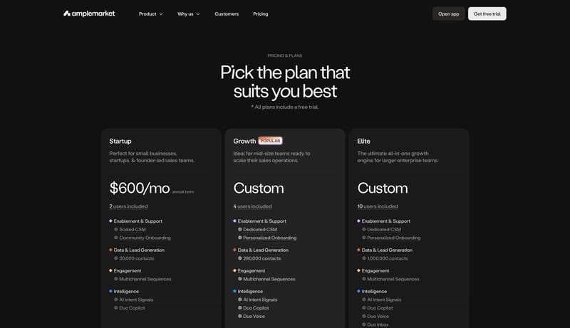
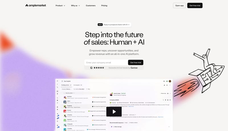
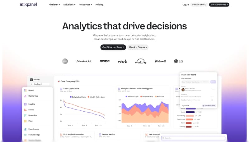
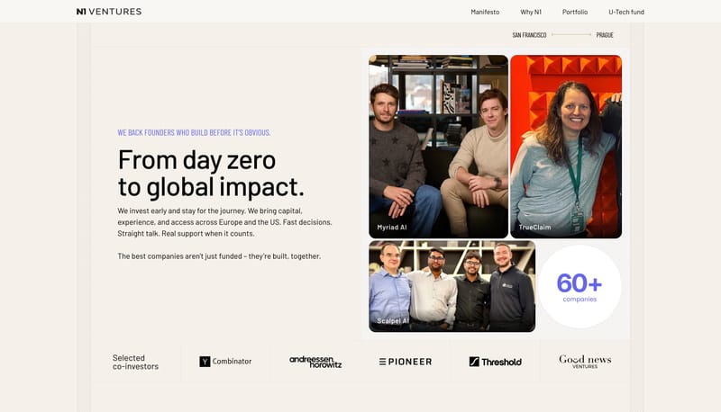
Open exampleBuild the first fold as a clean conversion stage, then let the aura and illustration introduce energy below it. Keep the tone sales-forward and legible rather than dreamy. Use the line illustration to avoid a generic das...
- Build the first fold as a clean conversion stage, then let the aura and illustration introduce energy below it.
- Keep the tone sales-forward and legible rather than dreamy.
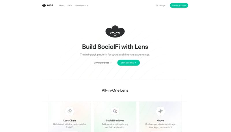
Open exampleBuild the page as an airy white ecosystem space with only one strong fill color: mint. Let faint background linework and soft cards provide just enough personality without compromising clarity. Keep the whole experience...
- Build the page as an airy white ecosystem space with only one strong fill color: mint.
- Let faint background linework and soft cards provide just enough personality without compromising clarity.
Open example