Design Analysis
What stands out in Features websites
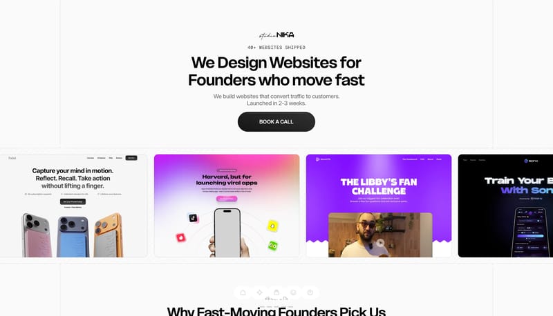
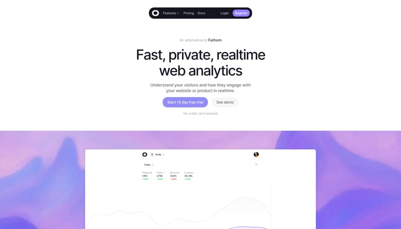
Build the interface as a mostly white field with just enough diagonal texture to keep it from feeling empty. Let type scale and capsule shape do the heavy lifting. The experience should feel direct, not decorated. Keep t... Build the experience as a near-white...
Build the interface as a mostly white field with just enough diagonal texture to keep it from feeling empty. Let type scale and capsule shape do the heavy lifting. The experience should feel direct, not decorated. Keep t...
- Build the interface as a mostly white field with just enough diagonal texture to keep it from feeling empty.
- Let type scale and capsule shape do the heavy lifting. The experience should feel direct, not decorated.
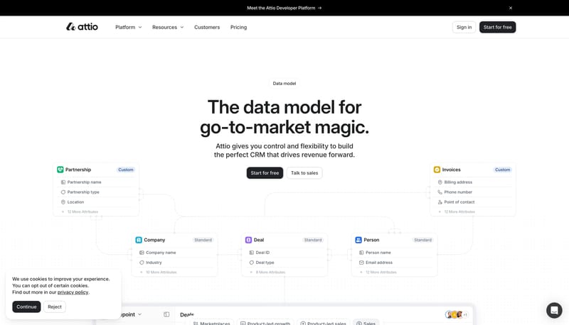
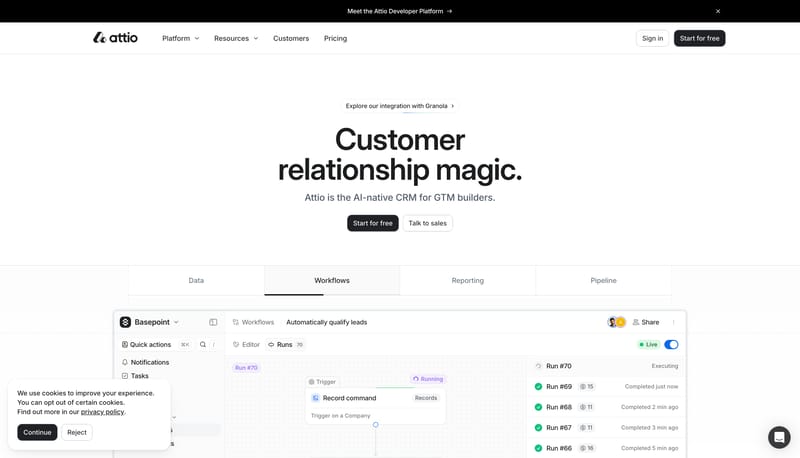
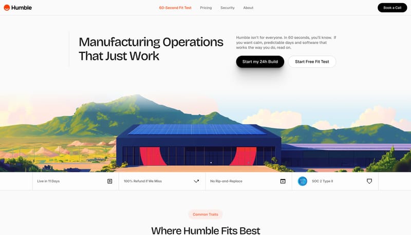
Open exampleBuild the experience as a near-white CRM field that feels spacious, exact, and product-led. Let faint guide systems, soft product windows, and crisp black CTAs carry the structure instead of dense feature clutter. Keep t...
- Build the experience as a near-white CRM field that feels spacious, exact, and product-led.
- Let faint guide systems, soft product windows, and crisp black CTAs carry the structure instead of dense feature clutter.
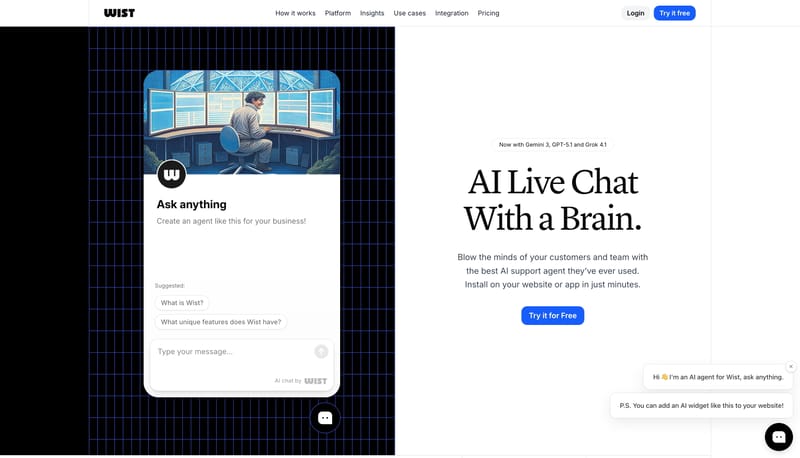
Open exampleBuild the experience as a product explainer that toggles between warm clarity and technical depth. Alternate clean white storytelling bands with deep navy blueprint interludes. Make the chat object feel central: the prod...
- Build the experience as a product explainer that toggles between warm clarity and technical depth.
- Alternate clean white storytelling bands with deep navy blueprint interludes.
Open example